Over the last 140+ years, real commodity and producer prices (that is, commodity and producer prices deflated by the consumer price index (CPI)), have been highly correlated with the earnings yield (the ratio of earnings to stock prices, or the inverse of the P/E ratio) on American stocks (SPY, DIA, QQQ) over the medium to long term, just as nominal producer prices were highly correlated with long-term interest rates from the 1720s until World War I over medium- to long-term intervals. This latter relationship is what Keynes called "Gibson's Paradox," in deference to A. H. Gibson's rediscovery of the relationship in the 1920s.
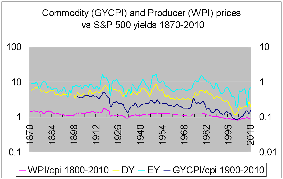 (Sources: Roy Jastram's The Golden Constant, Robert Shiller's data, and Stephan Pfaffenzeller)
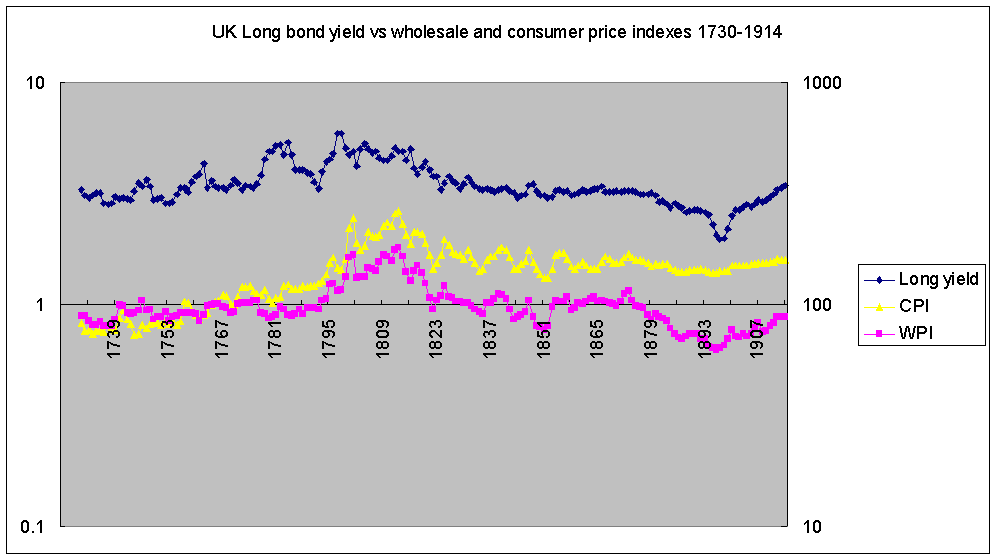
(Sources: Jastram, Bank of England)
Over the short term, the relationship tends to be more complicated than that. Commodity prices (RJA, GSG, DJP) can rise quite dramatically with stock prices (thus driving down the earnings yield, all else being equal) or fall in tandem. Not only that, but over the short term, different commodities appear to react in different ways to this relationship.
Oil, for example, tends to be an early mover while precious metals (most notably, gold) tend to be the last to show up to the party. Oil prices (CRUD, USO, OIL) peaked in 2008, while gold (NYSEARCA:GLD), silver (NYSEARCA:SLV), and platinum peaked in 2011. The great spikes in precious metals prices three years ago were, as in 1980, indicators that the decade of rising earnings yields (or, falling P/Es, if you prefer) and commodity prices was ending.
The oil/gold ratio is a simple way of representing that contrast between how oil and gold "respond to" or "predict" the earnings yield and commodity prices. (For charts and a more detailed review of energy and precious metals price behavior discussed in this piece, please see my previous article, "Inflation and Yields: The Rules of the Game").
Gold and crude oil are both somewhat peculiar commodities, however, because it has only been four decades or so that their prices have been allowed to float, having each been tied to the dollar up until the early 1970s. And, if we look at silver, although it has been cut loose from the dollar since the American Civil War, it did not exhibit this sort of extreme behavior prior to the 1970s either.
In other words, with the collapse of the Bretton Woods arrangements at the end of the great post-War boom, we were given this curious new twist to what appears to be a very ancient relationship between goods prices and yields. On that basis, the combination of low/flat energy prices and parabolic precious metals prices within the larger context of a general collapse in commodity prices over the last five years has indicated that we are in a secular bull market in stocks and a bear market in commodities (a statement that seems much more obvious today than when I argued in this vein over a year ago).
Based on these relationships alone, if this great boom in stocks is to end, the history of the last half-century suggests that we will have to see a significant rise in crude oil prices (WTI at $150) and/or a further collapse in precious metals prices (gold at $800) first.
Over the last year, and especially the last six months, as the trend in commodity and stock prices has become less subject to debate, I have been focusing more on the "internal" relationship between stock prices and earnings. Just as a year or so ago, I felt like I had to argue against those who were claiming that the collapse in commodity prices were somehow failing to "confirm" the stock market rally, I have since felt that I have to argue against those who claim that stocks are on the brink of collapse simply because P/Es and similar valuation ratios are "high."
I have tried to show that the relative volatility of earnings is as important as the levels of earnings and stocks when it comes to predicting stock market behavior and that history indicates that although this stock market boom is starting to mature, we probably have another two to three years left of very high returns. Interest rates, and especially the yield curve, say the same thing. (See this article for the relationship between the yield curve and stock returns, and this one, among others, for the relationship between earnings volatility and stock returns).
Historical precedent seems fairly clear to me on this point: the next two to three years will likely see a powerful surge in stocks and bonds and a further collapse in commodity prices. As I have been arguing, we are not living in another Great Depression but a concatenation of the 1920s and 1980s/1990s. And, we are fast approaching a crossroads. Investors who are thinking beyond the next 12 months' returns, indeed, already have to choose between the possibility of exceptional short-term (2/3-year) gains and a long-term (10-year) slide. Obviously, it is not for me to say what a given investor should do; that depends on any number of factors, but I think that there is more "upside risk" than "downside risk" at the moment.
By "upside risk," I mean three things. One, that the gains over the next two or three years might be so dramatic as to offset a long-term decline in stock prices after they finally peak, although that window appears to be closing with every passing month now. For example, in the mid-1990s, when P/E ratios were near historic highs, the stunning rise in stock prices over the subsequent five years far outweighed the crashes and flat growth that followed. Although the balance of risk is already beginning to shift in favor of a "long-term bearish" position, we do not appear to be at the tipping point quite yet. A long-term investor, I strongly suspect, can still gain long-term returns over the short term.
Two, that the more right I am about the short-term boom, the more traumatic will be the following collapse. Whereas today's bears are thinking about how high P/E ratios relate to the elements of the previous paragraph (i.e., the narrow question of how absolute P/E levels relate to stock returns), I worry about how these high ratios relate to the stability of the global economic and geopolitical order. To me, the similarities between the present decade and the 1920s are just too close for comfort. The more "optimistic" I am about the 2010s, the more "pessimistic" I must be about the 2020s. Here we are again, trapped between asset price booms and deflationary woe in the real economies of the world. Meanwhile, there appears to be a whole series of micro-level political shifts that are now starting to be felt at the macro/geopolitical level, connected, as in the early 1920s, with an initial post-commodity-boom shock. At the moment, the old order remains intact. The faces in the halls of power generally remain familiar. But, there are movements and parties that hold significant minority positions in the parliaments around the world, including the West, that seem poised to capitalize on the next big economic shock, if one should arise.
Such a shock seems increasingly likely. What is an optimistic but realistic expectation for economic growth over the next five years? And, what are the chances that we will have a shock/recession in that same period? I will be surprised if the Fed can raise rates next year without chaos ensuing the year after that. I don't think the Fed can do any good at this point, but they can probably do a fair amount of damage in order to regain a bit of credibility.
The third reason I am worried about "upside risk" is because of the "impact" that a booming stock market will have on commodity prices. If I am right about a brief but dramatic extension in the boom in stock prices and the correlation between commodities and the earnings yield, we should expect significant downward pressure on commodity prices as well as (worsening) crises in emerging markets over the next three years, somewhat akin to the late 1990s crises, which saw a massive boom in American equities and collapses in the Global East and South alongside commodity markets.
Here is where the experience of the 1990s and the 1920s begins to part somewhat. In both instances, we saw a similar sequence: a boom in equities, an unprecedented run-up in stock valuations, and a collapse in inflation and commodity prices. After the dot.com crash, however, we saw a boom in commodities and BRIC economies, whereas after the 1929 crash, we saw a further collapse in commodity prices and a more or less global Depression. In the 1930s, there was a strong commodity rally, but only after prices finally bottomed in 1932. In the 2000s, in contrast, commodities recovered much more quickly and substantially.
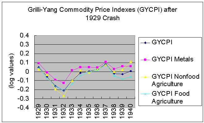
(Source: Pfaffenzeller)
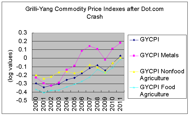
(Source: Pfaffenzeller)
So, even if we price in a stock market boom over the next three years, what will the next ten years (that is, the three boom years plus the seven post-boom years) look like? Inflation or deflation? Or some bizarre combination of the two? For example, a surge in real commodity prices while nominal commodity prices remain flat or falling? Could we really experience such a severe form of deflation, though? If we really wanted to generate inflation, don't we have the tools do so, i.e. barrel bombs of cash dropped from Bernanke's old helicopter fleet? I would say that the question probably hangs on how durable the post-Bretton Woods order is, which is as much a political as a financial question. And, yet, this seems to be precisely the sort of question nobody is asking right now. Rather, it is, when will the Fed raise short-term rates by 25-basis points? We are again in the age of parsing Fed chair(wo)men's statements, as good a contrarian signal as any, perhaps.
In short, what I mean by "upside risk" is a situation in which the boom is not only creating conditions for the subsequent bust (which is a fairly standard way of looking at the relationship between the two, I think) or masking the present bust (a standard anti-central banking position, I believe) but, in fact, is the convex side of the present bust. In other words, under our global monetary regime, the Dollar Hegemony/Pax Americana, a stock market boom is also a commodity bust. The two go hand in hand.
REVERSE-ENGINEERING COMMODITY PRICES
The obvious question that the correlation between the earnings yield (or yields generally) and commodity prices begs is that of causation. Is this correlation between yields and commodities a product of necessity or coincidence? But, let's not jump the gun. Certainly, answering that question is the ultimate goal, but that is not the first question we should be asking ourselves. There is no reason (that I am familiar with) in economics that suggests why yields generally and commodity/producer prices particularly should be tied together as closely as they have been. And, this relationship has gone unnoticed, as far as I can tell, among intermarket and other technical analysts, even though those sorts of relationships are the reason that sort of analysis exists.
What I mean is, if there is a causal relationship, it has not been obvious for some reason, and considering all of the alleys that economic theory has run down over the last 250 years, nobody (as far as I know) either noticed or posited the existence of that particular correlation. I doubt that we can rationalize our way to a competent theoretical account of such a relationship, therefore. Instead, I think we should ask a much smaller question stemming from what was, initially, not much more than a curious by-product of my previous comparisons of inflation and yields.
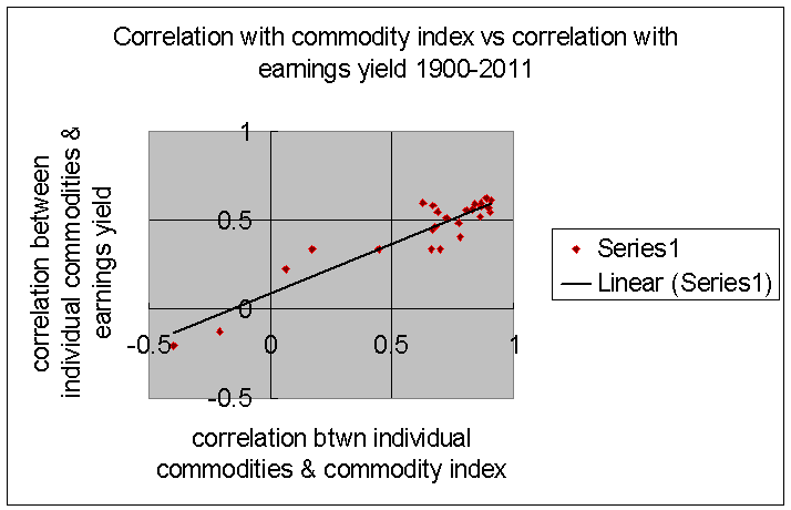
That question is, why is it that commodity and producer price indexes have been more highly correlated with yields than the vast majority of individual commodity prices were? In my five-part comparison of historical commodity and producer prices with yields over the last three centuries, I found again and again that although nearly all individual commodities were positively correlated with yields, the indexes were almost always more highly correlated.
The correlation between the (log of the) real Grilli-Yang Commodity Price Index (GYCPI)--specifically, the GYCPICW series, the geometric mean--and the (log of the) earnings yield from 1900-2011 was 0.70 whereas the median correlation for the 24 individual commodity components was 0.52 and the maximum correlation was 0.62.
Why might that be significant? A simple thought experiment might be useful here.
Imagine if the earnings yield were 10.0% and remained at that level for the next five or ten or twenty years (whatever period you like). In order for the commodity index to remain flat as well (say at the "100" level), either every single component of the index would have to also remain flat or every price movement in one commodity must be balanced out by shifts in prices in the other commodities. Now, what those shifts would look like would be influenced quite a bit by the weighting of the index.
If the weighting was not regularly rebased (which seems to be the case for the GYCPI, the standard historical commodity index), then in order for the index to remain more highly correlated than the components, a price change in one commodity must generally be met by a counter-move in one or more other commodities. (The size of those counter-moves would be dependent on each commodity's relative share of the index). If the earnings yield rose over a ten-year period, say, and the GYCPI rose, too, even if each individual commodity rose during that period, in order for the strength of the correlation to remain intact, any outsized rise in one commodity (nickel, for example) would have to be balanced by a slower rise in corn or coal or cocoa, simply as a mathematical necessity.
Likewise, a dramatic fall in one commodity, or a class of commodities, must be balanced out by a reduced fall or rise in the other commodities.
There are, of course, situations in which general commodity prices are falling but individual commodities might be rising rather significantly. This was the case in the 1980s, when a number of industrial metals (nickel sticks out in my mind) were setting new records while agriculture prices were falling. Just speaking mathematically, in order for that correlation to be maintained over the long term, it suggests a remarkable amount of volatility that is inevitable within the commodity class, with relative commodity prices necessarily shifting quite dramatically, even though they individually remain correlated with one another and the price index over the long term.
Interestingly, and as something of an aside, I found that the higher the correlation between a given commodity and the index, the higher the correlation between that commodity and the earnings yield. This suggests that for those who do not care for my insistence on connecting commodity prices and yields, they can ignore many of the subsequent references to the earnings yield and think of this discussion purely in terms of the way that commodities relate to one another singly and collectively. It is probably okay to mentally substitute the phrase "commodity index" for "earnings yield" in many of the statements below.
(Sources: Pfaffenzeller and Shiller)
Right. So, then imagine how a stock market boom must then be "felt" in the commodity sector. If stocks boom, and the earnings yield falls significantly, unless all of the commodities move in lock-step, there is apt to be an incredible amount of volatility within the commodity sector. In addition to the general downward pressure on commodity prices, there will also be this "jostling" amongst commodities. One can imagine what that might do to the terms of trade for different emerging markets and the volatility that will cause there.
The deeper question, again, is that of causality. Is that a metaphorical, mathematical jostling or is there, in some manner, an actual jostling somehow between disparate commodities? Does the price of grains have an impact (a relatively inverse one) on the price of metals and vice versa? If the earnings yield is falling but metals are rising, must agriculture and/or energy make up the difference by falling dramatically? Mathematically, that has clearly been the case, but is that inevitable?
When writing about commodities, either individually or in relation to yields, I have focused almost exclusively on metals and energy prices in previous articles, largely because my initial interest was in gold prices. However, the bulk of commodity price indexes are made up of agricultural commodities. The GYCPI has metals and agricultural commodities but no energy or gold (or iron ore, for that matter). The World Bank "Pink Data" indexes separate energy prices and precious metals from other commodities, but agriculture takes up the majority of the remainder (roughly 65%, plus 3% for fertilizers). Even though food commodities are the biggest sub-group in the World Bank commodity index (40%), no individual food commodity is very heavily weighted, whereas sawn wood, copper, aluminum, and iron ore collectively take up roughly a third of the index. Also, both the GYCPI and the World Bank indexes are weighted by export values rather than production values.
Moreover, using the GYCPI indexes from 1900-2011, the agricultural indexes are more highly correlated with the earnings yield than is the metals index. The "Gibson Effect" is, in other words, perhaps primarily an agricultural phenomenon.
It becomes necessary to ask: to what extent does index weighting influence the outcome? If the price of wheat doubles but the price of avocados halves, should a commodity index based on those two goods show a rise, a fall, or no change? If one has a very specific question in mind, then a fitting index can be constructed rather easily, I think. It seems that most historical commodity indexes are constructed with questions about terms of trade and development economics chiefly in mind rather than broader questions about the nature of commodity prices as such. Since we are working "backwards" from correlation to causation, it is not immediately clear whether or not wheat should weigh more or less than avocados and if so by how much.
This may seem like a rather arcane, tangential question, but as I hope to show, as it turns out, consideration of the problem of index weighting actually opens up a whole new level of relationships within the commodity complex that will help us understand commodity prices better and what to look out for in the coming years in global markets. What I mean to say is that thinking about the problem of index weighting actually answers more questions (and more interesting questions) than the otherwise dry problems surrounding index-construction. There is a lot more at stake than a technical issue.
PRICES AND PRODUCTION
My first step was take a look at the data. I began with the agricultural data at the UN's Food and Agriculture Organization (FAO) website.
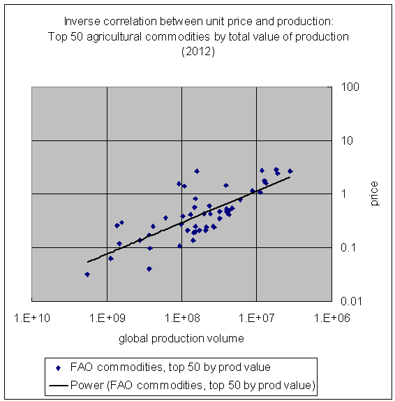
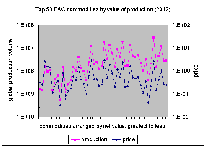
Perhaps everybody and their grandmother already knows this, but I was surprised to see that the prices of agricultural commodities listed by the FAO for 2012 were almost simple inverse functions of their production volumes.
(Source: United Nations Food and Agriculture Organization)
If that were perfectly true, of course, then the total production value of rice would be exactly the same as the total production value of watermelons, which of course, is not the case (rice production is ten times more valuable than watermelon production), but for the most part, that relationship holds. Onion production, for example, is less than twice as valuable as pear production. Wheat production is 34% more valuable than tomato production.
In the chart above, I compared the top 50 agricultural commodities by production value and put them on a scatter plot.
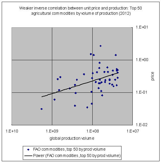
But, if you look at the top 50 agricultural commodities arranged by sheer volume of production, the correlation weakens. In other words, the higher the total value of a commodity's production, the more likely it is that its total production will behave as an inverse function of its price relative to similarly significant commodities. The inverse correlation between the price and the production is somehow tied to its total value, in other words.
(Source: FAO)
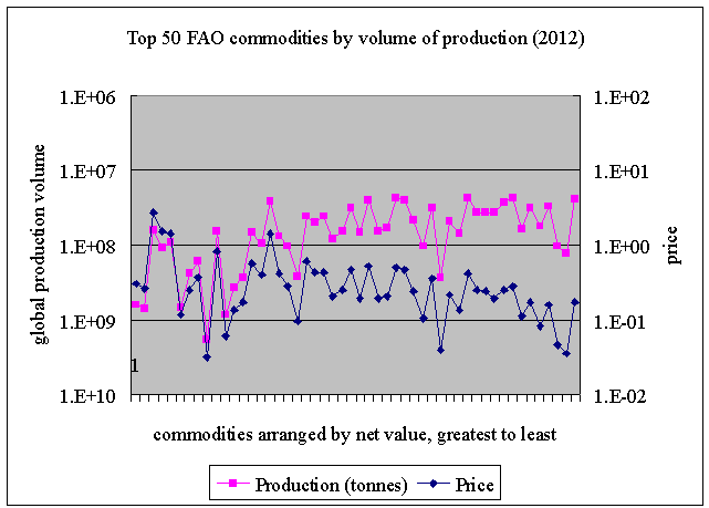
If we look at these two data sets again on a line graph, we can see how the relationship changes depending on the total value of production for a particular good relative to that of another good. Take the second set first. In the following chart, I have lined up the top 50 agricultural commodities by volume of production and organized them by their total value of production (with the value falling from left to right). As the total production of goods falls, the less likely that the unit price and total production are to be inverse functions of one another.
(Source: FAO)
If we take the top 50 agricultural commodities by total value of production and place them on a line graph in similar fashion, we find that the inverse correlation is much stronger, although the most valuable commodities by total value of production are also somewhat less sensitive to this relationship, as well: the relative increase in production does not drive the unit price down as much as it does the other commodities.
(Source: FAO)
Among the top 50 agricultural goods (by total value of production), the correlation between price and production is -0.77. Among the first 25 of those, it is -0.80, and among the second 25, it is -0.99. Among the top 50 agricultural goods organized by total amount of production, it is -0.44.
How is that significant, apart from being interesting in its own right? For one, it suggests that it is not necessary to exert any great effort in weighting commodities. If they tend to be inverse functions of their production values, then regularly weighing the commodities by total value of production unnecessarily amplifies the price behavior of the most extreme commodity price fluctuations. Instead, we can simply use a geometric average of whatever basket of commodities we are looking at. On the other hand, if it is characteristic of major commodities to exhibit this inverse correlation between (relative) price and (relative) production, then there might be a reason to employ some sort of threshold for commodities. Perhaps some commodities are more commoditized than others? Tangerines should not be weighted equally with wheat, but perhaps coffee should?
More importantly, perhaps, is what this suggests about the larger questions we are attempting to make sense of. If, as was suggested by the discussion above, individual commodity prices are influenced (in whatever fashion) by movements in yields and by the movement of other commodities, and if relative prices are to some degree a function of relative production (or vice versa), we might expect to see a shift in relative prices coincide with adjustments in relative production volumes. The relative impact is different from that implied by the Gibson Effect, however:
Under the Gibson Effect, all else being equal, a fall in one commodity price would raise other commodity prices on average, but if relative production and relative prices are an inverse function of one another, then, all else being equal, a rise in the price of wheat should result in a rise in all other (agricultural) commodities, more or less--or, somewhat paradoxically, where prices for all other commodities remain stable, an expansion in production. In other words, if we take these relative relationships naively, a 50% rise in the price of commodity X would imply a 50% drop in production of that commodity, a 50% rise in the price of all other commodities, a 50% increase in the production of all other commodities, or some combination of the three. Of course, that assumes that 2012 was not a fluke.
Fortunately, the USGS provides a fair amount of long-term data on global production and prices for major mineral commodities. Like the GYCPI commodity index, much of it goes back to 1900.
FROM AGRICULTURE TO MINERALS
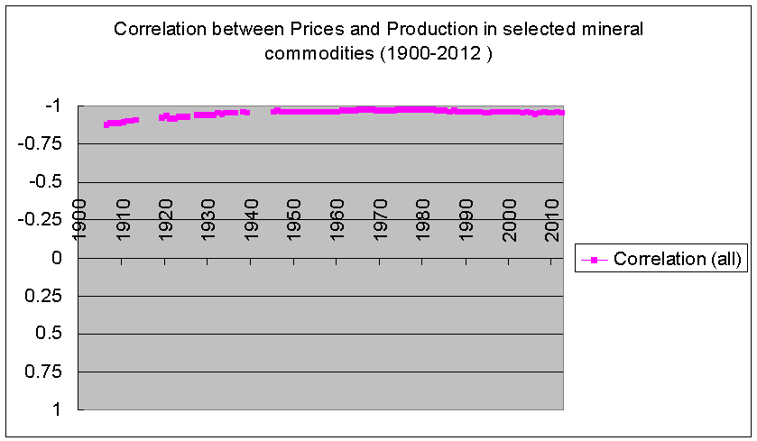
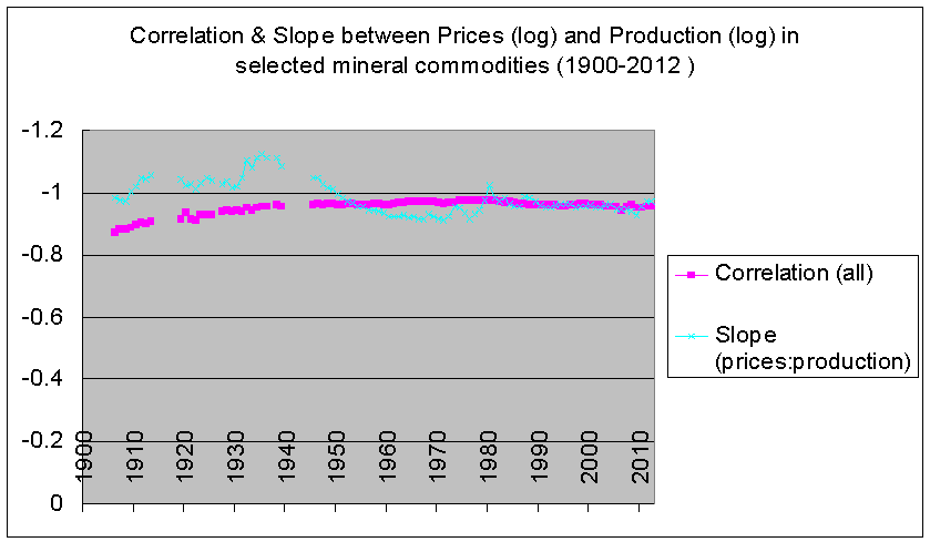
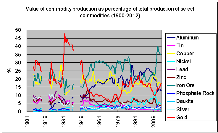
Taking eleven major mineral commodities (gold, silver, tin, zinc, lead, aluminum, iron ore, bauxite, phosphate rocks, copper, and nickel), we can see that this inverse correlation between relative prices and relative production holds throughout the last century.
(Source: United States Geological Service)
(Source: USGS)
(Source: USGS)
There are, in fact, a lot of interesting things going on in these charts apart from the general stability of the correlation.
From sometime around the Depression, there seems to have been a slight shift in the slope of the line somewhat enhancing the "weight" of production relative to price. That is, the expansion in production among the cheaper minerals tended to rotate the end of the curve for expensive metals downwards somewhat, especially up until the 1960s. Since the early 1970s, the relationship between price and production has been more evenly balanced.
(Source: USGS)
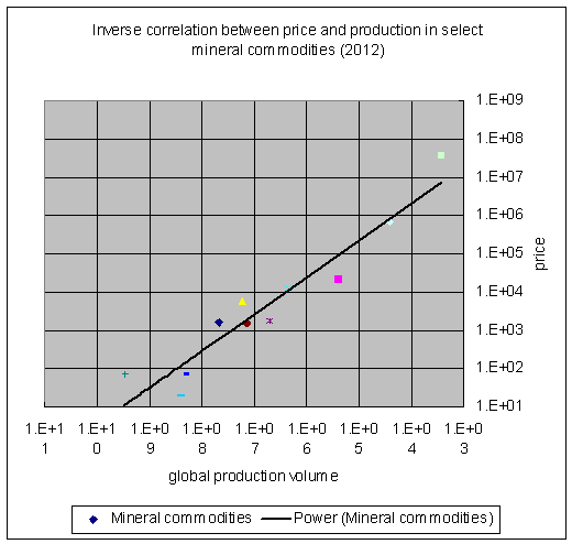
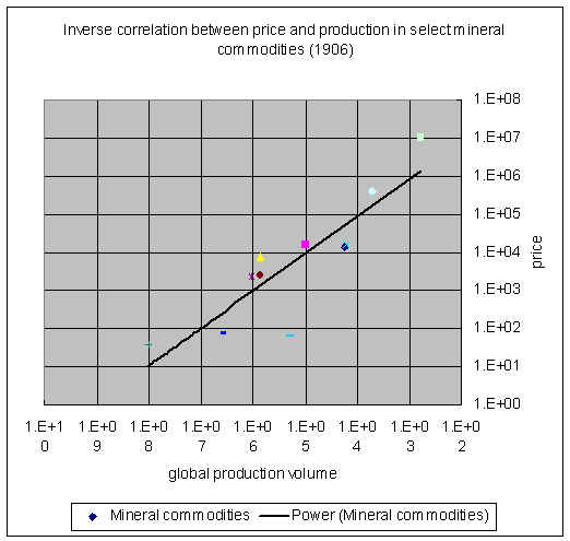
Better than these correlations and snapshot scatter-plots of random years, however, is a scatter-plot of the entire 112-year period. The chart below appears to suggest that there has been a massive expansion in the production of the cheaper metals while rarer metals have responded with rising prices. For example, the price of gold has tended to rise and fall with the production of commodities like iron ore and phosphate.
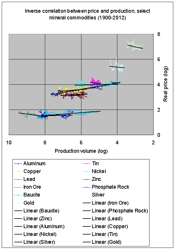
(Source: USGS)
As global production has expanded, thus shifting the overall slope towards the "northwest" of the chart, the correlation has remained intact, and it has done so (among rarer metals) by price expansion rather than expansion of production, as shown by the slopes of the individual commodities (across time).
(Source: USGS)
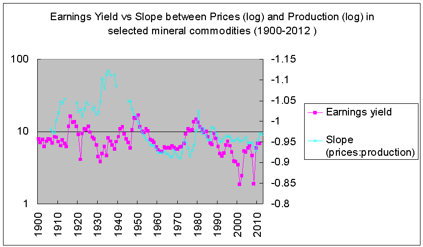
If you look at the slope of the price-to-production curve again and how it surged downwards up during the post-War boom up until the early 1970s, just on this relationship alone, it is not surprising that the US could no longer suppress the price of gold, or oil, for that matter.
 (Source: USGS, Shiller)
More recently, this makes me wonder somewhat about the supposed surge into gold last year by Asian buyers while the gold price tanked. If absolute supply and demand determine prices, then the gold price should have risen on the surge in demand, if we take the gold bugs at their word. But, if supply, demand, and price are relative phenomena, it is possible that the collapse in gold prices on surging demand was linked to slowdowns in emerging markets.
Tying this back into the outlook over the next three years, then, if we are due for another downdraft in commodities, and if the precious metals markets are usually the last to know, and precious metals tend to react more strongly than other commodities, as in the late 1990s, we should perhaps not be too surprised if this coincides with turmoil in emerging markets that are heavily tied into global commodity production. Obviously, the BRICs come to mind first, especially the most prominent member of that group.
And, we should not be too surprised to see another surge of buyers, perhaps, into the precious metals markets as gold and silver tumble while American stocks rocket upwards.
WATER AND DIAMONDS
Before concluding with the long-term scenarios for commodity prices, however, it is important to point out that this discussion has essentially been the obverse side of the hoariest classical macroeconomic puzzle, the "water and diamonds paradox," which asks why useless commodities (e.g., diamonds) are more expensive than useful commodities (e.g., water). The simple and obvious response has been that diamonds are far rarer than water. I would assume, though, that the total value of water would exceed the total value of diamonds. But, this investigation seems to hint at the possibility that that is not the case, or at least that their respective total values are closer than we might otherwise imagine.
Of the eleven mineral commodities I looked at here, except for the period when gold was being held down to an unnatural level in the Bretton Wood years before Nixon closed the gold window, the total value of annual gold production has almost always been one of the top three mineral commodities. Only iron ore, aluminum, and copper are comparable. That seems slightly paradoxical to me. It is not that hard to understand why the per unit value of gold (or diamonds) might be higher than that for more useful commodities like iron or copper (or water) but I am not sure I understand why total gold production should be comparable to the value of iron ore production. If all the gold and diamonds vanished tomorrow, I suspect that we could recover from the trauma much easier than if all of the iron ore were to vanish. I would expect that, all else being equal, that the utility of a commodity would tend to increase the total value of production of that commodity above that of a relatively useless one.
(Source: USGS)
To put this another way: if you think it is perfectly obvious that relative commodity prices should be an inverse function of relative volumes of production, then you will be perfectly content with the idea that the total value of global water production may be equal to the total value of global diamond production (assuming that both water and diamonds obey the "laws" we have described here), but I imagine that that is not a perfectly obvious condition for most people and will even seem somewhat perverse.
BETWEEN WATER AND DIAMONDS
Whatever might account for the tendency towards parity among major primary commodities, these two relationships that we have discussed here--the Gibson Effect and the inverse correlation between relative price and relative production--suggests that both the price and production levels of a given commodity are influenced as much by the behavior of the other commodities as it is by that commodity's own "fundamentals" (e.g., supply and demand).
If commodity prices do fall further over the next three years, as I believe they will, we should not expect to see an orderly retreat, but rather waves of sudden drops in one set followed by collapses in others. We should also expect to see a contraction in the production of basic commodities (especially commodities like iron, aluminum, phosphate, rice, wheat, and corn) along with severe drops in more expensive commodities such as precious metals, but also industrial metals like nickel.
In other words, during these sorts of commodity market contractions, if history is any guide, we should expect to see a reversal of the longer term trend of rising lower-end production and high-end prices.
If we look at the correlation between the price of gold and the levels of production of the other minerals, the correlation is highest among the cheapest commodities. In simple English, this means that, as we discussed above, the price of gold will tend to move with the level of production of commodities. Prices and production in a commodity bust both contract but not necessarily in the same commodities.
(Source: USGS)
What this means for our outlook over the next two, three, five, or ten years is that, we should expect to see an exacerbation of the present predicament--high asset and low commodity prices during a period of lackluster global growth--with pressure felt increasingly in emerging markets. Global growth (and commodity production) will slow and prices will fall. Stocks will continue to rise. But, then comes the crash.
THE LONG TERM
The question then is what yields and commodity prices will do after the crash. We are accustomed to high P/E ratios being the consequence of high stock prices, but that is really a post-Depression phenomenon. High P/E ratios used to be primarily a consequence of low earnings (think of the Great Depression of the late Nineteenth Century). In other words, if we are going to face a Depression-like situation in the 2020s, we may see a simultaneous collapse in stock prices, profits, and commodity prices, somewhat similar to what happened during the worst moments of the late crisis, but this time stretched out over years.
This economy does not seem like it has much cushioning left for another shock or a prolonged slump, and the question now seems to be how global political and monetary institutions will respond to those sorts of outcomes. The present trend seems to point to a long, deflationary slump to follow our deflationary boom, but if that should become more palpable than it was even in 2009, that would seem to increase the possibility that those institutions would become more creative in their attempts to generate inflation. In the event of 1930s-style political crises, there may be a much greater impetus to engage in more heavy-handed interference in market processes than bailouts and quantitative easing.
In short, the return of stock-picking and Fed-watching means that the market is not "correctly" pricing in the possibility that the P/E ratio will go to 50 (putting the earnings yield at 2%) and what that means over both the short, medium, and long terms.
On the broader question of the very nature of commodity prices, let me conclude with the basic problems we are left with after this review of the history of commodity prices and production.
1. What is the nature of the correlation between commodity/producer prices and yields, particularly the earnings yield?
2. In light of the tendency for commodity indexes to be more highly correlated than individual commodities to yields, how might the change of the price in one commodity inversely impact the price (in aggregate) of all the other commodities?
3. In light of the inverse correlation between prices and production levels for commodities relative to one another, what sort of mechanism would account for the change in price and/or production level of one commodity positively impacting the prices and/or production levels of all other commodities over time? That is, why is it that an increase in production of one commodity seems to necessitate an increase in price and/or production for all other commodities?
4. Why is it that the inverse correlation between relative prices and production levels is itself positively correlated to total production values? In other words, why is it that this inverse correlation is felt greatest in the "biggest" commodities?
5. Why is it that commodity production values gravitate towards parity in terms of their total production values, apparently irrespective of their total utility values? That is, why is it that the gold and diamonds of the world are roughly equal in price to the iron ore and water of the world?
Disclosure: The author has no positions in any stocks mentioned, and no plans to initiate any positions within the next 72 hours. The author wrote this article themselves, and it expresses their own opinions. The author is not receiving compensation for it. The author has no business relationship with any company whose stock is mentioned in this article.