There have been a lot of discussions and comments on debt, its impact, and whether we have too much of it. In order to have a handy reference, I decided to accumulate the relevant data from the Federal Reserve and the Bureau of Economic Analysis and put them in a blog for future reference. The figure below (debt data from the Fed Z.1 report http://www.federalreserve.gov/releases/z1/current/ and GDP data from the BEA bea.gov interactive data) shows the debt held by various sectors of the US economy through the end of 2013 (in billions of dollars, not adjusted for inflation). There are several trends. The total debt seems to have two long term trends. The first (1979-2001) has a slope of about 0.7 T per year and is quite linear. The second period (2002-2013) has a slope of 1.7 T per year and is also fairly linear, although the inflection point caused by the 2009 crash actually breaks it into two sub-sections (2002-2008 at about 2.1 T per year, and 2009-2013 at about 1.4 T per year). First impressions that the overall curve is parabolic don't hold if the segments are linear, but only time will tell.
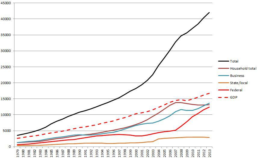
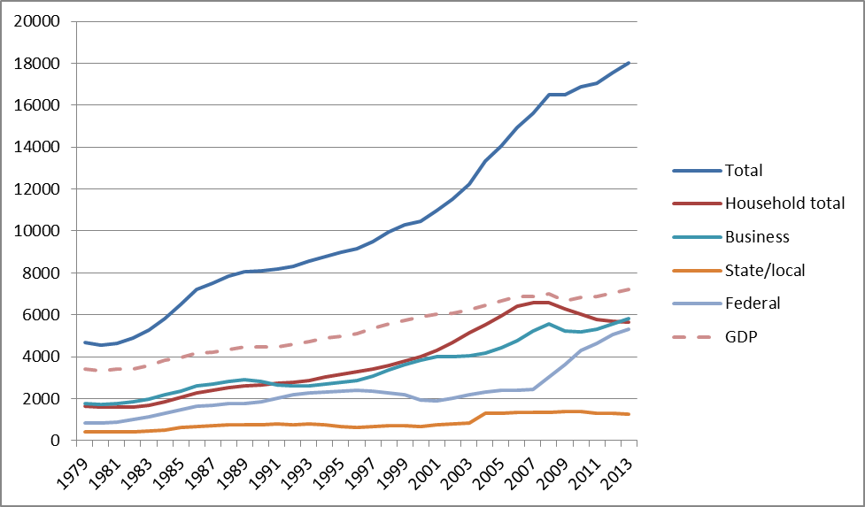
The components of the total are also interesting. From 1979 to 1995, all components increase more or less uniformly. From 1995 to 2001 Federal debt flattens, and household debt increase becomes the biggest driver of the increase. Around 2001, corporate debt starts to increase rapidly, and household debt continues to rise. Both are increasing at greater than a linear rate. Although federal debt increases from 2001 to 2007, it's a fairly small component of the total. When the recession hits in 2007-8, consumer debt flattens and then starts to fall slightly. Business debt is affected, delayed relative to consumer debt, but falling only slightly and then increasing again. It's only in 2008 that federal government debt starts to soar, more than making up for the consumers and nearly returning the total debt curve to the slope of the 2003-2008 period.
The GDP curve over the entire period is also surprisingly linear except for a slight discontinuity at the start of the Great Recession. The huge increases in consumer and corporate debt during the period 2001-2007 had little impact on the GDP, nor did the corresponding increase in federal debt from 2007 to 2013.
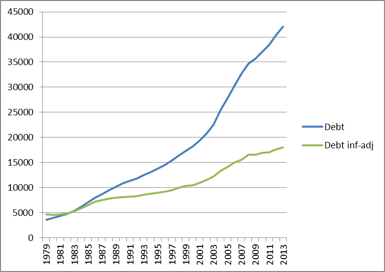
There's also a school of thought that says that only real (inflation adjusted) dollars matter, so I adjusted the same data by the CPI-U (figure below). The CPI-U has flaws, but that's another topic. The total debt curve looks a bit different in the 1970's.
Comparing the debt in then-year dollars against inflation-adjusted dollars is quite interesting (figure below). The trends are much less exaggerated and a linear approximation to the debt increase looks a lot more plausible. The timing effects are also quite interesting. There are several periods separated by inflection points:
1979-1986
1986-1999
1999-2008
2008-2013
These inflection points are harder to see in the actual dollar curve and what looks like a significant change in 2003 really doesn't appear if the debt is adjusted for inflation.
Many more factors can and need to be taken into account, but those are also topics for another post.