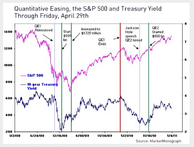
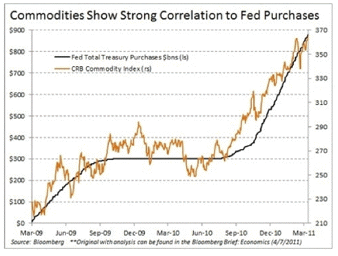
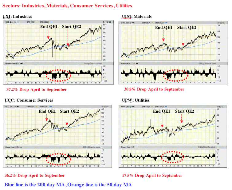
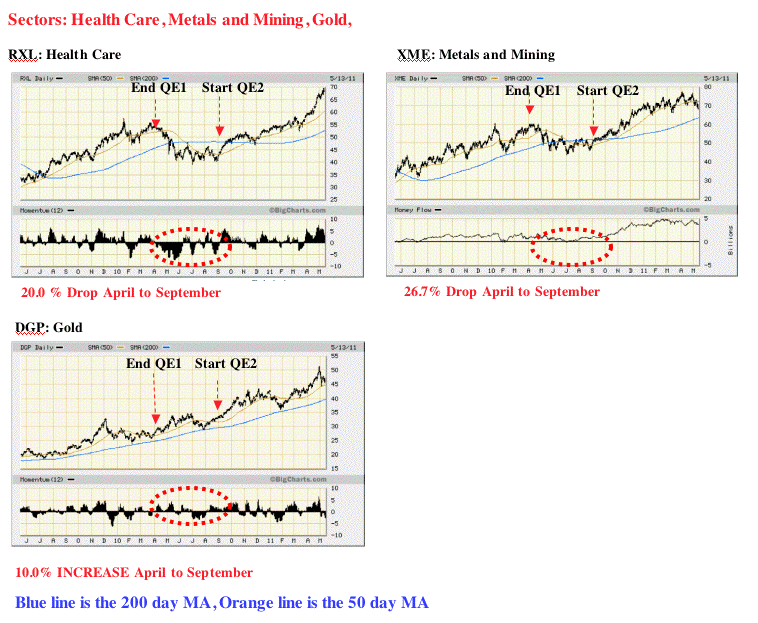
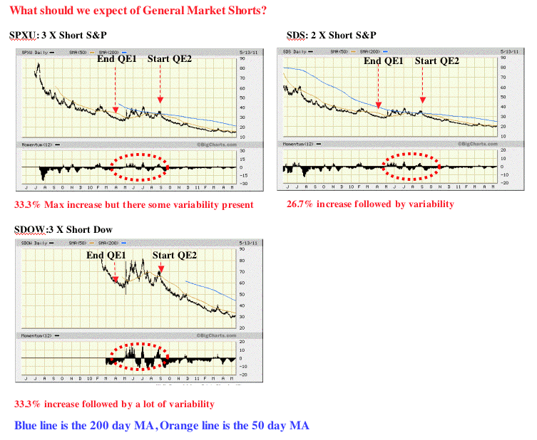
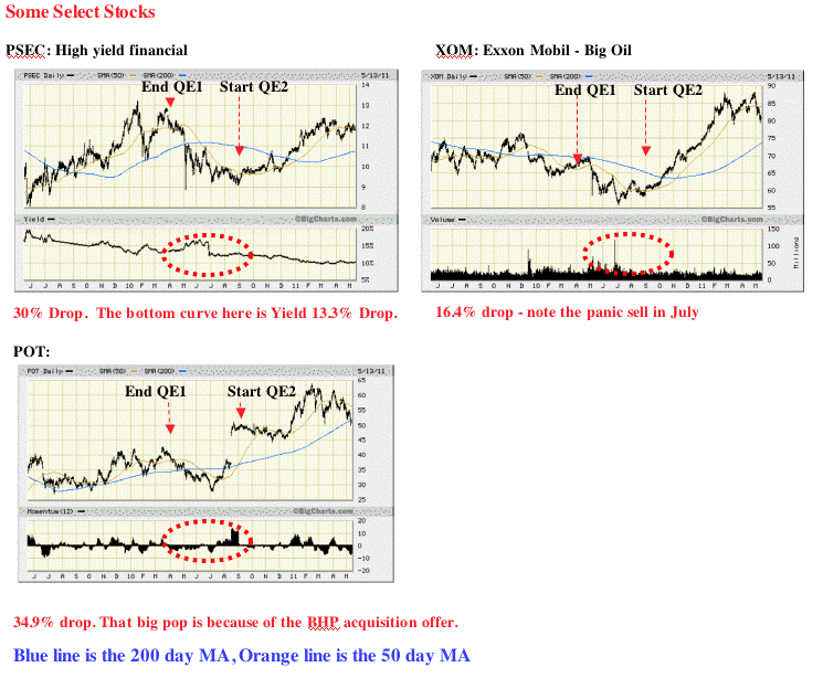
Welcome to the Hedge Shack The purpose of the Hedge Shack is to provide a place where counter-plays for the end of QE2 are identified, tracked, and discussed. * The QE2 Counter-Play: The end of Quantitative Easing Two (QE2) will occur at the end of June 2011. This article is designed to provide an area for focused discussions about the design of counter-plays for a potential sharp reduction in equity valuations. * Why would the end of QE2 cause a sharp reduction in equity valuation? In other words, how does QE2 work? Quantitative easing is a monetary policy used by the Fed to stimulate the US economy. The Fed buys government bonds and other financial assets with new money that the Fed creates (out of thin air), thus increasing the money supply and reserves of the banking system. This action raises the prices of the financial assets bought, which lowers their yield. As the Fed systematically purchases a substantial volume of long-term Treasury bonds and other financial assets (i.e., equities), large financial institutions (i.e., bondholders) shift their wealth into equities to achieve a higher return. In other words, the Fed's actions reduce risk in the equities market which makes equities a more sensible investment than bonds. So, simply put, the Fed puts large quantities of money into the markets, inflating the price of equities. Money follows money, and up the market goes. The resulting rise in equity prices increases household wealth, providing a boost to consumer spending. Figure One clearly demonstrates the effect of quantitative easing. Figure One Of course, a few data points do not constitute absolute proof that quantitative easing is causal to a stock-market rise, or that stock-market increases cause increases in consumer spending. However, the timing of the stock-market rise, and the lack of any other reason for a sharp rise in consumer spending, makes that chain of events look very plausible. Figure One shows us that shortly after QE1 was announced, the market free fall began to stabilize. After the QE1 program was expanded from 600b to 1.725 trillion, the market sharply reversed. When QE1 ended, the market once again reversed with about a 20% drop. That’s 200 S&P points (2,000 Dow points) over a two month time period. QE2 was then suggested, and the market reversed. At the moment of decision, the market hesitated, then QE2 was announced, and once again, the market sharply increased. The time line of these events is perhaps more clearly demonstrated in Figure Two. Figure Two Note that as the Fed buys Treasures, the yield stabilizes at about 3.5%. Figure Three demonstrates a clear association between the Fed purchases and commodity prices. Figure Three * Consumer Spending and Increases in Share Prices: Note - the source for this section is based on a published interview with Martin Feldstein, Professor at Harvard. The magnitude of the relationship between the stock-market rise and increases in consumer spending also fit the data. Share ownership (including mutual funds) of American households totals approximately $17 trillion. So a 15% rise in share prices increased household wealth by about $2.5 trillion. Relationship Between Wealth and Consumer Spending: Since US households’ after-tax income totals $11.4 trillion, an one-percentage-point fall in the saving rate means a decline of saving and a corresponding rise in consumer spending of $114 billion – very close to the rise in consumer spending implied by the increased wealth that resulted from the gain in share prices. None of this appears to augur well for 2011. There is no reason to expect the stock market to keep rising at the rapid pace of 2010. Quantitative easing is scheduled to end in June 2011, and the Fed is not expected to continue its massive purchases of Treasury bonds after that. Without increases in stock-market wealth, will the savings rate continue to decline and the pace of consumer spending continue to rise more rapidly than GDP? Will the strong economic growth at the end of 2010 be enough to propel more spending by households and businesses in 2011, even though house prices continue to fall and the labor market remains weak? And does artificial support for the bond market and equities mean that we are looking at asset-price bubbles that may come to an end before the year is over? * The Hedge Shack: So what does the investor do? Based on what happened at the end of QE1, it appears we can anticipate a 15% to 20% drop in the overall market. Are their any market sectors that would provide safety? The following series of charts shows what happened to Oil and Gas, Technology, Semi-Conductors, Industries, Materials, Consumer Services, Utilities, Health Care, Metals and Mining, and gold during the period of time when QE1 ended and QE2 started. NOWHERE TO RUN, NOWHERE TO HIDE. Figure Four: Figure Five Figure Six Looking at the eleven sectors I charted, ten of the eleven exhibited a death cross (50 day MA drops below 200 day MA) after QE1 expired. Those death crosses converted to golden crosses (50 day MA crosses the 200 day MA from below) after QE2 started. As a result, the utilization of the gap between the 50 day MA and the 200 day MA should provide a rough estimate of the expected drop in equities when QE2 ends. In fact, since the market tends to lead predicted events, it would not be surprising to see the market start to drop in Mid May. The only chart that appeared to provide some degree of protection was gold. This was expected since the Fed is basically printing money during quantitative easing. As a result, the price of gold in US dollars would be expected to rise. * Speculative Pressure And The Precious Metals Hedge: Unfortunately, gold does not provide a level of absolute protection because its price can be actively manipulated by COMEX through modification of margin requirements - a strategy we are all too familiar with. It was because of this active manipulation and the special circumstances associated with silver that led me to not include a silver chart. Interference in the precious metals market by COMEX adds another unknown variable into the equation. The latter raises questions as to what forces are actually in play with respect to COMEX actions. By the way, what does a coming margin hike look like? One of the main things professional traders watch for are daily price fluctuations. A big spread between a day’s highs and lows may be a sign the exchange is about to step in with higher margin standards. * A US Dollar Hedge: I was interested in whether investments in the US dollar might serve as one kind of hedge play. Figure Seven demonstrates what happened to three different kinds of US dollar hedge plays. Clearly, investments in the dollar did indeed increase at the end of QE1. Those increases appear to have been anticipated by four months prior to the end of QE1. A close examination of Figure Seven reveals that the US dollar plays have all started to increase at the start of May. It appears that the double leverage US dollar (RYSDX) might be one of the better hedges against the end of QE2. However, caution is advised. The currency markets appear to be quite sensitive to anticipated moves by the Fed. I suggest this is the reason why the US dollar investments started to decline three months before the end of QE1. Figure Seven Figure Eight demonstrates that leveraged general market shorts appear to be a good way to hedge the end of quantitative easing. However, notice the high degree of variability present. Is this due to investors looking at the technical charts, or is something else happening? If a leveraged market short is used, the investor needs to be cautious. Figure Eight In Figure Nine, I looked at a few individual stocks. I will add more of these as requested. The first surprise was the performance of PSEC, a high yield return financial stock. I suppose I should not have been surprised given the performance of the Financial Sector. PSEC's valuation not only decreased by nearly one-third, its yield dropped by 13.3%. So high yield stocks are not necessarily a good hedge. PSEC's high yield at 15% has not recovered to this day. While the oil and gas sector dropped by 37.5%, XOM dropped by about half of that (16.4%). It's likely that more speculative oil and gas holdings (i.e., high beta) suffer larger drops. If anyone is interested in that issue, I will look into it. POT dropped by 34.9%. I was interested in POT because I wanted to see if a special catalyst (i.e. acquisition attempt) would override the loss of quantitative easing effect. The answer is a resounding yes. So special catalysts can still move the needle substantially even if the general market is falling. Figure Nine
Historically, the association between wealth and consumer spending implies that each $100 of incremental wealth raises consumer spending by about four dollars, so $2.5 trillion of additional wealth would be expected to raise consumer spending by roughly $100 billion. That figure matches closely with a drop in household saving and the resulting increase in consumer spending.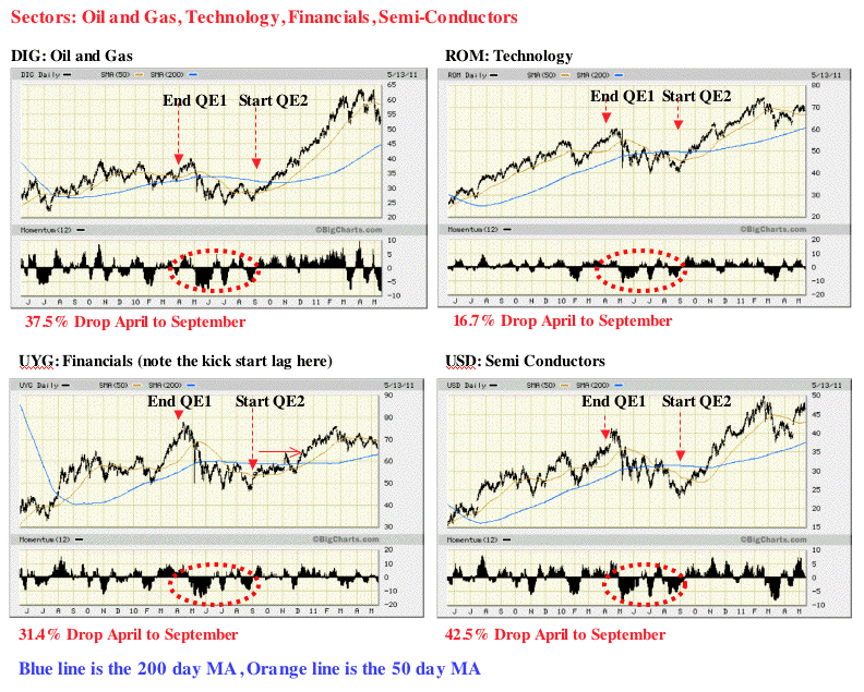
* Summary - Death Crosses!: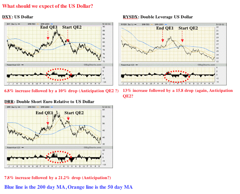
The Hedge Shack Part 2
Seeking Alpha's Disclosure: Past performance is no guarantee of future results. No recommendation or advice is being given as to whether any investment is suitable for a particular investor. Any views or opinions expressed above may not reflect those of Seeking Alpha as a whole. Seeking Alpha is not a licensed securities dealer, broker or US investment adviser or investment bank. Our analysts are third party authors that include both professional investors and individual investors who may not be licensed or certified by any institute or regulatory body.