Saturday 12 January 2013
We deviate from our coverage of the futures markets to take a look at this popular stock. As we often say: A chart is a chart, composed of price, volume, and time. While fundamentals may be more prevalent in stocks, from an analysis perspective, they can be very subjective, depending uponhow they are presented. The reason we view any analysis only from price, volume, and time, is that the charts reflect all the best fundamental views that are translated into buy/sell activity. Charts also include all the worst possible points of view, for they, too, are an integral part of the price/volume relationship.
We briefly dwell on this topic because some, [many?] view any analysis that does not incorporate fundamentals as flawed, somehow. The flaw in that assessment is that it is equally flawed. Who determines which of the myriad fundamentals presented are legitimate, worthy, on target, based on bias?
After all is said and done, the only thing that matters is the action taken in the marketplace based upon all available information, from the most expensive and sophisticated, to the least informative presentation. The collective decisions from every possible source is captured and recorded in the marketplace, either as a buy or a sell. These transactions reveal the cumulative forces of supply v demand, each seeking dominance over the other. Once these continuing decisions to buy or sell are recorded in the charts, the collective opinions become indisputable facts, and they can be measured in a way that no other analysis allows.
With this, we turn to our collection of charts over a period of varying time frames to see what the forces of supply and demand are saying, regardless of any fundamental spin. We start with an annual chart because the higher time frames hold greater sway over smaller time frames. Not many look at annual, quarterly, or sometimes even monthly charts, but they form the context within which the smaller time frames spin
What you want to see most from differing time frames is a synergy amongst them that relates a consistent story. This does not always happen, but when it does, the "story" revealed becomes more compelling.
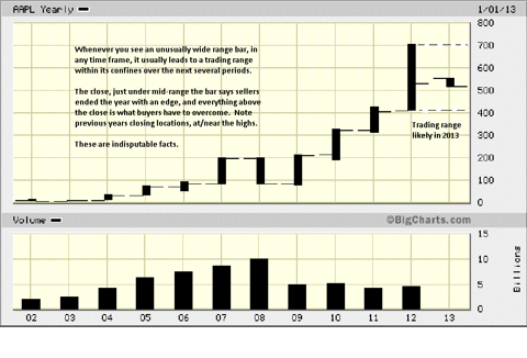
By the end of 2012, the close, it was just under mid-range the bar. The location of the close tells us who won the battle between buyers and sellers. There are two things to note on this annual chart. Firstly, the unusually larger size of the 2012 range, relative to previous years. Whenever you see a large range, it tends to capture subsequent ranges within it. We could see several years of trading within this 2012 range. It is not a guarantee, but it does have a proven history for respecting price to be contained, moving forward.
Secondly, note the close location of prior years, relative to 2012. Eight of the last nine years had annual closings at or near the high for the year. 2012 is a change in behavior, a potential warning for what follows. We do not know in advance what will follow, but we have been alerted, by the most reliable source, the market itself, to be on guard. Smaller time frames will have already given similar warnings.
The quarterly breaks the annual into four separate parts. In Qtr 1, there was a wide range rally bar, typical in a bull market. Not marked, but in Qtr 2, the range narrowed, and the close was lower than the opening and lower than the previous close. Here is an excellent example of what a "warning" can be like. The move higher did not end, but its character had changed, and we see this in the Qtr 3, marked #1 on the chart.
The range had narrowed, and just as importantly, the volume decreased, [arrow]. When volume decreases in an up market, it says there is a lack of demand, existing demand is tired, or a combination of the two. We had a warning from the last Qtr, and now we see buyers are meeting resistance from sellers, evidenced by the fact that the range did not extend higher, increasing the factual observations to a red flag status.
Look at Qtr 4's range size, location of close, and highest period
volume for the year, all negative in implication and a result of the
information the market provided from the past two Qtrs. You can
bet that many fundamental interpretations were calling for yet
higher prices at the top, even into the 4th Qtr. The fundamentals
and the technicals had diverged. Most of the public rely upon
fundamental analysis.
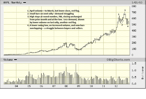
Here we see the same conclusion drawn at the end of Qtr 1, above, but we get to see more volume distinction. The volume at #1 was equal to the previous month, but the results for that effort was a close under mid-range the bar and lower than the prior month. This was the first sign of a warning about the internal structure of the market that you will not see from reading the news.
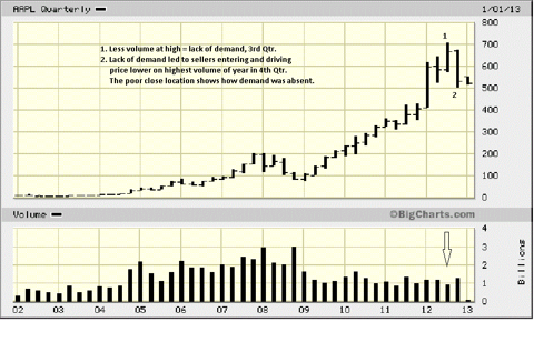
The few months' rally, marked by #2, shows a market laboring, with smaller ranges and less volume. By bar #3, the red flag is waving. Why? Look at the size of the bar, small, the relatively weak volume, and most telling: the location of the close, lower end. This is a clear sign that sellers were dominant over buyers at a point where buyers are supposed to be in control.
Cover up the last four bars, and it is at this point that longs were being sent a very clear message to be concerned. Not a lot of people who trade stocks use stops. Futures traders know better. Uncovering the last four bars is the typical response one can expect, based upon the factually observable, market-generated information. The overlapping of bars at #4 says there is a battle between buyers and sellers, and with price teetering at 500, buyers are facing quite a battle to preserve that level and not let it give way, for there is not much be between it and 400. That is also what the annual chart said. Ah, synergy.
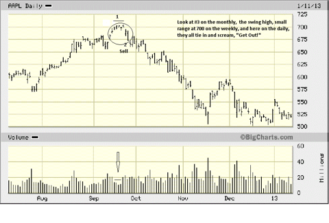
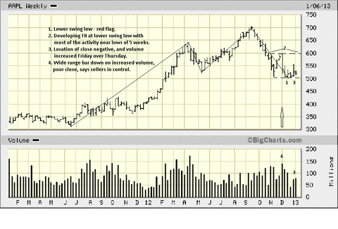
We used lines to connect the swings from lows to highs and highs to lows. It cuts out the "noise" in between so we can better see what the trend is. Remember we said in the first sentence, last paragraph above: "Cover up the last four bars, and it is at this point that longs were being sent a very clear message to be concerned." That was the monthly, and we mentioned synergy between time frames. Now look at the high of the weekly chart, below.
What stands out, actually shouts out, is the tiny range made at the high. Buyers were MIA, Missing In Action! They were totally unable
to extend the range higher, and sellers more than met the buyers
efforts which is why the range did not extend higher. We did not
have the daily chart go back far enough to include this high, so we
are adding a "bonus" chart, at the end, to tie together the
synergistic message from the market over a series of varying time
frames.
At #1, price made a lower low, under May 2012. This is a warning that the weekly up trend could be ending. It has weakened, but it has not yet ended, at least not until we see a lower high and another lower low to confirm the trend change.
To give the benefit of the doubt, one could argue that the swing low at 1 could have been moved over to the low in early November 2012, and the high in December could be another swing high, making the scenario presented a little more bearish, but we opted for the more conservative point of view.
#2 shows the trading range for the past two months. It has issues.
At #3, there is a wide range bar on increased volume, relative the
previous two bars that tried to go lower but did not. The location of the close is just under mid-range. This tells us that price tried to rally, effort increased on the part of the buyers, but by the end of the week, sellers had the upper hand.
Price did not break sub-500 during the previous three weeks, but the attempt to rally away from the danger point was not very successful. Red flags keep showing up. The last bar on the chart depicts the week just ended. The range is small, but volume increased. Yet another potential warning that buyers may be unable to sustain the 500+ area.
Why?
The increased volume tells us buyers were trying to get price higher. The small range tells us sellers kept the buyers in check, meeting buyer demands, and even defeating the effort, based on the lower close. On the positive side, it can also be argued that the effort of the sellers to break 500 was unsuccessful, as buyers kept sellers in check. The biggest concern is that price is not rallying away from 500. The longer it lingers there, the more price accepts that area, and eventually, it will give way.
Buyers need to step it up, immediately, next week.
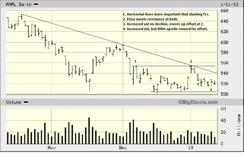
Finally, a daily chart. While we rail at a fundamental approach for understanding the market, we also admit that technical analysis is not an exact science, and there are many who misuse it, and/or do not understand how to apply it. We totally agree with the fundamentalist camp on that one. Technical analysis is more of an art because it is not mechanical. It requires understanding why high volume in one instance can be positive, but in another instance negative. Knowing what a small or large range bar means, in context to developing market activity, trend, etc, is also another form of art in how to read a market.
The above digression serves as an acknowledgment to some of the
flaws of technical analysis, or better stated, its
misuse/misunderstanding, and an explanation why we prefer using
horizontal lines, drawn from previous highs/lows as more significant
that slanting trend lines off tops and bottoms. See points 1 and 2
on the chart. Here, we will accept the reinforcement of the down-
sloping trend line in the stopping of the rally on the first trading day
for January 2013.
Not to get too fine in the ongoing analysis, but the decline at bar #3, on increased volume, erased the effort of rally bar at #2. The last five bars on the chart capture the small weekly range. Bar #4 is pointed out because price opened higher that day, and the opening was also the high, and volume increased. The increased volume tells us buyers and sellers were more active. Who won the battle by the end of the day?
This is more interesting, and we revert to the art form to understand that day. The close was above the half-way point of the day's range, so edge to the buyers. But, and we know whenever there is a "but," it says to ignore everything that was said before it; where was the follow-through on Friday? If sellers won, would it not be logical to expect price to at least try to rally higher, next day? That is not what happened.
We leave the analysis here. What will happen next week, next month, next Qtr? We do not know, nor does anyone else. We do know that price is showing more weakness than strength. We also know that buyers are taking a stance at the 500 level. Would we be a buyer down here? No. You might, but not us. The character of the market is weak, and one does not typically make money buying a weak market. We need to see a change in the daily chart from a down-leaning to sideways momentum shift to the upside.
Would we be a seller here? Not yet. We want to see 500 breached by a wide-range bar lower, on increased volume and a poor close. location. That would be the market telling us that buyers have lost control and sellers are in charge.
These are the indisputable facts, as we see them, as stated by the market, the final arbiter.
[Bonus chart follows after this one]
You can see how small the ranges were when price struggled at the 700 area, and note the decline in volume. Both are clear signs of lack or inability of demand to go higher. At #2, there is a wide range bar down, on increased volume, with a poor close. This was the point to exit all longs, even get short, if aggressive, and this pivotal turning point was apparent on three different time frames.
For anyone who wants to throw darts, saying this was a hindsight analysis, re the high, hold on. We do not analyze stocks. We are aware of how popular AAPL is and decided to take a look at it, for that reason alone. The purpose of the analysis was to determine where price is, currently hovering at the 500 level, and how it may move going forward. The logic applied to interpreting the five charts works all time, and not just in hindsight. If you follow the logic, it all makes sense, and this is how we do it in the present tense.
A legitimate question to ask is, why not go short at the beginning of September, when there was a similar series of small ranges that would have led to a losing position, at the time. At point 2, the sell bar was confirmation that the decline from the prior bar failed on a retest. In the September situation, there was no such confirmation after the first decline bar, [4th bar]. This is an important distinction.
The point to be made is to demonstrate how developing market
activity tells the most reliable "story" about the market's intent. We
could care less about anyone questioning the market high as an
obvious top as pure hindsight. In fact, we will accept that. What
anyone taking that view that has to do is now to understand the
current analysis leading up to the tenuous 500 level and see if
future market activity confirms it.
It is understanding the past that leads to present tense interpretation. Just as there were indications from the market that a top was forming at 700, last September, there are signs of trouble for longs at 500. Just as there was confirmation at 2, below, to confirm taking action, there needs to be confirmation, as we described in the second to last paragraph in the previous chart, before taking any position.
Questions or darts can be directed on our site, and are welcomed.