This will be a crucial post for all hard money vigilantes and Gold stalwarts alike. What we normally read, hear and see are about how the fundamentals are never more bullish because of burgeoning global debt and much more importantly, the process of monetizing them instead of funding these liabilities through tax revenues (there isn't enough to go around anyways). Goldbugs are well versed in the supply and demand situation in the physical market; global Gold production has peaked in the late 80s while the biggest producer, China will never unleash a swath of pent-up supply because just about every ounce of Chinese Gold production will go to the Chinese themselves (read PBoC & hungry pork-sucking middle class adults). The recent backfire by India's government to impose a 4% tax on brand Gold jewellery released about a week's worth of demand but the Gold hardly bumped. As fundamental as physical holdings of Gold by central banks and governments are in reverting to a Gold-backed/anchored new global monetary system, it just doesn't seem to matter a tad how far the equilibrium swings in the bull's favor because the futures market dominate price discovery, leaving no ruck of a chance for physical buyers and sellers on any widespread price negotiation. One bitter fallacy investors often find themselves in is when reality isn't reflected in the markets and their prices. Strong willed investors cling tightly to their believe while the market diverges farther in the opposite direction, leaving them with deep schism where volatile but extremely predictable emotions eventually get the worse of them. Yes, I'm a firm believer that inordinate amounts of debt monentization will eventually be the deathknell of fiat reserve currencies. Timing is crucial because with good timing of entry and exit, the reliance of leverage to provide investors with outsized returns can be reduced.
This post isn't about repeating what has been tautologous but aims to present all interested readers who are serious about their investments in Gold and other related assets, the reality in the paper markets in a easy to understand manner.
Presented below is a rescaled chart summarizing the entire volatility complex of all option contracts on Gold futures traded on the Comex. I've always been a fan at studying volatility because they often give analysts a pseudo view of the relative cheapness or dearness of an asset. Volatility in its essence is a quantitative measure of the variance or deviation of price. Volatility can be implied in all widely traded and liquid assets. As the name suggests, implied volatility isn't actualized volatility. It is implied through a complex mathematical model (common models are Black-Scholes and Binomial) from the asset's price. I've used the prices of all exchange traded options to imply their volatilities in a haul to determine how risk has been priced. This analysis doesn't compare how options are being priced against how they have been priced in the past. Rather, it juxtaposes how upside and downside risks are being priced, right now.
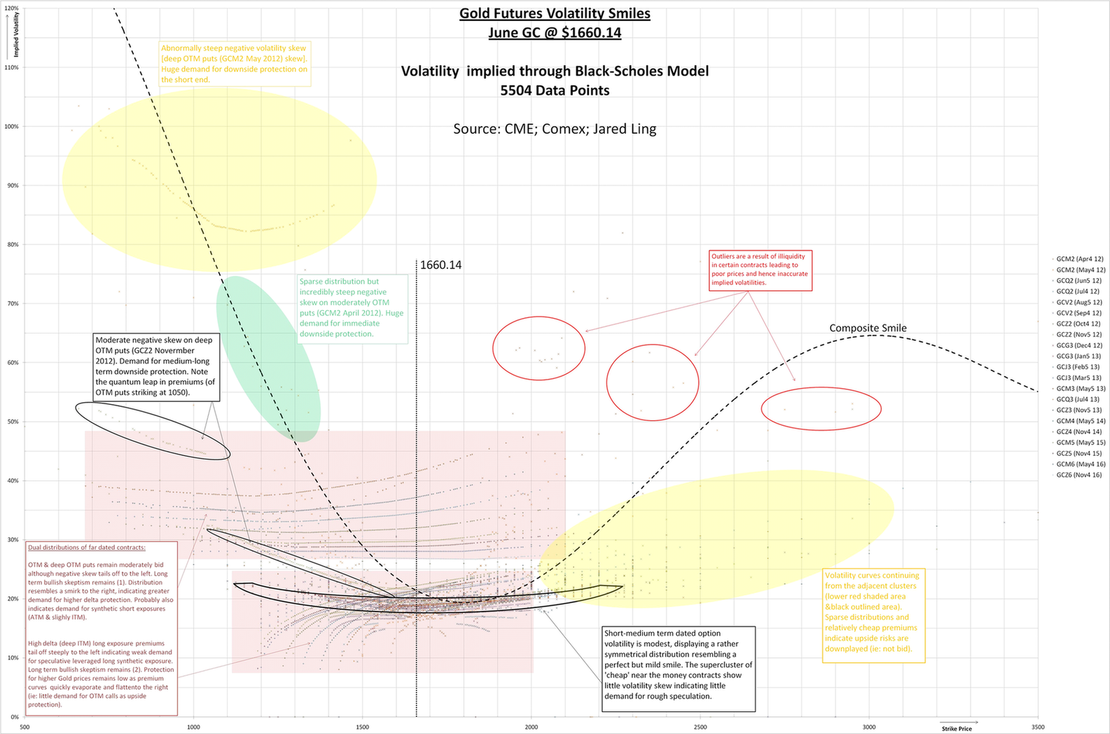
(Zoom in)
Take some time to study the chart. I will explain some features as presented. The Y-axis plots the implied volatility (IV), the X-axis encompasses every strike of the option contracts, while the "x"s and "+"s within the plot area are individual data points of each option contract (there were 5504 in total). Not all data points were included inside the plot area because they would cause the chart to blow up in size (for instance, there was a few contracts pricing a 500%+ IV). There are a total of 21 option chains, each trading on their underlying GC futures contract. These chains are plotted in a different color and some with a different marker (the long dated contracts were generally marked with "+"s while the rest with "x"s). June Gold was trading at $1660.14 when this data set was generated so all of the presented data is as of Gold @ $1660.14. Although these points will never remain static (due to delta and time), I reckon this snapshot is good for a few weeks (unless the price dynamics of Gold change rapidly).
First, note that there are 2 very distinct distributions within the plot area. They are shaded in red rectangles. Most of the technical commentary are already imprinted on the chart itself so I won't repeat those. The main reason for these 2 distributions in Gold (as well as several other 'risk' assets) is due to negative volatility skew (ie: puts generally trade at higher premiums to calls), a powerful phenomenon which normalized after the crash of 1987. The adage "Markets take the stairs up and the elevator down" makes it clearer. People familiar with options and derivatives wrongly believe that volatility increased when assets fall and wanes when they rise. This observation is correct but the mechanism isn't due to falling or rising prices but the rate of change of prices (refer to the adage and it'll click).
Back to the chart. The upper IV distribution (in red) is that of puts (or downside protection). The lower IV distribution (in red) is that of calls (or upside protection). Notice that IV is circa 85% higher for downside protection than upside protection. Puts trade almost twice as high on a delta adjusted basis, that is a huge premium. The high put premiums are also skewed and concentrated to the left (OTM puts). Contrast this to the right tail of the call IV distribution and we see that low delta puts are expensive relative to equally low delta calls. This is a very important observation.
Apart from long dated put clustered distribution, there are shorter dated contracts that are pricing in exorbitant risks premiums (as shaded in green and yellow). The latter (in yellow) stands as a canary in the pale complex because it seems that the entire deep range OTM puts are forming a panacea, in the form of a smile. Someone must be bidding up these contracts. Could this be an effect after the latest FOMC minutes hinting of no more QE? This might be the case but we never know. This is the Achilles heel of this chart; where the absence of a time series handicaps our ability to peer into the past and chart the pathology of events (well, just imagine plotting 5500 data points every other day).
Also note the interesting quantum leap in premiums occurring at the $1050 strike (as circled in 2 black circles with arrow annotations). Again, someone has been bidding pretty ferociously.
A super cluster is found in the shape of a very mild smile (bounded in thick black lines); its eye or the most densely populated region occurs near $1660 (where Gold was trading) where risk premium is low.
Focus now on the call IV distribution (lower red shaded area). The sharp tailing off of premiums when we travel deeper ITM indicates little or no demand in longer term high delta long exposure. This supports the general thesis that the big money in Gold futures are never exposed long but rather short as hedges (puts) or outright (naked) short. I'll save some quackery here. As we look to the right of this distribution, premiums aren't risking much if at all. This is yet another cornerstone-observation.
Apart from focusing on individual risk clusters inside the plot area, I've aggregated the date set and plotted a composite volatility smile (thick black dotted curve). As expected, the distribution is far from normal; huge kurtosis to the left (as IV would be 0 when the strike falls towards 0), while the skew to the right is slow to steepen (this also illustrates how OTM puts are much dearer than equally OTM calls).
Conclusion:
1) Downside protection is highly bid and is expensive.
2) Upside protection is poorly bid and is modestly cheap.
3) There is little or no demand for synthetic long exposures.
4) Long term skepticism on Gold remains heightened and intact.
5) The risk premium of a hyper-inflationary tail is low.
6) The risk premium of a deflationary tail is high.