More great stuff today from the 5 Min. Forecast.
The first graph is a completely accurate graph comparing the current gold market to the Nasdaq dot.com bubble.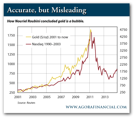
The second graph shows the same comparison.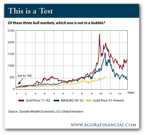
The second graph shows the 1971-82 gold price graph, which was, by most determinations, a bubble.
This is a test: Why do the two graphs give such a different picture?
Answer: Look at the two y-axes in the first graph. The scale on the left (for gold) is expanded by nearly a factor of 3 vs. the right side scale (Nasdaq). The second graph has both price charts on the same scale.
What a difference honest comparisons can make.
Gold - How Can Some See a Bubble and Others Can't?
Seeking Alpha's Disclosure: Past performance is no guarantee of future results. No recommendation or advice is being given as to whether any investment is suitable for a particular investor. Any views or opinions expressed above may not reflect those of Seeking Alpha as a whole. Seeking Alpha is not a licensed securities dealer, broker or US investment adviser or investment bank. Our analysts are third party authors that include both professional investors and individual investors who may not be licensed or certified by any institute or regulatory body.