This is an excerpt from my Financial Newsletter, Volume1 Issue12. The full Issue of my newsletter can be found at http://liamgarrityrokous.tumblr.com/
I would like to start off by giving a little background on some of the major events that have been going on recently in the market. I'm sure that many of you already know about some of them, but this article gives clear information about each event and demonstrates why each event is important to my overall market analysis. At the end of this article I clearly outline my thesis: That I believe a 10-15% correction in the market is imminent.
Small Cap Stocks Corrected As The S&P 500 Reached New Highs
Has anyone heard about how Small Cap stocks have gotten hammered recently? How small tech companies have experienced huge declines from recent highs? Well it has been all over the news recently, and if you are following financial markets there's a good chance you've heard about it. Something that hasn't been talked about quite as much, although it has definitely been mentioned in some articles recently, is how there is a growing divergence between the performance of the Russell 2000 Small Cap Index Small (IWM) and the S&P 500 Large Cap Index (SPY).The divergence has actually gotten quite huge recently, and in a WSJ article released on May 13th it was reported that "Jonathan Krinsky, chief market technician at MKM Partners, alerted clients… of a sharp divergence playing out in the markets" (WSJ). Mr. Krinsky stated that the divergence arose from the fact that recent data indicated that "…some 80% of S&P 500 components traded above their 200-day moving averages-a proxy chart watchers use to gauge a market's long-term trend… At the same time, only 42% of Russell 2000 Small Cap stocks traded above their 200-day averages" (WSJ). The figures that Mr. Krinsky reported were probably compiled on the 8th or 9th of May, and it is definitely a good sign that so many companies in the S&P 500 are trading above their respective 200-day averages (average price for last 200 trading sessions), because it "…suggest[s] wide participation among the market's rally" (WSJ). However, the fact that so many Small Cap companies in the Russell 2000 are trading below their 200-day averages is not a good sign at all for the stock market, as a whole, and it stands in "…sharp contrast from the S&P 500. In fact, it marks the widest divergence between the two indexes since 1995, according to Mr. Krinsky's calculations" (WSJ). The WSJ article went on to mention that "It's unclear what the ramifications of this divergence suggest for the broad market's next move, although the trend is an oddity that is gaining attention among market watchers" (WSJ).
The article really is quite amazing so I would definitely encourage you to take a look at it yourself. I do not want to quote all of it, but the article does outline the three instances in the last 20 years when the divergence between the Russell 2000 and the S&P 500 was similar to the divergence we are seeing now, but slightly less extreme. The years in which those divergences took place should raise some major warning flags in the mind of any investor, especially considering the fact that we are seeing an even more extreme divergence now, because those three instances occurred in 1995, 1999, and 2007. In short, two out of the three instances (1999 and 2007), where the Russell 2000 experienced a negative divergence from the S&P 500, were followed by huge declines in the stock market about a year later. All three instances were vastly different and you should take a look at the article to read about what caused each of the divergences, and what the resulting effect on the market was.
Regardless of what has happened in the past, the current divergence between the Russell 2000 and the S&P 500 is quite concerning and likely highlights the overall uncertainty that many investors are feeling right now, as they flee "risky securities" (Small Cap stocks are considered riskier than Large Cap stocks) in search of safety. Indeed, the WSJ article highlighted this phenomenon by mentioning "Small Cap stocks have fallen out of favor in recent months as investors flocked to larger, dividend-paying and more attractively priced companies" (WSJ).
This entire situation is important because one of the Risk On/Risk Off measures that people look at to see if now is a good time to buy securities is whether or not investors currently have an appetite for risk, which is measured by whether or not Small Cap companies (the Russell 2000) are outperforming Large Cap companies (the S&P 500). Currently Small Cap stocks are definitely underperforming Large Cap stocks, apparently more so than at any point in the last 20 years, and this is not a good sign for financial markets. If the broader market experiences a correction, which I believe it will (as I outline in the final part of this Issue), Small Cap stocks could start underperforming the broader market again. However, it will be a bullish sign for the market (indicated by a bullish Risk On/Risk Off ratio) if Small Cap stocks begin to outperform Large Cap stocks during a broad market correction, because it will mean that investors are using the decline in price to load up with shares of the beaten down Small Cap stocks and that is bullish for the stock market as a whole.
FEAR and VOLATILITY!
Don't let the title deceive you because we currently aren't seeing any of either, if the VIX is anything to go by. The CBOE Volatility Index, commonly referred to as the VIX, is calculated "from the prices investors are willing to pay for options tied to the S&P 500. [A] decrease in demand for portfolio hedges can push those prices, and thus the price of the VIX, lower" (WSJ). As a result, the VIX is often seen as a "fear gauge" for the S&P 500. I learned from a teacher of mine in high school that investors would sometimes make "contrarian" decisions and buy Put options for the S&P 500 (believing the S&P 500 will decline) when the S&P 500 reaches extremely low values. Thus, a "contrarian investor" would be making an educated decision to bet against the market, because he (or she) believes that investors are currently very "complacent" and any increase in volatility would spark an increase in the level of "fear," which would result in a sharp decline in the stock market.
This very phenomenon can be seen when one looks at the chart below:
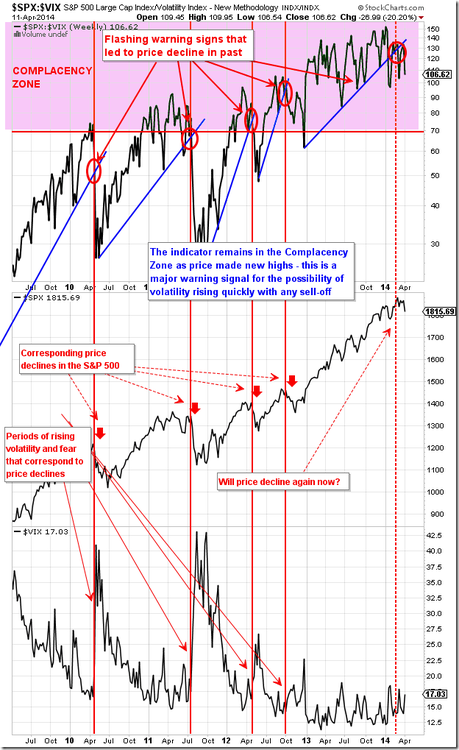
This chart shows the ratio of the S&P 500 to the VIX. The graph was sent to me by Geoff (at BillCara.com) and, although it is more than a month old, it is still an important chart to look at because it shows at what values (of the ratio of $SPX to $VIX) in the past five years that the market as experienced a decline. The ratio is now at the highest point (the value of the ratio closed at 167.30 on May 23rd) that it has been at in the past five years! Although there has been a lot of talk recently about how the VIX is no longer a good indicator of market volatility, I believe that this ratio should act as a major warning sign for everyone!
The situation is getting quite drastic and, to quote the very first line of WSJ's Morning MoneyBeat article from May 15th, it appears as though "fear has left the building" (WSJ). On May 13th, the VIX closed at 12.13, which is the lowest level that the VIX has closed at so far in 2014, and it is down more than 43% from it's year-to-date closing high of 21.44 on February 3rd. More recently, the VIX spiked up to 13.77 on May 15th and is now heading back down to re-test its multi-year lows around the 12.00 level (the VIX set a new YTD intra-day low of 11.80 on Wednesday, May 21st). "Minus a couple of brief spikes, the VIX has roughly remained around 14 for much of the year, well below its long-term average of about 20" (WSJ). Nothing has been able to get the VIX to rise in the past few months, not even the situation in Ukraine or the recent decline in Small Cap stocks, and (when one looks at the VIX's recent movements) it would appear as though the VIX is fated to stay below 20 for a very long time. This very situation has caused many well-known investors to question whether or not the VIX is still the best measure of market volatility. Nicholas Colas, "chief market strategist at New York brokerage ConvergEx Group," posed the question, in a research note, that has been on many analysts' minds recently: "are we witnessing the death of volatility?" (WSJ). He also posed the follow-up question: "'Are we so accustomed to central bank intervention that any negative macro action has an equal and offsetting policy reaction?' " (WSJ).
Frankly, I am very concerned by this situation and I believe that it could easily lead to a large market selloff, if any sort of major catalyst occurs that causes even a spark of fear to creep into the ever-bullish hearts of investors.
Investors Turn To "Safer" Assets
As you may have heard by now, the interest rates on many long-term U.S. government bonds have hit some very significant lows in recent months, which means that the prices of those bonds have reached some new highs (because, as you all probably know, the price and yield of a bond are inversely related). This has happened, despite the fact that the Federal Reserve is tapering its stimulus program, which includes the purchase of long-term bonds, because investors are re-adjusting their allocations to bonds and stocks after being extremely overweight in stocks by the end of 2013. Long-term oriented investors are doing this because of the recent huge selloff in "Small Cap" stocks (AS MENTIONED ABOVE!). Small cap stocks, using the Russell 2000 Small Cap Index as a benchmark, have been flirting with "correction territory," which is defined by many investors as a drop of more than 10% from recent high to recent low. Additionally, investors are buying long-term U.S. bonds because of worrying news coming from the Ukraine-Russia front, and because some investors believe (like I do!) that the stock market is currently overvalued and due for a correction. All of these events have caused the price of long-term U.S. Treasury bonds to soar in recent weeks, and the yields on those bonds to subsequently drop.
Despite the recent increases in the price of long-term U.S. Treasury bonds, I believe that the price of long-term bonds (20+ Year maturity) will probably see a dip in price, which I predict will begin in the next few weeks. I believe that the decline will last approximately two to three months. Regardless of that, I believe the price of bonds will continue to move higher going forward (after it has had a chance to dip), and my belief that the price of long-term bonds will continue to rise in the intermediate-term (next six months to a year) coincides with my belief that the stock market is overdue for a correction (because bonds typically catch a bid if "fear" increases and the market has started to decline).
Why do I believe this…? We don't need to look much further than the following chart…
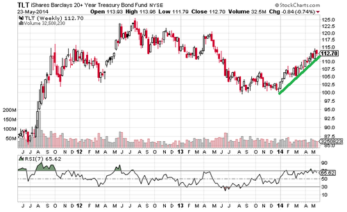
This chart is very simple, and all it shows is the iShares Barclays 20+ Year Treasury Bond ETF (TLT) in weekly time intervals with a simple green line, which I drew, and the Relative Strength Index (RSI) indicator added in. RSI is defined by Investopedia.com as "a technical momentum indicator that compares the magnitude of recent gains to recent losses in an attempt to determine overbought and oversold conditions of an asset… An asset is deemed to be overbought once the RSI approaches the 70 level" (Investopedia). The chart shows that the 7 Week RSI value for TLT is at 65.62, as of Monday (May 19th), and was above 70 last Friday (May 16th). I included this chart to help illustrate how the rise in TLT has been extremely sharp over the past few months, and it is time that TLT took a break. Sometimes it is best to keep things simple.
…But "simple" was never really my forte, and why not make it a bit more complex and add some more evidence to back up my prediction?
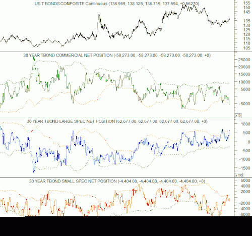
The above chart shows a graph for the "30 Year Treasury Commitment of Traders Report," which Geoff (from Billcara.com) sent to me recently, and demonstrates that investors are currently overly bullish on long-term U.S. treasury bonds. The Commitment of Traders Report (COT) classifies investors into three categories; Commercial investors (those "in the industry"), Large Speculative investors (investors with "large" portfolios), and Small Speculative Investors (investors with "small" portfolios). I have talked about the COT report before, but just to refresh your memory I will describe how it works now.
Buy Case: When basing trading decisions on the COT report it is usually a good time to buy shares in the underlying security (US T Bonds Composite in this case) when the NET POSITION held by Commercial investors is high, the net position held by Large Speculative investors is low, and net position held by Small Speculative investors is very low.
Sell Case: It is usually a good time to sell shares in the underlying security when the NET POSITION held by Commercial investors is low, the net position held by Large Speculative investors is high, and the net position held by Small Speculative investors is very high.
Interpreting The Chart (finding a buy/sell signal): The COT report also has channels that show a level that is two standard deviations above the mean, and when any of the investor groups gets too high or low (and pushes the bound of the channels) it may be a good time to buy or sell the security. The red dashed-line shows you when it would be a good time to sell (or go short), and the green dashed-line shows you when it would be a good time to buy (or cover). If the lines for all three investor groups cross (or have recently crossed) the green dashed-line then the chart gives you a buy signal, and if the lines cross the red dashed-line then the chart gives you a sell signal.
Currently, the COT report shows that it is a good time to be thinking about selling long-term U.S. Treasury bonds, because we are in the Sell Case (as described above). The COT report/trading indicator is almost always accurate, as you can see by looking at the corresponding chart for the US T Bonds Composite price, but the timing is not always exact so other indicators must be used to help narrow down the timing (that is why I look at technical indicators like RSI). Right now the chart is bearish, but not too bearish, so it leads me to believe that the price of long-term U.S. bonds will dip soon and then recover and move higher in the months following the dip.
"The only things that anyone desires to own are the US dollar…
…the Japanese Yen, gold, bottled water and bullets!" (an unknown FX Trader). This famous quote was heard on the trading floor on October 6, 2008, and it quickly became notorious for describing the market's environment during the 2008 financial disaster. Don't worry, I only used this quote for the effect and I'm not saying that the same situation currently holds true… I'm not crazy.
I found this quote to be rather ironic because the US dollar (USD) is one of the few things that I am bullish on, but only for the next 3-6 months. Long-term I believe the US Dollar (as measured by the US Dollar Index) will depreciate, past its current price, as a direct result of the huge amounts of money that the Fed has been "printing" recently. As a result, I believe inflation in the U.S. will eventually pick up and it will be bullish for commodities and for the stock market. However, I believe the US Dollar can experience one last rally before that happens.
In order to prevent this article from becoming too long, I have decided to delay my full write-up on why I believe the US Dollar is about to rally until next week. However, I wanted to mention it here because it is part of my reasoning for why I believe the stock market will soon experience a correction of 10-15% (it is just one more piece in the puzzle in my mind). I don't want to give too much away, but the simple version of why a rally in the US Dollar would be bad for the stock market is that the US Dollar currently has an extremely negative correlation to the S&P 500, and it has had a negative correlation to the S&P 500 since 2008. Therefore, a rise in the US Dollar should result in a decline in the S&P 500. Much more information will be included in next week's article!
Things To Look Forward To For Next Week:
Next week's Issue of my Newsletter (Issue #13), found at http://liamgarrityrokous.tumblr.com/, will contain write-ups on our economy, the economies of countries in the Eurozone, the US Dollar (why I believe it will rally for next 3-6 months), the Euro (why I believe it will fall when the Dollar rallies), how I believe a rally in the US Dollar will affect the stock market, and how I believe a rally in the US Dollar will affect gold. I hope you are all excited for next week's newsletter because it's sure to be very interesting, and hopefully very informative!
A Recap Of All The "Predictions" I've Made Thus Far
I have given a lot of information, both in this Issue and in Issue #9, to back up my prediction that a correction of 10-15% is imminent. Before diving back into the information I covered in Issue #9, I would first like to list the "predictions" that I have made so far in this Issue, and say what the effect on the S&P 500 will be if they prove to be accurate.
Direct Predictions:
1) Long-term bonds (20+ year maturity) will decline in price for approximately the next 1-3 months. I believe that the decline will begin at some point in the next three weeks. However, I believe that long-term bonds will then rise, after the "dip" in price, for the next six through nine months.
=> I believe this would be short-term bullish for the S&P 500 (1-3 months) and intermediate-term bearish for the S&P 500 (6-9 months)
2) The US Dollar will rally for the next 3-6 months
=> I believe this would be bearish for the S&P 500 (bearish for 3-6 months)
Risk On/Risk Off Ratios (more of an "analysis" then a "prediction"):
1) The fact that the Russell 2000 has been underperforming the S&P 500 in recent months leads me to believe that investors no longer have an appetite for more "risky" stocks.
=> I believe this is a bearish (Risk Off) condition for the S&P 500
2) The fact that the VIX has been so low for so long, and that the $SPX to $VIX ratio is so high, leads me to believe that investors are currently very complacent. Therefore, I am making the logical assumption that any catalyst that can incite a spark of fear in the stock market will cause investors to quickly sell shares of stocks, which will cause the S&P 500 to experience a sharp decline.
=> I believe this is a bearish (Risk Off) condition for the S&P 500
More Reasons For Why I Believe A Correction Of 10-15% Is Imminent:
Economic Backdrop To Current Market Environment:
The Federal Reserve is expected to allow interest rates to rise as soon as six months after the Fed's monthly security purchasing program (Quantitative Easing or QE for short) ends. This is not new news, because Janet Yellen announced the Fed's intention to allow interest rates to rise many weeks ago, and the stock market has reacted poorly to any news from the Fed about interest rates rising thus far.
The current market environment, therefore, could be summed up as follows: any data giving a hint of the Fed providing more "easy money," in the form of more QE, is good for the stock market; any data suggesting that the Fed would continue to taper as expected or raise interest rates at all, or even sooner than expected, is bad for the market. This means that any bad economic data indicating any slowing or stagnation of the U.S. economy would be good news for the stock market, because it would cause the Fed to slow their rate of tapering or lengthen the time before they raise interest rates. On the other hand, any good news for the economy is bad news for the market because it would cause the Fed to continue to taper at the same pace, with the expectation of an interest rate hike in the not so distant future.
Why is this scenario long-term bullish for the stock market? Current estimates are that although short-term interest rates will eventually rise, they will still be below long-term averages; meaning that in the long run we can still expect "easier money." However, in the short term the market reacts negatively to any mention of interest rate hikes, no matter whether the market should have expected those hikes to begin with. Therefore, moving forward, expect that a mention of interest rate hikes made by FOMC officials, the Federal Reserve (in their statements), or Janet Yellen will cause a negative move by the stock market.
=> Domestic and global economic forecasts for 2014 are not inspiring in the slightest, and that could actually be intermediate-term (6-12 months)
Investors Have More Leverage Now Than At Any Point In Last 35 Years
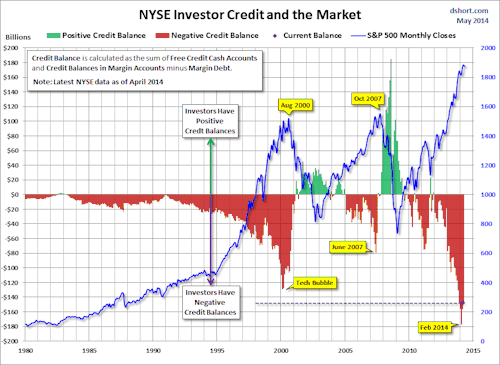
I included a similar image to the chart above in the 9th Issue of my newsletter, but the one I included this time gives a little bit clearer view of the situation than the one I used before. A full article on the situation can be found by following this link: http://www.advisorperspectives.com/dshort/updates/NYSE-Margin-Debt-and-the-SPX.php
The data in the chart is a few weeks old, but the situation is still very important to track and it is clear what happens when investors take on too much debt to finance further purchases of stock. The NYSE Credit Balance acts as a leading indicator and, as Doug Short (the writer of the above linked article) mentions at the end of his article, "we see that the troughs in the monthly net credit balance preceded peaks in the monthly S&P 500 closes by six months in 2000 and four months in 2007. The most recent S&P 500 correction greater than 10% was the 19.39% selloff in 2011 from April 29th to October 3rd. Investor Credit hit a negative extreme in March 2011" (Doug Short).
In situations where investors have extremely negative credit balances (no free cash), and they want to liquefy their assets, the only way for them to raise cash is to sell stock. If lots of traders do this all at once it would trigger a major selloff, as everyone tries to raise cash at once. This is how margin calls happen.
When these events all happen at once, industry professionals call it a "fire sale," and the stock market suffers a very quick and violent downturn. However, obviously all these events have to happen at the same time, and much less drastic situations are also possible (and much more likely given the fact that the Fed seems VERY willing to intervene if another market meltdown seems imminent).
=> This is a VERY bearish situation and, although it is not a perfect timing tool, it is definitely something that we should all take seriously and watch closely moving forward.
Investors Have A Heavy Appetite For Risk

The chart above should provide more information to back up everything that I just said, about how investors have been financing their purchases of stock by taking on more debt and about how the VIX is EXTREMELY LOW, and it helps add more weight to my bearish position.
Simply put, the chart plots the Risk Appetite Index against the S&P 500, and adds a red dashed-line (a point above which historically it has been a good time to be bearish on the S&P 500) and a green dashed-line (a point above which historically it has been a good time to be bullish on the S&P 500) to help make the charts easier to interpret. The chart clearly shows that investors have an extremely heavy appetite for risk now, and this has acted as a leading indicator for the S&P 500 in the past. Let's be smart and use the past to help tell us what to do in the present/what might happen in the future. This chart was sent to me by Geoff (at BillCara.com) on May 18th.
=> Obviously this is a BEARISH indicator, but again it is not timing specific.
How Are We Doing Timing-wise?
(This is directly copied from Issue #9 of my Newsletter, which was released on April 10th)
I can answer in two words: not good. I recently received a link to an article that all of you should probably check out, it can be found by following this link:http://www.safehaven.com/article/33230/the-64-month-bubble-pattern The article talks about how "All the 'name-brand' market bubbles in history have lasted 64 months from initial growth to blow-off top. This includes the 3 biggest bubbles in modern market history:
· the Dow into the 1929 peak
· the Nikkei into the 1989 peak
· the Nasdaq 100 into the 2000 peak."
This is quite a crazy concept, but it is definitely something that everyone should be aware of (although I have never seen any other mention of it before), because our current bull market in the S&P 500 will reach month 64 this upcoming June. The writer of the article, David Nichols, has his own website and clearly he has done some research into the topic, because he has some great charts of how the 64 month pattern has played out in previous bubbles that have taken place throughout history. I encourage all of you to visit the link I gave above to take a look at the charts of past bubbles, and the 64-month pattern, because they really are fantastic to look at.
The author does note, however, that the market could still see some big run ups before beginning to decline in June or July of this year, so he's not calling for an immediate flight to cash just yet.
Interestingly enough, the person who sent me the link to the article, Geoff, the investor who writes the "Four Pillars" newsletter and is one of the main writers for a blog named the Forbes Magazine "Favorite Trading Blog" (Billcara.com), actually agrees with the 64 month time-frame. I would definitely encourage anyone who is interested in market timing to check out the free blog!
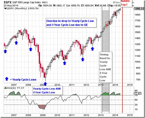
When looking at the chart above, you can see that the S&P 500 is already late for setting what Geoff calls the index's "Yearly Cycle Low" and "Four Year Cycle Low." Geoff says that cycles in the market have become extended in time due to QE, which is why the market completely passed his "timing band" and may not even decline in June or July as David Nichols predicts. Regardless, David Nichols is one of quite a few well-known investors who believe that the market is currently over-priced and in need of a correction.
Follow this link to see another report from an investor predicting a market decline in the near future: http://blogs.marketwatch.com/thetell/2014/04/03/sp-500-will-peak-around-1900-to-1950-then-drop-30-saxo-bank-strategist/
Full Disclosure: I received the "Four Pillars" newsletter, with the link to the article about 64 month bubbles, on March 26, 2014.
At Long Last, My Opinion On The Stock Market:
(This is almost directly copied from the 9th Issue of my Newsletter, released on April 10th, because my opinion has literally not changed since then…)
I definitely think that the market is currently overvalued, and that investors are currently over-extended when it comes to their positions in U.S. equity markets, and I believe that the market will experience a correction in the near future (of 10-15%). However, I am not quite so sure that the market is currently in a bubble, and I am not so certain that the "bubble" will pop in June or July as David Nichols predicts. I may be inexperienced, compared to these other market timers, but it just seems to me as though this "bubble" is a bit too predictable. When talking to people, who experienced the events personally, about past bubbles I always got the sense that "no one expected it to happen," and right now it seems to me that too many people are speculating about how the market "might be rolling over." One thing that I believe to be true about the stock market is that generally when everyone expects something to happen it generally doesn't happen. I am not so sure that market sentiment is at the point that everyone believes the current bull market will last forever, and because of that I am a little bit more cynical about the prospects of a "bubble popping" in the next few months. However, if the market does experience a huge run up over the next few months then that could definitely lead to the overzealous sentiment of investors that seems to lead to major market corrections.
Additionally, while the S&P 500 seems to be trading at a pretty high trading multiple (P/E ratio), it does not seem as though this current bull market is overvalued enough to warrant a major market downturn (like that happened when many of the past bubbles popped). Again, if the market experiences a major run up over the next few months I would need to re-evaluate my position.
Also, I do not think the Fed will sit idly by and let a bubble pop, so soon after the 2008 financial crisis, so I would expect intervention from the Fed to minimalize potential losses if the market does take a big downturn (which would prevent another major financial crisis).
I HAVE TONS MORE CHARTS TO FURTHER BACK UP MY PREDICTION, BUT I THINK THAT THIS ARTICLE CLEARLY OUTLINES MY OPINION OF THE MARKET AND WHY I BELIEVE THE MARKET IS ABOUT TO EXPERIENCE A 10-15% CORRECTION.
If anyone wants to talk to me further about anything that I have written, or see more of my "evidence" then please contact me at GarritLi@bc.edu.
Disclosure: I have no positions in any stocks mentioned, and no plans to initiate any positions within the next 72 hours. I wrote this article myself, and it expresses my own opinions. I am not receiving compensation for it. I have no business relationship with any company whose stock is mentioned in this article.