I was asked to write something for a friend who knows only a little about the stock market that gives my thoughts on the current economic environment given the fact that mainstream media is trumpeting the successes of this supposed strong economy. He wanted to better understand things like the national debt and a stock market that never goes down. This is above my pay grade, out of my area of expertise, and is in no way intended to predict any impending doom. Rather, it is simply a compilation of observations that I have made in recent time. I am well-aware that nearly any paragraph in this document could be expanded upon and debated for days, and my attempt to simplify a seemingly impossible task is most likely in vain. At any rate, here it goes.
First, in order to more easily understand our nation's debt problem, let's remove some of the zeroes that make the topic rather unfathomable.
The national debt just crossed the $18 trillion mark. That is an 18 followed by 12 zeroes: $18,000,000,000,000. So, let's create a new world where we erase 6 of those zeroes, and say that the national debt is only 18 million dollars: $18,000,000
Of course, in this world, the average house in the USA would cost about 20 cents, and the average person would work all year long to make about 5-7 cents.
This national debt is being accumulated due to the fact that our country brings in less revenue (through various forms of tax) than it spends. In 2013, for example, the country had revenue of roughly $2,775,000, but we spent roughly $3,455,000. This gave us a deficit for the year of approximately $680,000. Remember, we are living in a world where Tiger Woods made $83 last year.
Much like a college kid with a credit card, we "charge" the difference by selling various forms of debt, including T-Bills, Treasury Notes, Bonds, TIPS, etc to people (individuals, corporations, other governments, and even our own government).
Also like a credit card, we are charged an interest rate by those who lend us this excess by purchasing our Bills, Notes, Bonds, and TIPS. Thankfully, we do not have to pay 25% like you might have to pay with an outstanding credit card balance! Well, not yet at least.
However, we are charged something. Many people might remember receiving a T-Bill or a Bond as a gift as a child. Back then, you might have received 5% or 10% or maybe even 15% interest from the government on your gifted investment because interest rates were pretty high back in the 70s. However, these are the current percentage rates that the government is paying:
Title | Average Interest Rates | |
October 31, | October 31, | |
Interest-bearing Debt: | ||
Marketable: | ||
Treasury Bills | 0.056 | 0.087 |
Treasury Notes | 1.807 | 1.806 |
Treasury Bonds | 4.919 | 5.088 |
Treasury Inflation-Protected Securities | 0.937 | 1.086 |
Treasury Floating Rate Note | 0.080 | N/A |
Federal Financing Bank | 3.516 | 3.619 |
Total Marketable | 2.016* | 1.981 |
T-Bills represent debt that matures in 1 year or less. Since people who buy these are lending their money for the shortest amount of time, they are receiving the least amount of money in return. Great for borrowers, and terrible for lenders. You might have heard your elders complaining at Thanksgiving dinner about their savings not earning any money to support them. Likewise, if you have money in a checking account or even a money market account at the bank, then you are receiving next to nothing.
Treasury Notes represent debt that matures in 2, 3, 5, 7 and 10 years. As you can see from the data above, in exchange for locking up your money for a longer period of time, the government pays you about 1.8% on your money. This is about 32 times more than they pay for the aforementioned shortest term debt, the T-Bill. Hang in there, I promise this will all make sense by the end of this document.
Treasury Bonds mature in 30 years, and following suit they pay roughly 4.9% interest to those willing to lock up their funds for 30 years. This is approximately 2.7 times more than they pay for the Notes and a whopping 88 times the amount paid on the T-Bill debt.
If you were racking up credit card debt, then which rate would you prefer to pay the credit card company? .05%, 1.8%, or 4.9%?
You most likely chose an interest rate that would lead to the lowest payment, .05% or 1.8%. This is a perfect segue into the next section, as many people did, in fact, choose these exact types of rates during the housing bubble of the mid-2000s. Before we get to them, though, we need a rudimentary history lesson on bubbles. So, at the risk of losing most readers here, I am going to expand on the bubble before the bubble.
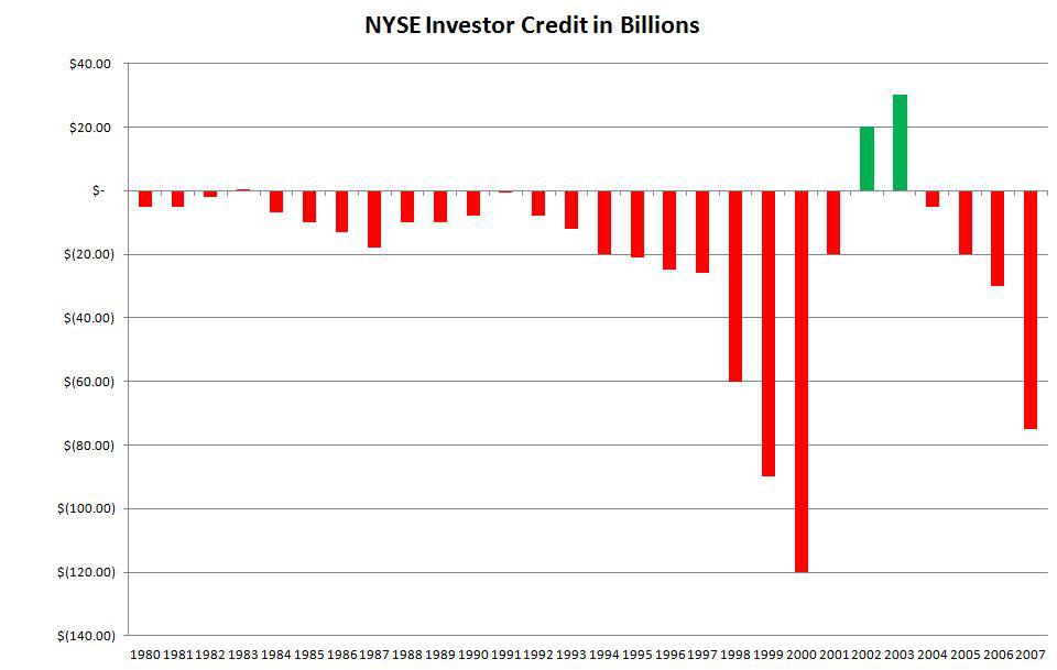
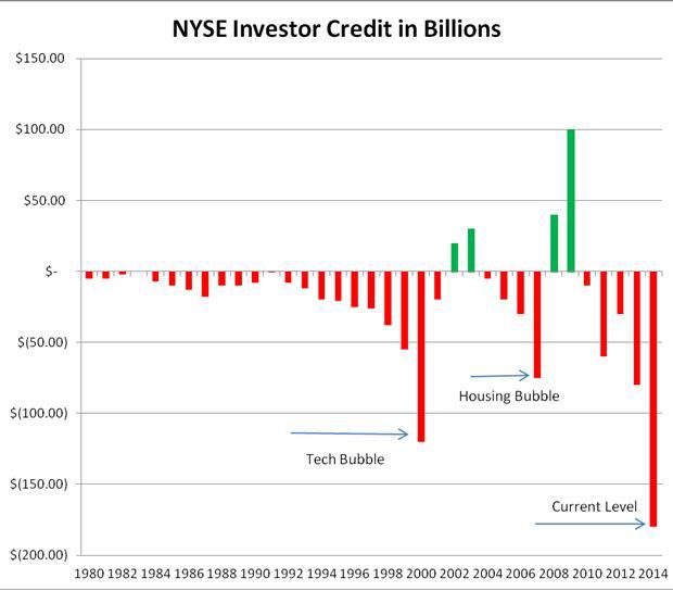
Approximately 20 years ago, circa 1994, the world wide web as we know it really began to kick off, and by 1995 online stock trading was taking shape. It was around this time when the stock market really began to break out of what many would consider "normal" trading patterns. Triple digit % gains were the norm, and as the market exploded so did something called margin debt. Margin debt is another way of saying leverage. Investors would borrow funds from their broker to invest in a market that never went down. It was a fool's paradise. From 1980 to 1994, NYSE investors had credit balances that fluctuated between a few billion dollars to negative 20 billion dollars. By 1998, the tech bubble was becoming evident, and the stock market was on fire. As a day trader during this time, I was offered 4:1 leverage by many brokers who were eager to get my business. This meant that if I put up $100,000, then I would receive $400,000 in what is called buying power. This is a wonderful tool so long as you are invested in the proper direction. Imagine only having $100,000 in your account, but being able to buy 4000 shares of CMGI @ $100 per share ... CMGI could easily move up 25 points in one trading day, and that would yield a profit of $100,000 in one day ... meaning you were able to double your money in one day. People were leaving their "regular" jobs in droves to trade stocks, and the NYSE Margin Debt data reflects the abuse of the system. By 1998, NYSE Investor Credit Balances, also known as Investor net Worth (Free Credit Cash + Credit Balances in Margin Accounts - Margin Debt) had swelled to more than negative $60 billion. 1999, negative $90 billion. 2000, negative $130 billion. Here is a chart that I constructed from approximate data points found in a copyrighted chart:
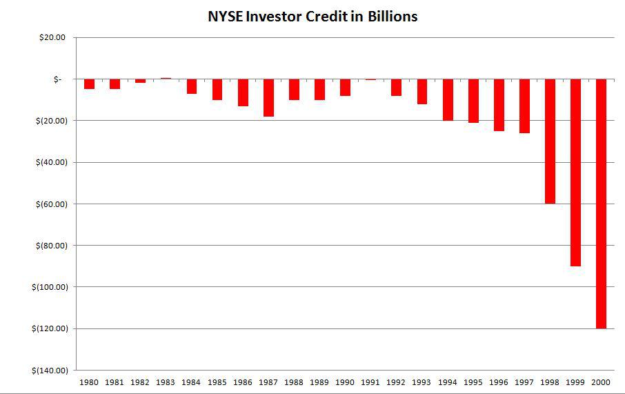
This increase in negative balances would mark a deviation of nearly 1000% from the norm in less than 6 years. The result? Well, here is what happens when you are margined, or leveraged, to the hilt. Imagine the previous scenario when someone had $100,000 in his account. He has been given an additional $300,000 from his broker as a loan, on margin. Now, imagine that the investor has purchased the same 4000 shares of CMGI @ $100. But today, instead of going up, CMGI begins to fall. As CMGI falls, the broker is watching all of his clients' accounts. If CMGI falls by a mere 10%, or $10, the investor who was fully margined is now down 40% of his total account value (4000 shares x $10 = $40,000 out of his $100,000 cash). The broker sees this, and not wanting to subject any of the firm's money to risk, the broker calls the investor and instructs him to begin liquidating his stock or the firm might liquidate it for him. As he sells, prices fall, which in turn creates more margin calls, which in turn create more selling. Now, without getting into too many boring details, imagine the snowball effect of this fallout. As margin debt is brought down, the market collapses upon itself ... mainly because it was propped up with invisible money, the margin debt that was printed out of thin air. The result was the collapse of the tech bubble, a loss of roughly $5 trillion of market value, and for many, it meant having to try to go back to work. However, by March of 2001 finding a job was not so easy, and the Bureau of Labor and Statistics had announced that the economy had entered into a recession.
Enter the Federal Reserve and the Fed Funds Rate.
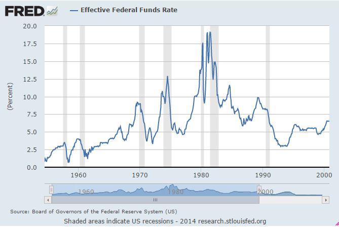
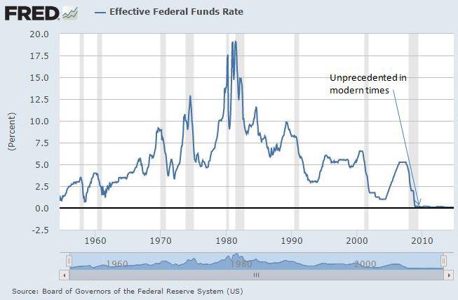
Below is a chart of the Fed Funds Rate from the 1950s until the year 2000. Understand that it is this rate that serves as the base rate that determines all other rates of lending in the U.S. Economy. The higher the Fed Funds Rate, the more expensive it is to borrow money, whether you are borrowing to buy a car, a house, what have you. The lower the Fed Funds Rate, the cheaper it is to borrow money. Lower interest rates are used to spur economic growth, and higher rates tend to cool off a hot environment. Notice that the lowest rates got just below 1% for a couple of months back in the 1950s, but that the average rate for the past 60 years sits somewhere in the neighborhood of 5-7%. In 2000, as the tech bubble burst, the Fed Funds rate sat at 6.5%.
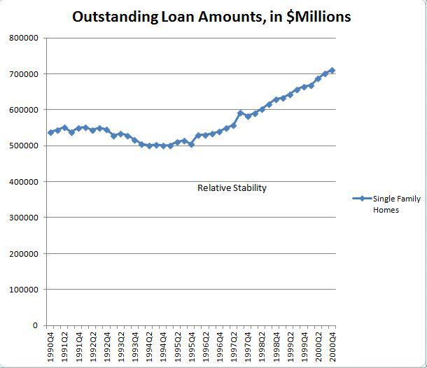
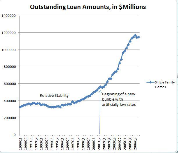
Before moving forward, it is important to notice the trend of mortgages in the United States during the 1990s. Below is a chart that was constructed using the Federal Reserve's data for outstanding mortgage debt, and focusing on the total amount of loans obtained by individual persons for single-family residences. A relatively stable looking chart, with asset prices beginning to move upward along with the previously mentioned tech bubble that began in the mid 1990s. However, it is important to glance back at the Federal Funds Rate chart and remember that during this time interest rates were at what many would consider a historically normal level, 5%-6%.
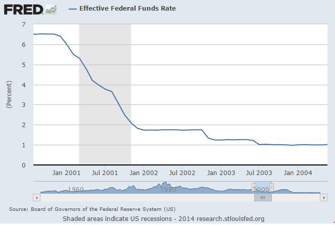
However, in an attempt to combat the economy's collapse, the Federal Reserve began to lower the Fed Funds Rate in January of 2001. They hoped that the lower rates would help to spur economic growth. They would continue to lower the Fed Funds Rate 10 more times in 2001 to a level (1.75%) not seen since the 1960s. Here is a graphic of the drop:
As rates went down, money became easier to borrow ... for all things, including houses. Below is the same Individual Single Family Total Outstanding Loan Amount chart from above, but this time it includes data from the year 2000 through 2006. Notice that the beginning of what would become the real estate bubble (a massive increase in debt, leverage, or margin) began at precisely the same time that the Fed manipulated the interest rates to artificially low levels. Pay particular attention to the rate of change in this chart, as it is an important component of understanding what is sustainable in a real economic ecosystem. This concept will be revisited towards the end, too!
Much like the stock market bubble before it, as this debt was created by issuing money that was created out of thin air, asset prices (namely housing) began to rise.
Start by looking at this chart that shows the growth patterns of various cities across the United States from 1990 through 2000:
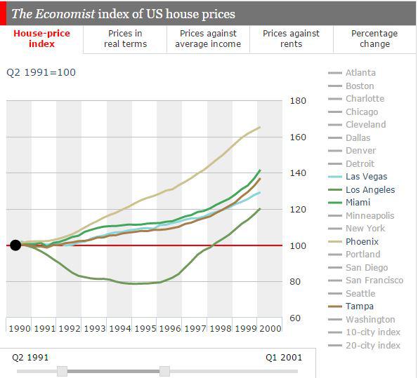
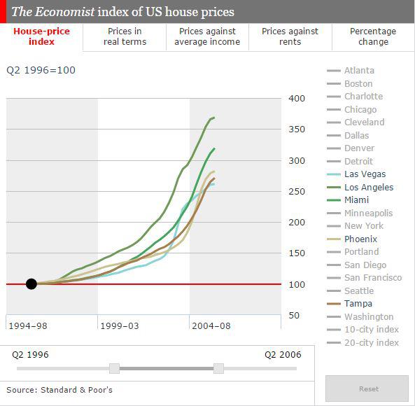
Again, the trends were somewhat normal in the period when interest rates were also considered to be somewhat normal and when the amount of mortgages was somewhat normal. However, just like the brokerage firms of the 1990s, both lenders and politicians realized that they could capitalize on the availability of cheap money and a rising market. No need to get into the blame game here. Just suffice it to say that many were in the wrong with what came next. In 2002, the Fed would lower the Fed Funds Rate to 1.25%, and again in 2003 to 1.00%, while politicians promoted the idea of home ownership for everyone and fostered that idea through the advocacy of "exotic" mortgage packages that we will discuss in a few minutes. The result of artificially low interest rates and easy lending? Here is the rest of the above chart, as if you need to see it, played out from 1990 to 2006:
As the market exploded, investors clamored to take on more debt in order to capitalize on the rising home prices; an act reminiscent of the stock market bubble that occurred only a few years prior. Rather than financing these properties with traditional, long-term loans that would amortize over 30 years, many of these investors began to try to maximize profits by taking on loans with adjustable rates and loans that only required a payback of the interest without any payments to the principal amount of the debt. Tied to the Fed Funds Rate, the payments on these loans would fluctuate as interest rates went up and down. These loans might allow an investor to lock in a rate for 1, 3, or 5 years, but eventually the loan would come due and need to be refinanced. According to the New York Federal Reserve, over 40% of the outstanding loans made in 2004 were done so as adjustable rate mortgages. It is extremely important to understand that the very nature of these loans is to allow the borrower to borrow as much as possible with the lowest possible payment. However, these loans mirror those Treasury Notes from the earlier graphic in the sense that they will mature in usually 3-5 years. This means that the borrower will be forced to refinance the loan in 3-5 years at whatever rate exists at that future time. That is the gamble. As long as rates remain low, the borrower can usually keep his head above water, so long as the underlying asset (in this case, houses) increases in value. Remember the case of CMGI stock. As long as the stock is moving up, the additional debt allows the investor to make more money. However, once the underlying asset (the stock) began to go down, the leverage had to be unwound, which meant lower and lower prices, which ultimately lead to what is affectionately known as the death spiral. Again, the meteoric rise was simply, mathematically unsustainable. I am not attempting to bore you death here, and I promise that all of this will make good sense soon enough.
In 2004, the Fed slowly began to raise interest rates to what was still near a historic low. In 2005, they continued to raise rates and by the end of the year the rate was set at 4.25%. By the time the Fed got the interest rate level back to a "normal" level of 5% in 2006, the real estate market was showing signs of a top. Many of those adjustable rate mortgages were coming due, and the investors were seeing the amount of their payment skyrocket as a result of the rising interest rates. All of a sudden, the math began to no longer work. Properties could no longer be flipped for profits, investors could not afford the new, higher payments on the higher interest rate loans, and Goldman Sachs was already bundling these mortgages and pawning them off to other countries while placing bets of their own against the housing market. They must have lived through and remembered that little tech bubble thing that occurred just a few years prior. Of course, this housing bubble would dwarf the tech bubble, which remained quite contained, comparatively speaking; and it might have corrected itself under natural free market forces without the intervention and manipulation by the Fed and government. You see, the attempt to artificially engineer a cure for the effects of one bubble led to another bubble that would be trillions of dollars larger than the first. These are those pesky "unintended consequences" that pop up when people try to manipulate natural forces. Of course, you must believe in true free market capitalism's natural ability to do its job. As the old saying goes, "The free market is never wrong. You just might not like the answer it is giving you at the moment."
It is also important to notice that during this low interest rate environment corporations, too, were able to borrow cheaply, and investors were once again funneling money into the stock market. In 2005, the NYSE Investor Credit had once again gone into negative territory to the tune of $20 billion. By 2006, it had grown to negative $40 billion, and by the time the stock market began to collapse along with the housing market, NYSE Investor Credit had swelled to negative $80 billion. Another graphic for your enjoyment:
Remember that individuals had also racked up about 1.2 trillion dollars worth of mortgage debt at this point, too! The country was once again leveraged to the hilt.
As home and stock prices fell, the margin man came calling. People were forced to liquidate stocks and houses, and the economy began to crumble once again. By December 2007, the Bureau of Labor and Statistics had declared the United States to be in yet another recession; a worse recession than the recession that had occurred just 7 years prior. Remember that the low interest rates imposed by The Fed in 2001 were supposed to "fix" the economy that had just crashed. However, as we have seen, it led to a bigger problem. So, what was the response to this latest crisis? The Fed would begin to lower interest rates, of course. By October 2008, The Fed had lowered the rate from 5.25% to 1.00%, the lowest level seen in 70 years, and lower than the rate that had just caused the crisis they were trying to fix. This is where things begin to get good, or should I say, terrible.
In December of 2008, the Federal Reserve lowered the Fed Funds Rate to an effectively 0% rate. Let's get a graphic of how out of whack this is:
With most of the US population suffering from 401k demolition and foreclosures, banks reeling from doling out too much fake money, and corporations going bankrupt, there was virtually nobody left to take advantage of the now insanely and artificially-low interest rates. Who was going to rack up new debt and dig us out of the recession? Enter the United States government.
Before we dive into the black hole that is our nation's debt, you need a basic understanding of a few things. First, there are many levels of debt, ranging from consumer debt to local municipality debt to federal debt. For our purposes here, we will focus on the federal debt. The federal debt, also known as the national debt of the United States, is broken down into several components based upon who owns the debt. Sparing you mundane details, I am choosing to focus solely on the "public debt", which is debt held by individuals, corporations, foreign, state and local governments, and The Federal Reserve. That is correct, the Federal Reserve, the guys who set the Federal Funds Rate, can finance the nation's debts when nobody else will. This is a subject that we cover soon enough.
You know that I like charts, so allow me to provide you with pretty pictures of life prior to a 0% interest rate environment. This first chart shows the portion of the federal debt that was held by the public from the 1980s through 2008. Mind you, the total debt is much larger than what you see here:
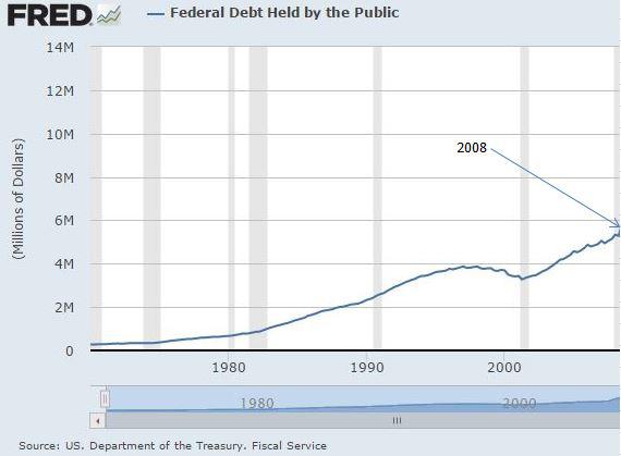
Notice the relative stability of the chart. Like all of the previous charts that I have shown that led up to the bubbles to follow, this chart is growing, but within the bounds of normal growth patterns.
Next, take a look at the portion of the public national debt that was held by the Federal Reserve leading up to the 0% rate environment that began in effectively 2009:
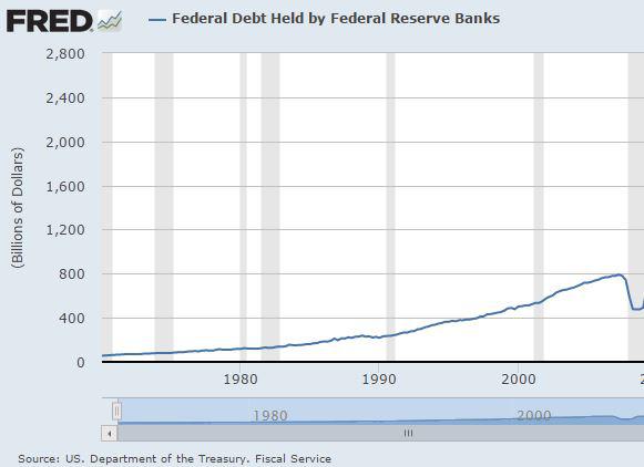
Again, notice the relative stability of the chart as it ascends with a semblance of order.
Then came 2009, and with it an economy in shambles and a new President who vowed to fix it all. With virtually everyone laden with debt, the country was convinced that the only hope was for the government to start borrowing money that would then be used to grow the economy out of yet another recession, bordering on depression. Who needs free markets when you have the nanny state, anyway?
In order to make this happen, the government would need to sell a variety of T Bills, Treasury Notes, Bonds, and TIPS to investors. So, we can think of the public debt as being broken down into the following categories:
T Bills, which pay the least amount of interest and mature in less than 1 year,
Treasury Notes, which pay more interest than T Bills, but not as much as Bonds, and mature in approximately 4-5 years, and
Bonds, which pay the most interest and mature in perhaps 30 years or more.
In the year 2000, the composition of the Public Debt with corresponding interest rates looked like this (amounts are in millions of dollars):
T Bills | $616,174.00 | 6.20% |
Notes | $1,724,263.00 | 5.80% |
Bonds | $668,229.00 | 8.2% |
TIPS | $ - | 2% |
Non-Marketable | $ 430,357.00 | 6.50% |
As you let that sink into your brain, think about the adjustable rate mortgages that were so popular during the housing bubble of the mid-2000's. Within a few years, those T-Bills and those Notes will have to be paid off or rolled into new debt at the then current interest rates, just as those adjustable rate mortgages had to be refinanced. Lower rates mean lower payments, and higher rates mean higher payments. The total interest that is paid on these instruments is known as the debt service, or the amount that is necessary to cover the interest payments on the outstanding public debt. Think of it kind of like a minimum payment due on your credit card.
Before we look at that number, we must know what our total outstanding public debt looks like. Luckily, I have a chart for that. This chart will also bring us into the era of enormous government spending, which really began in 2009.
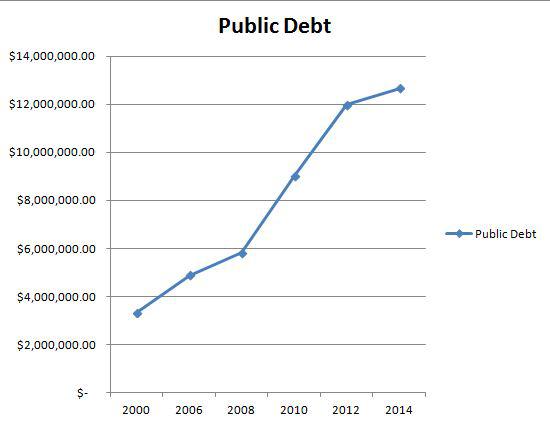
As you can see, the public portion of the federal debt now sits at well over 12 trillion dollars. But, to fully appreciate the level of stupidity at play here, we must break down that number into its components.
Rather than post a bunch of numbers, let me simply post a chart that shows how each form of the public debt grew after 2008:
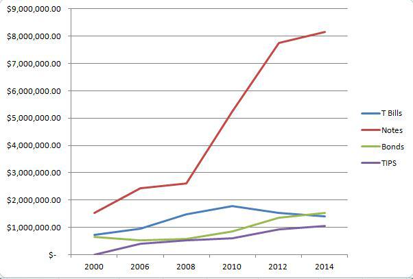
Do you see what happened in 2008? The government began to take on extraordinary amounts of debt of all kinds, but especially in the form of Treasury Notes, which we know are akin to those rather dangerous adjustable rate mortgages. We need to take a brief pause here to put this chart into perspective.
Total federal debt (not just public debt) was 5.6 trillion dollars in the year 2000. That is the total amount of debt that our country had accumulated since its inception, several hundred years. From 2008 to 2014, the United States racked up more, new "adjustable rate mortgage" debt ($6.4 trillion) than we had accumulated in total in 200+ years. Let that sink in.
The total "adjustable rate mortgage" debt would be 150% greater than the total outstanding debt just 14 years prior. Let that sink in.
The amount of "adjustable rate mortgage" debt that was added from 2008 to 2014 would be enough to cut a check to every man, woman, and child in the United States in the amount of $20,000. Family of 4? You could have had $80,000 cash. Instead, you got things like Solyndra, drone strikes, and shovel-ready jobs on the interstates. Let that sink in.
Another way to think about it is that the amount of "adjustable rate mortgage" debt that was racked up in the past 6 years totals more than the entire market value lost during the stock bubble crash of 2000. The total debt incurred during this same time frame is greater than the total market value that was lost from every piece of falling real estate during the collapse of the housing bubble. Let that sink in. Do you think that housing collapse was pretty bad? Well, we just exchanged all of that and more for short-term federal debt.
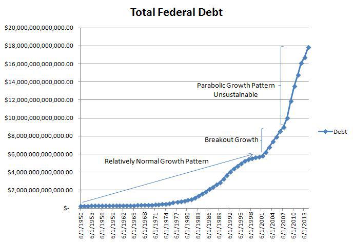
At this point, I feel it only right to inject a chart that shows the parabolic growth of the total national debt. This is only for illustration, and is another story altogether.
Who purchased this debt? In addition to individuals, banks, China, and others, a lot of this debt was purchased by the Federal Reserve. Remember that chart from above? Let's look at what they did when their pals at the federal government needed more money:
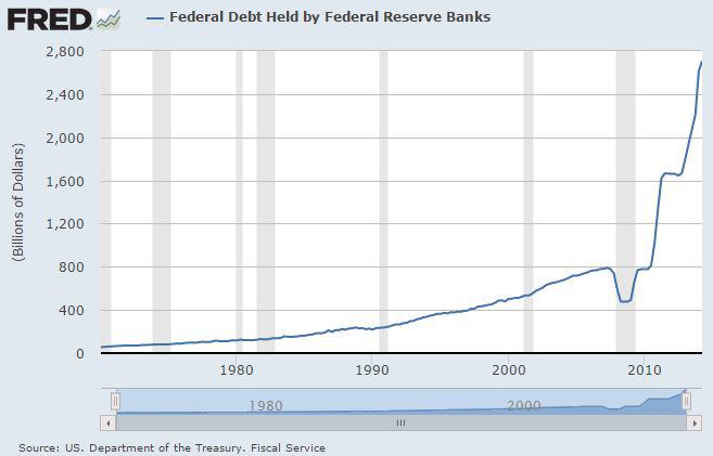
Does that chart depict natural movement? Are those deviations within reason? Have you seen some charts that looked like this in the past? Noticing a pattern yet? By the way, that is called monetization of the debt ... to the tune of more than 2 trillion dollars in a few years. This was also called Quantitative Easing. It is the process by which the government issues debt to finance its spending addiction by selling said debt to its central bank, who conveniently prints the money out of thin air. With this little Ponzi Scheme in effect, let's move forward.
What do you think has happened to that "minimum payment due" amount that we previously discussed now that the amount of debt has skyrocketed so?
I have a chart for that, too.
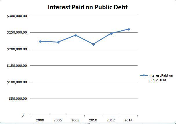
Surprised? How could so much debt be taken on without a similar rise in interest payments? Well, let's take a look at what happened to the interest rates on each form of public debt over the same time frame:
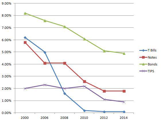
Remember how the Fed took the rates to near 0% in 2008? That effectively destroyed the interest owed on this massive accumulation of debt. Thus, our interest payments have remained somewhat constant over the past 14 years, despite the fact that our debt has risen by 300%! This same phenomenon is what allowed home buyers to purchase 3 or 4 condos instead of just 1 during the housing bubble.
The biggest difference is now the underlying asset is not a stock or a house, but pretty much the entire economy, itself. No problem.
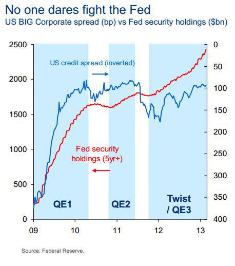
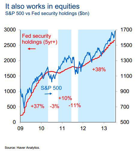
The best part is that by dictating a near 0% interest rate environment, the Fed can not only keep interest payments down, but also influence the flow of capital. If you are a fund who must produce returns for your clients and the current environment is such that you will receive roughly 0% return on cash, what do you do? You buy real estate and stocks. Blackstone Group LP, the largest U.S. private real estate owner, was spending $100 million a week on houses in 2012. Could the same work for the ailing stock market? Sure. Check out these graphics titled "No One Dares Fight the Fed" and "It Also Works In Equities" from a presentation by the Treasury Department:
In fact, it became so blatantly obvious that public companies, themselves, began to follow suit at an almost unprecedented pace. They would issue debt at incredibly low borrowing rates, and invest that money into their own stock - to the tune of some $1.8 trillion since 2009. Apple has repurchased $33 billion worth of stock this year alone, and $130 billion since 2012. Corporations repurchased nearly $340 billion worth of stock in the first half of 2014. It is interesting to note that this is the largest amount for any 6 month period since 2007. We have already discussed how 2007 ended.
To drive this point home, consider that JP Morgan calculated that $2.20 of the $3.70 gain in S&P Operating Earnings Per Share between the 3rd quarter of 2011 and the 1st quarter of 2013 was the result of share buybacks, leaving only $1.50 of the $3.70 (only 40%) attributable to organic growth. Standard and Poor's estimates that during the 1st quarter of 2014 share buybacks boosted corporate earnings by 24%.
A graphical representation perhaps provides a better understanding of this concept. Take a look at this chart comparing the performance of the S&P 500 to something called the S&P 500 Buyback Index over the past 10 years:
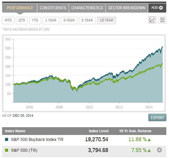
In March 2009, both were marked @ 64. As of December 2014, the S&P's move (based on 100) has been to 215, or an increase of 334%. During the same time frame, the S&P 500 Buyback Index has risen to 307, or a gain of 480%.
Near record high stock buybacks coupled with low share issuances has led to a rather unique environment for this bull market. According to Trim Tabs data, equity float (pieces of the proverbial pie) during the 1995 to 1999 bull cycle expanded by nearly 120%. During the next bull cycle from 2003 to 2007, the equity float expanded by almost 20%. Since 2009, however, equity float has increased by an almost inconsequential 2.2%. This means that there are simply fewer pieces of the pie out there this time around. Consequently, it has been much easier for prices to go up, especially when buoyed by a couple trillion dollars of corporate buying and an interest rate environment where holding cash or short-term equivalents is without reward.
Corporations have also been giving profits back to investors in the form of dividends. Without getting into that whole story, suffice it to say that according to data compiled by Bloomberg and S&P Dow Jones, corporations are set to spend $914 billion in 2014 on share buybacks and dividends. That amount is approximately 95% of their total earnings. They are not plowing money into their businesses. They are using it to boost dividends to shareholders and to restrict the amount of stock that is available to purchase on the open market. Anyone who took basic economics knows that given a constant demand, if supply is shrunk, then prices will increase. This is why the mantra on "the street" has been to "BTFD". For those not in the industry, that stands for Buy The $%^&* Dips. With shrinking share supply, 0% interest rates, and 1.8 trillion dollars worth of share buybacks sitting on the bid, it has been the only prudent thing to do.
The Harvard Business Review got in on the debate, and I thought the best part of the article was the following:
"Why are such massive resources being devoted to stock repurchases? Corporate executives give several reasons, which I will discuss later. But none of them has close to the explanatory power of this simple truth: Stock-based instruments make up the majority of their pay, and in the short term buybacks drive up stock prices. In 2012 the 500 highest-paid executives named in proxy statements of U.S. public companies received, on average, $30.3 million each; 42% of their compensation came from stock options and 41% from stock awards. By increasing the demand for a company's shares, open-market buybacks automatically lift its stock price, even if only temporarily, and can enable the company to hit quarterly earnings per share (EPS) targets."
To further put it into perspective, consider this data from The Economist in an article entitled 'Corporate Cocaine':
"IBM spends twice as much on share repurchases as on research and development. Exxon has spent over $200 billion buying back its shares, enough to buy its arch-rival BP. Since 2008, Home Depot has spent 28 cents of every dollar of cash flow on dividends and a further 52 cents on share repurchases."
For the record, IBM's purchases in Q1 2014 represented 13% of the total volume of IBM stock.
Since I like to look at things that are outside the norm, consider this from the Wall Street Journal:
'In August 2014, about 25% of the non-electronic trades executed at Goldman Sachs, excluding high frequency trades, involved companies buying back shares.'
And, what have investors done in this environment? Let's take a look at that NYSE Investor Credit chart again, and see what the data looks like today. Oh my!
Many believe that all of this artificially-low interest rate driven buying is serving as a prop for the stock market and that the unprecedented levels of investor leverage could signal a market top. Maybe. Maybe not. Only time will tell. After all, the economy is adding jobs and unemployment is falling. Perhaps all of this wonderful economic growth will trickle down and negate all of the aforementioned red flags. Then again, it might not. Let's take a closer look, and tie all of this information together.
Mainstream media is bombarding us with unemployment figures over which we should fawn and rejoice. However, things might not be quite as rosy as that unemployment number suggests. After all, we have just seen that corporations, the engines of the economy, are channeling money into buying back their stock and paying out dividends as opposed to investing in their own growth, which would seemingly produce an insane number of jobs. So, what is really going on here? We will need to pull up some data from the Bureau of Labor and Statistics to get a better understanding.
Unemployment data is a relatively simple math computation whereby the number of unemployed people is divided by the number of people in the Civilian Labor Force. For example, most recently the Civilian Labor Force was 156 million people strong. 8.6 million people were unemployed. Thus, the unemployment rate is approximately 5.5%. Sounds pretty good! I will one up that number and make it sound even better! If you take out the portion of the Labor Force that is 16 years old to 24 years old (high school and college) as well as the portion that is over 65 (retirees), then you get a picture that looks like this:
The Civilian Labor Force that is ages 25 to 65 is 126 million people strong. Of this pool, only 5.8 million are considered unemployed. This means that the unemployment rate for this group is roughly 4.8%. Phenomenal, right? As Corso would say, "not so fast, my friend."
There is another number, which represents the number of people who are "Not in Labor Force". Now, some have argued that this number is skewed because of an aging population and an increase in # of retirees. So, I omitted those persons over 65 years in these calculations to help compensate for that argument.
The number of people who are part of the Civilian, Non-Institutional Population of the United States and who are also part of the Not in Labor Force group is 37.9 million. Of course, part of this pool is comprised of stay-at-home moms. According to Pew Research, there are approximately 10.5 million stay-at-home moms, and according the Census Bureau roughly 700,000 of those are not working because they cannot find a job. This means that we can subtract roughly 9.8 million from that 37.9 million number, leaving us with approximately 28.1 million people who are aged 25 to 65, who are not employed, and who are not caring for a child at home by choice.
If we add that 28.1 million number to the 5.8 million unemployed number, then we get a scenario that looks like this:
Roughly 34 million people ages 25 to 65 are not working. This means that more than 20% of the people in this country aged 25 to 65 who are not staying at home to care for a child by choice are not working.
If you take the entire pool, aged 16 and over, then you get a picture where more than 40% of the non-institutionalized, civilian population in this country are either unemployed or not working. Coincidentally, a record number of Americans are receiving welfare benefits, which is another story tied to federal debt.
Before looking at some more charts, ponder that Not In Labor Force number and how it relates to the Unemployment Rate. What if every American except for you decided to either take out some student loans and go Rodney Dangerfield Back to School on us or simply elect to sit at home, collect welfare, and play Xbox all day? Technically, every American other than you would then be part of the Not In Labor Force number. If you got a job at McDonald's, then you would be employed. The Labor Force would be comprised of 1 person for calculation purposes. Since you are employed, the Unemployment Rate would be stated as 0%. The nation would be fully employed, despite the fact that you were the only person in the country who was working. Arthur Andersen, eat your heart out. Moving along ...
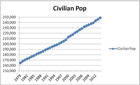
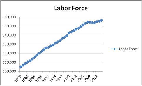
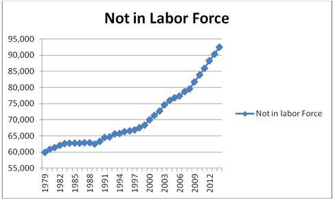
The charts of the aforementioned data look something like this:
Civilian Population shows steady, normalized growth pattern (perhaps because government hasn't yet figured out how to manipulate birth and death rates)
Labor Force shows steady, normalized growth pattern until 2009, at which point it begins to stagnate
Not in Labor Force shows steady, normalized pattern from 1979 to 2000. From 2000 to 2008 it begins a "breakout" trajectory. From 2009 to 2014 the pattern begins to deviate greatly. Perspective: more people fell out of the Labor Force between 2009 and 2014 than from 1979 to 2000.
With that part of the puzzle out of the way, let's move on to Federal Receipts as presented by the White House's own Office of Management and Budget. Think of this as Income. In this chart, notice that the historical "Income" is marked in blue and the "Projected Income" is marked in red:
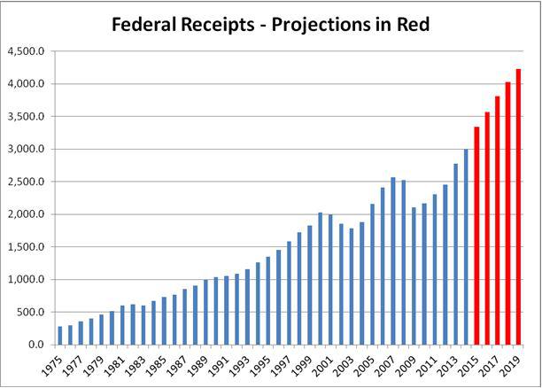
As you can see, the Office of Management and Budget is projecting some pretty incredible growth in tax receipts in the coming years. This is a good thing, because the government will need it ... and they had better pray that they are correct and that there are no hiccups along the way.
One of the main reasons I say this is because of the previous charts that showed the increase of the debt, the decrease in the interest rate on that debt, and the composition of that debt.
You see, the same Office of Management and Budget that is predicting the somewhat insane growth of the economy and federal tax receipts is also showing signs of sanity by predicting that this artificially-low interest rate environment cannot last forever. It also knows that all of that "adjustable rate mortgage" debt will have to be rolled over into new debt. In fact, the Treasury Department stated in its annual report for 2014 that:
"Of the marketable securities currently held by the public as of September 30, 2014, $7,063 billion (over 7 trillion dollars), or 58%, will mature within the next 4 years."
The CBO projects that the average interest rate on the public debt will rise from its current level of 1.8% to only 3.9% a decade from now. I would be surprised if it were that low a decade from now, considering the fact that historical averages have been closer to 6%. Even so, with only a slight increase from 1.8% to 3.9%, the interest payments alone will rise to over $800 billion a year. Imagine if interest rates go higher, or rise more quickly, or if the economy hits a hiccup and receipts do not go up as projected. Those payments will still come due, regardless of everything else.
Some have analyzed this data further and have come to the conclusion that the payment on the interest alone (never touching principal) will be more in 1 year than the government will spend on a decade of education. The interest payments will also become more than the entire defense budget by 2020. That, of course, is assuming what is quite possibly a best case scenario for interest rates.
All of this begs the simple question: What is sustainable?
The beauty of a bubble is that it blinds almost everyone from seeing what it truly is until it is too late. Right now, housing prices are recovering and the stock market is enjoying its biggest run ever. Individual mortgages once again total over 1.1 trillion dollars thanks to a boost in the purchasing of rental properties in recent years. NYSE Investor Credit is at levels never seen before, negative $180 billion. That is nearly 50% greater than the peak level seen during the stock market bubble, and more than 200% greater than it was at the peak of the real estate bubble. Public debt has risen by some $7 trillion dollars in the past 6 years, while short-term interest rates have been cut by 60-95%. Student debt is at an all-time high while more than 1 out of 5 people aged 25 to 65 are not working. Welfare is at an all time high, and corporations are using nearly 100% of their profits to prop up share prices and pay dividends to insiders and fat-cat shareholders. Some of the world's largest real estate funds have drastically reduced their real estate purchases, and politicians are once again looking at lowering down payment and credit requirements for buyers. Looming interest on the debt is almost unfathomable.
There is another famous saying that "the market can remain irrational longer than you can remain liquid", which means simply that although sanity, logic, and even fundamental numbers might be on your side, there is no way to account for the irrational exuberance of mankind. Humans have a seemingly innate ability to intoxicate themselves on the debauchery that comes from the enjoyment of living inside a bubble. It is exactly this irrational behavior, however, that creates a set of data points that when charted end up looking parabolic. That being said, there are a lot of number sets out there whose movements have gone "parabolic", and if the effects of 'corporate cocaine', cheap money, and drunken government spending begin to wear off, then it could set off a chain reaction with the potential to burst a bubble that would dwarf the previous 2 bubbles of the past 2 decades. It is coincidental that the total federal debt incurred since 2008 is somewhere around 10 trillion dollars, and corporate buybacks and dividends are roughly 3 trillion dollars. That is 13 trillion dollars of pumping. The tech bubble lost about 5 trillion dollars in value and the housing bubble lost about 7 trillion dollars in value. Together, that is about 12 trillion dollars. Admittedly, this is above my pay grade. However, this seems like a shell game to a simpleton such as myself. If I am correct, then one has to wonder how long the game can be perpetuated before sanity, logic, and basic math take over.
You see, parabolic charts are made of data patterns that are simply unsustainable. It is never the sheer number alone that causes alarm, but rather the rate of change of the number relative to itself. It is a function of price, time, and volume. When all 3 of these factors combine to produce a parabolic set of data, the outcome is a crash ... at least in every, single instance that I have ever watched. So, be on the lookout for a decrease in the rate of change of home prices, stock buybacks/dividends, stock prices, or especially government spending. If and when the margin comes calling this time, it will be something to see ... hopefully, from afar.
So, those media outlets are correct to a degree. We have growth, but where did it come from and what is its real cost? I do not believe we yet know the answer to those questions. But, the market will eventually give us and my friend the only answer that matters, and undoubtedly the government will be there to "fix" whatever answer we receive. At that point, he will probably have more questions.