Originally published on March 5
It is said that a picture is worth a thousand words. So, this week, I've decided to try and sum up the keys to the current market environment with a series of charts and graphs. I started out looking for five key charts. That quickly turned into ten. And before I knew it; I had a baker's dozen. And frankly, I'm sure I've skipped some key stuff. So many messages, so little time!
The areas I focused on include the technical picture of the market, the state of the current trade, market valuations, the Fed/monetary policy, and the #GrowthSlowing theme. So, without further ado, let's get to it.
The Technical Picture
Some analysts suggest we are currently experiencing a replay of last year's Q1 market action. We had a very nasty/scary pullback that was followed by a return to rally mode and eventually, new highs. However, one thing that was missing from last year's rebound were indications that there was some "oomph" behind the move. And as most analysts know, it is that "oomph" which usually accompanies a fresh leg of a major move.
As it turned out, the lack of "oomph" to last year's rally turned out to be a precursor of bad things to follow. Sometimes, it does indeed pay to read the tea leaves in this game.
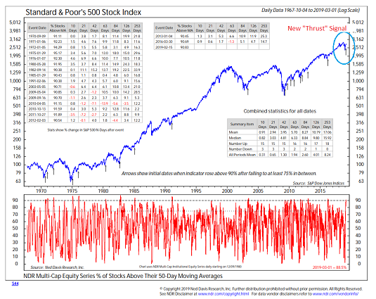
The good news is that this time is different. This time around, there are an abundance of "breadth thrust" indicators that have flashed buy signals, which is a sign that there indeed is some "oomph" behind the move. Below the latest signal to trigger - the percentage of stocks over their 50-day moving averages.
Breadth Thrust Buy Signal
View Larger Chart Online Source: Ned Davis Research
History shows that when 90% of stocks are above their