I received a bit of criticism yesterday about a segment in NFTRH74 with regard to personalizing the motives of the Fed and policy makers or more specifically, with regard to writing as if I know what 'Gentle Ben' is thinking with regard to inflation/reflation (or lack thereof). This criticism came from a subscriber who has many decades of experience running some pretty big trading desks going all the way back to Paul Volcker. So of course, I listen... as I do with any and all constructive criticism.
The intent of the segment is to illustrate the myopic nature of the general financial services industry as it tends to err, forget to highlight the reasons we may have projected economic rebound and buoyant markets; namely, inflation of money supplies in various aggregates and through various means. The premise is that if you want to under-perform, you just buy the S&P 500 and if you want to out-perform, you buy the most intense beneficiaries of the inflationary regime. Of course, this assumes that reflation will be successful - no given.
So really, Bernanke/Geithner/Summers hyperbole aside, I am focused on what IS, and what IS is represented in this chart.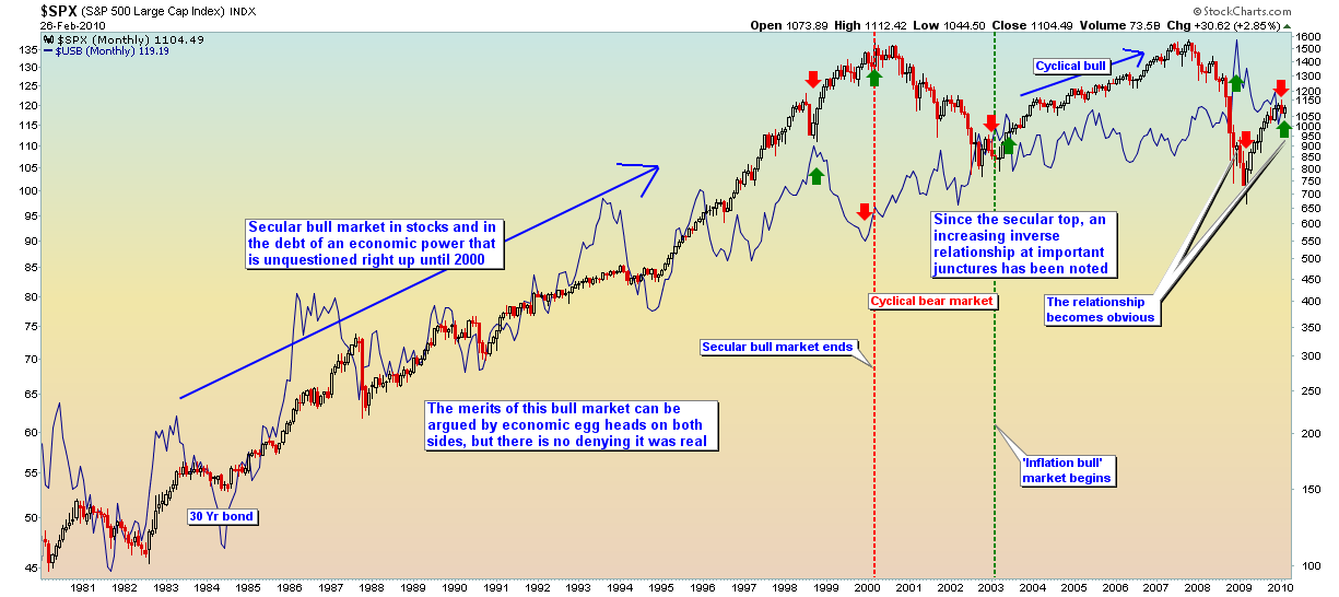
Now, cases for deflation and inflation can be argued (are argued by some very smart people) with regard to interim swings, but the big picture monthly chart - correlating the US long bond to the S&P 500 - cannot be argued. So let's forget the name Beranke, tune out the media and avoid the inflation/deflation debate for a moment. Let's just look at the chart.
It is striking to me that during a secular bull market US stocks and bonds rose together, as capital was sucked in to a still-productive enterprise as it headed for its secular top, conveniently right to the round number of 2000. Now, when I spout about 'inflators in high places' I am really just trying to illustrate the meaning of this chart while expressing myself as a human. That is because as a human, it pisses me off that the country has resorted to such a bald-faced method of funding its ventures. As a human it pisses me off to see the financial media not reporting the whole story. A headline I would like to see on Bloomberg:
US Sells More T-Bonds as China Blinks, GDP to Benefit By Direct Infusion of Proceeds
But as a cold chart and market watcher, I simply go about what I do. The chart does not lie and its message is that the conclusion of the major bull market, beginning at the secular top (2000) and leading into the cyclical bull (2003-2007) ushered in an era of ever more intense inversion of the relationship between US stocks and US bonds (debt).
It is no secret that the US funds itself through its ability to pile on more debt to the $Trillions high dung pile. So, again as a human, it scares me to see a bearish looking pattern in the nominal $USB chart (potential head & shoulders) and the proximity to the monthly EMA 100 that I often write about. That is because that moving average represents a secular (many decades long) thing and while I am not sure what will happen if it breaks, I am not eager to find out.
In summary - and depersonalizing the players in the macro drama - the chart implies that a continued stock (and commodity) rise could bring about its own destruction as inflation fears break down the barn door. The secular containment of interest rates below the monthly EMA 100 (bond above its own EMA 100) has been vital to funding in an era (post-2000) where such funding is ever more vital to the pretense of economic rebound.
We will have continued economic rebound, which will be attended by the thing that birthed it (inflation) or we will have a double dip (or worse) as the system attempts to purify itself through natural, deflationary means. Conventional financial media obsessions like 'consumer spending' and 'GDP' are just ephemera overlaid on top of the macro big picture.
US Stocks & US Bonds
Seeking Alpha's Disclosure: Past performance is no guarantee of future results. No recommendation or advice is being given as to whether any investment is suitable for a particular investor. Any views or opinions expressed above may not reflect those of Seeking Alpha as a whole. Seeking Alpha is not a licensed securities dealer, broker or US investment adviser or investment bank. Our analysts are third party authors that include both professional investors and individual investors who may not be licensed or certified by any institute or regulatory body.