 The PE ratio needs no introduction. For a very long term chart of the ratio, click on the image to the left. The source of the chart is the NY Times with a helping hand from the economist, Robert Shiller. I was surprised to see that we were trading at a higher PE ratio as early as last year, than the top in 1929!
The graph above is based on the average earnings for the preceding 5 years. This chart is more short term, based on the rolling 4 quarters of earnings:

Why Use the Price Dividend Ratio?
I’m not sure where I first learned about this ratio. But Stan Weinstein really made it stand out for me as a very important measure of market valuation in his book: “Secrets For Profiting in Bull and Bear Markets” The power of this ratio comes from the fact that unlike earnings, dividends can not be “massaged” by creative accounting. There are no “EBIT” dividends. They are completely immune from accounting shenanigans. They are either declared and paid in cash or they aren’t.
Also dividends are free from the year to year shocks such as “write-offs” which can affect earnings. Most companies treat their dividends with what you might say approaches reverence because dividends send such a clear and strong signal about their financial strength.
I’m loathe to dip into the fundamental analysis toolbox but from time to time, when the situation warrants, I do. But for the reasons above, I prefer to use the price dividend ratio instead of the much more popular price earnings ratio.
Basically, the ratio tells you how much you have to pay for $1 of dividends. So in a way it can be equated to the “yield” coupon of the stock market. Or the inverse dividend yield of the stock market. And because of that, it has some correlation to the interest rate. So when interest rates are high, usually the dividend yield is also high.
Here is a very long term chart of the S&P 500 Index. I’ve added two data points, one for where we were this time last year and one for now:
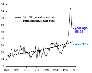
Source: Federal Reserve Bank of San Francisco
Dow Jones Price Dividend Ratio
A year ago, when the Dow was at ~14200, the price dividend ratio was 49. Meaning you would have had to pay almost $50 to get $1 of dividends a year. It also corresponds very closely to the S&P 500’s price dividend ratio (above).
As of now, however, the Dow’s price dividend is a more reasonable 26. This is because of two things. First, and most obviously, the Dow has come down a lot, but also importantly, dividends have increased a healthy 11.7% from a year ago.
As you can see from this long term chart of the Dow’s price dividend ratio, we are right around the long term average for this ratio:
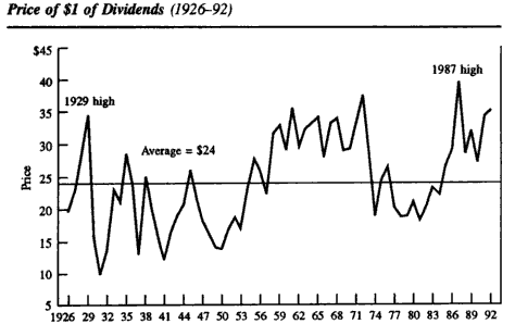
Source: John Bogle on Mutual Funds
As we’ve all noticed in the past few days, the market has the ability to reach maximum levels and then to keep pushing into new territory (I’m looking at you VIX). So just because we are now at a much more “normal” price dividend level doesn’t mean that it can’t go lower. For example, here’s a really scary picture of what might/could happen.
Having said that, I’m glad to see this fundamental ratio not clash with other technical indicators which are pointing to a potential market bottom.
The charts above are long term but do not show the most recent years, so if you know of a more up to date price dividend ratio, I’d love to see it. Or if you have access to a platform like Bloomberg, where you can look it up, send me a screengrab. I’m sure the most recent data holds some insight.