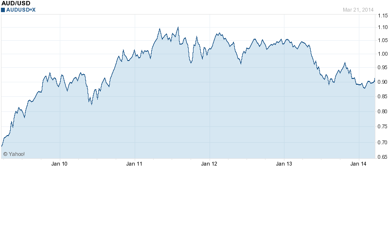
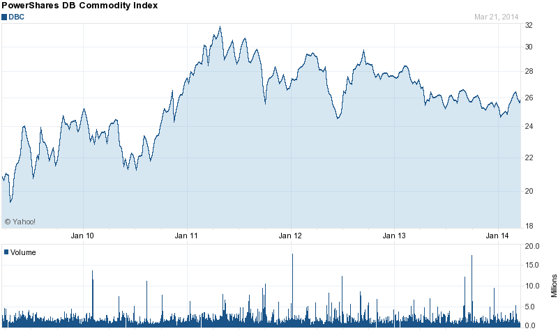
The Australian Dollar (AUD) is gaining on the strength of the Chinese economy and commodity prices. If you take a look at the chart for the AUD/USD relationship and then compare that to a chart of commodity prices, this becomes more apparent. The relationship is not a perfect reflection but the trends are the same. Specifically, please look at the overall shape of the charts (both covering five years).
Now compare those charts to the annual growth rates in China's GDP. The 2014 rate of 7.7 percent is still very impressive, but with much of the developed world economies struggling China is carrying the ball for commodity prices these days (includes an extra five quarters at the beginning so try compare the shape without those first five bars).

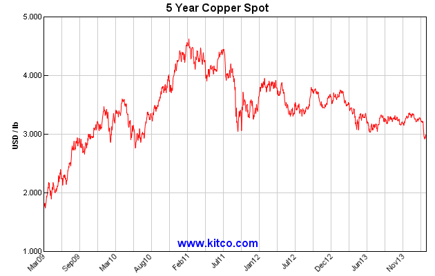
You can find the above chart and supporting data here. Without adequate demand growth for commodities from the U.S. and Europe China become the default driver of demand and pricing for most industrial commodities such as copper and aluminum. Notice the trend in the 5-year copper price chart below:
Now look at the 5-year price chart for aluminum:

There is a similarity in all of these charts, rising from the March 2009 lows to a high in 2011 and then trending lower to the current time. The exception is that the China GDP growth peaked earlier in 2010, but the Chinese speculators continued to buy up industrial metals (especially copper) and place it into warehouse storage for future sale hoping for higher prices. I do not believe that the similar pattern is coincidence but rather related. And I believe that the impact will continue to be felt in the AUD for several more years. But it could get ugly fast as new events unfold in China this year (more on that later in the article).