The Kellogg Company (NYSE:K) recently came on my radar after the stock fell sharply and started offering a decade-high dividend yield of 4 percent. The long-term price chart reveals that the downside is limited and offers a good buying opportunity for the coming years.

Source: BBC 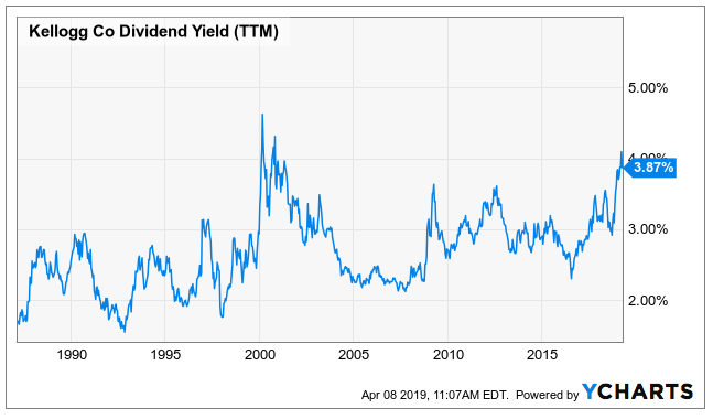
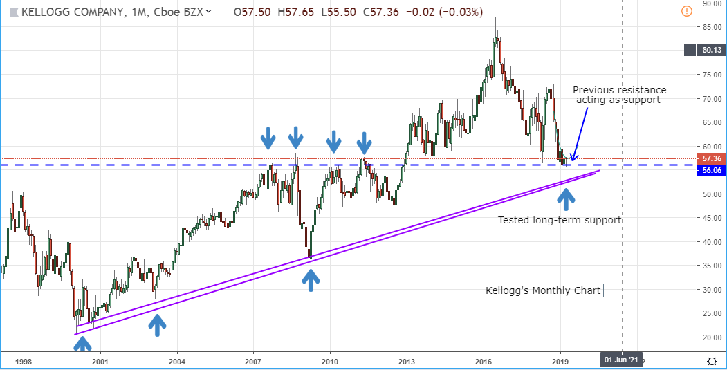
Kellogg's monthly price chart below spans the period from 2000-to-date. It can be clearly seen that the stock formed a significant bottom then and has since maintained an upward trajectory. This uptrend holds value because it wasn't violated even during the 2008-09 panic (see the blue up arrows) which further strengthens the buying view. Clearly, there has now been almost four months of consolidation near this strong support region.
Source: TradingView
The long-term chart supports are not easily broken. Monthly charts also offer clarity on the long-term investor behavior, which in the case of Kellogg has been buy on dips. For K, the strong support is near $52, approximately 10 percent lower from the current market price.
According to the principle of change in polarity, once a resistance level has been breached, it should act as the support for the stock. In the monthly chart, I have marked (with blue down arrows) that the region of $55-$57 used to act as a really strong supply zone for around five years before it was decisively taken out in Jan 2013. So, both the upward trajectory as well as the horizontal support indicate that we are closer to the bottom. Barring any negative developments such as the one in Kraft Heinz (KHC), the market isn't really expecting a major fall in the corn flakes maker.
Since the huge gap-down in Oct last year, we have seen the stock maintain a lower-top/lower-bottom structure, making it ripe for a sell-on-rise candidate. The resistance has been curving rather than a straight trendline