Originally published on June 4, 2019
Rising Dividend and Falling 30-Year T-Bond Yield = Potent Profit Formula
The two vectors that determine the dividend discount value of the DJIA are its actual dividend and the yield of the 30-year T-bond. A rising dividend pushes up the value of the DJIA as does a falling T-bond yield. These positive conditions have both been in effect for the past four decades.
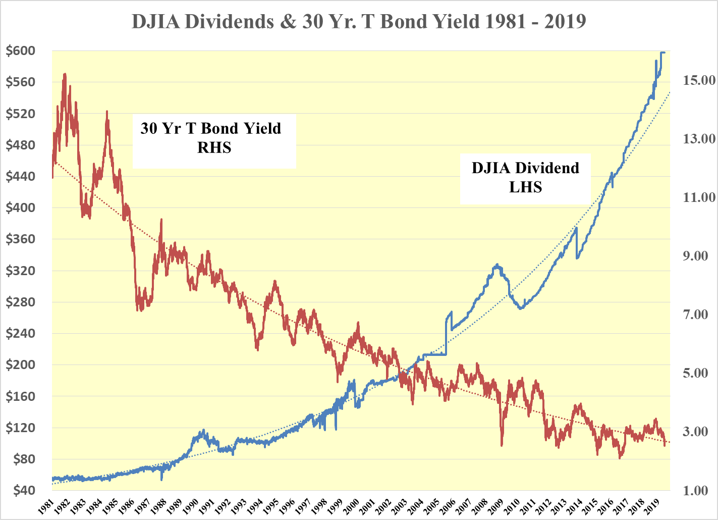
Chart created by the author from the U.S. Federal Reserve and Dow Jones, Inc. data.
Combining these vectors, the following chart shows the dividend discount value in red. Last night, it stood at an all-time record of 54.567 as the 30-year T-bond yield fell to 2.53%.
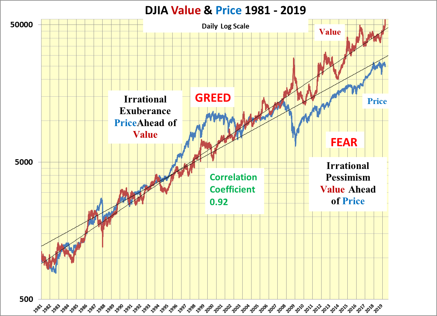
Chart created by the author from the U.S. Federal Reserve and Dow Jones, Inc. data.
The price of the DJIA, shown in blue, has also risen, but at 24,820, it is at a 55% discount from its value. As the correlation coefficient between the value and the price of the DJIA is 0.92, the pressure on the price of the DJIA remains decidedly up.
Bond Yield: Equity Yield Ratio Also Screams BUY
Another way of looking at the above is to compare the T-Bond Yield: Equity Yield Ratio with the price of the DJIA, the red line. Since 2008, the ratio, the black line, has been below the historical average of 2.33. As such, the DJIA is considered underpriced relative to its value. Prior to 2008, the ratio was mainly fairly priced except in the summer of 1987 and the latter part of the 1990s during periods of irrational exuberance.
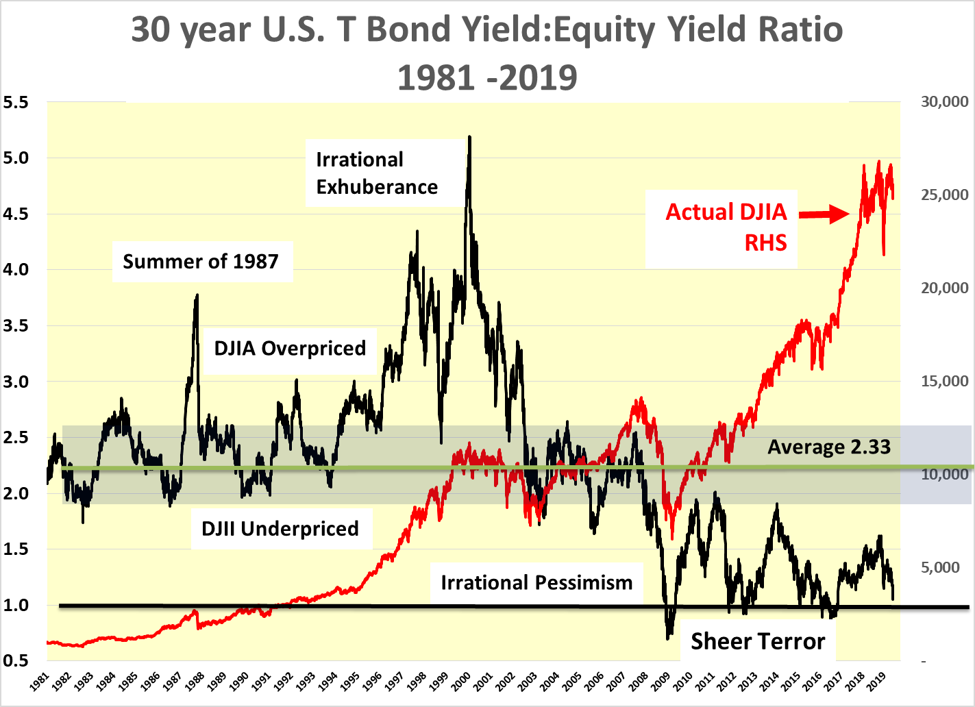
Chart created by the author from the U.S. Federal Reserve and Dow Jones, Inc. data.
Since Lehman, the Bond Yield: Equity Yield ratio has remained underpriced and in a state of irrational pessimism as market participants remained