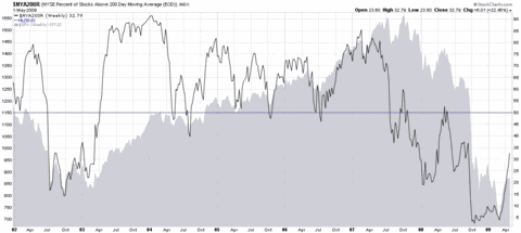
While it is similar in construction to yesterday’s chart of the week (the percentage of NYSE stocks above their 50 day simple moving averages), a chart of the percentage of NYSE stocks above their 200 day moving averages looks much different from the 50 day version and is generally subject to a much different interpretation.
The chart below is a weekly chart of the percentage of stocks trading above their 200 day simple moving averages since 2002. As the graphic demonstrates, the 200 day moving average does an admirable job of capturing the strength of the long-term trend. During the 2003-2007 bull market, for instance, pullbacks to 50 percent represented excellent buying opportunities. Furthermore, when the percentage of NYSE stocks above their 200 day SMA failed to surpass the 60 percent level in October 2007, this should have been taken as a sign that market breadth was weak and the bull market was in danger.
As 200 days encompasses approximately 9 ½ months of trading, large swings in the 200 day percentage data have a tendency to significantly lag the market. For this reason, interpreting the chart below should focus on swings of at least 30 percent that move the aggregate percentages above the 60 level or below the 40 level. Applying this interpretation to the chart below, the current bull move should be considered a bull market when the percentage of NYSE stocks above their 200 day SMA exceeds 60.
[source: StockCharts]
