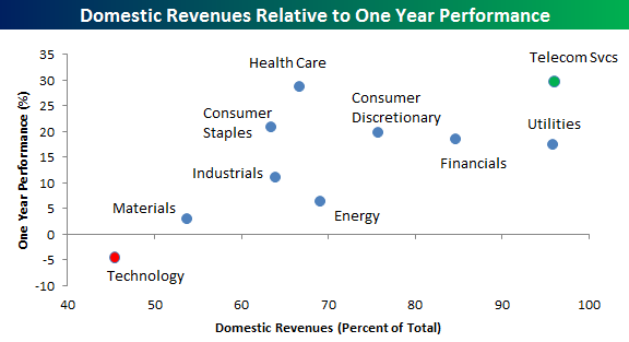
Clients and regular readers of this site know that we have had a longstanding preference for US stocks with domestic exposure over stocks that generate the bulk of their revenues outside of the United States. A look at the chart below shows just how well that strategy has been working over the last year. In the chart, we compare the one-year performance of all ten S&P 500 sectors (y-axis) to the percentage of domestic revenues for the average stock in the sector (x-axis).
As shown, Technology is the only S&P 500 sector that is down over the last year, and it also happens to be the only sector where the average stock generates less than half of its revenues in the United States. On the opposite end of the spectrum, stocks in the Telecom Services sector generate the largest percentage of their revenues in the United States, and Telecom has seen the best performance over the last year. Besides these two sectors, if you look at the rest of the sectors in the S&P 500, there is a clear trend between percentage of domestic revenues and performance over the last year; the more the better.