Over the past few days I've seen several references to the fact that both the Dow and S&P 500 weekly closes are in the vicinity of their 200-week simple moving averages (SMA). I've spent some time studying this indicator in both indexes, and I've extended my investigation to the Nasdaq 100 and the Nikkei 225.
S&P 500
Since its creation in 1957 until the top of the Tech Bubble in 2000, the S&P 500 has generally trended above the 200-week (SMA). The bear market declines are responsible for the few occasions when the index dipped to or below the 200-SMA — most notably in 1968-1970 and 1973-1974.
Here's a chart of the index weekly closes since 1950 with the 200-SMA (the S&P 500 is spliced with the earlier S&P Composite). I've highlighted bear-market declines and recessions, and I've given a "real" alternative view to indicate the amount of nominal performance that is inflationary illusion:
images
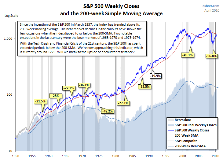
With the Tech Crash and Financial Crisis of the 21st century, the S&P 500 has spent extended periods below the 200-SMA. After nearly two years below the indicator, the latest weekly close brings the index within a fraction of the 1225 level of the current 200-SMA. Will it break to the upside or encounter resistance?
Dow
Here's a comparable chart of Dow weekly closes, where the 200-SMA is similar to what we saw in the S&P 500:
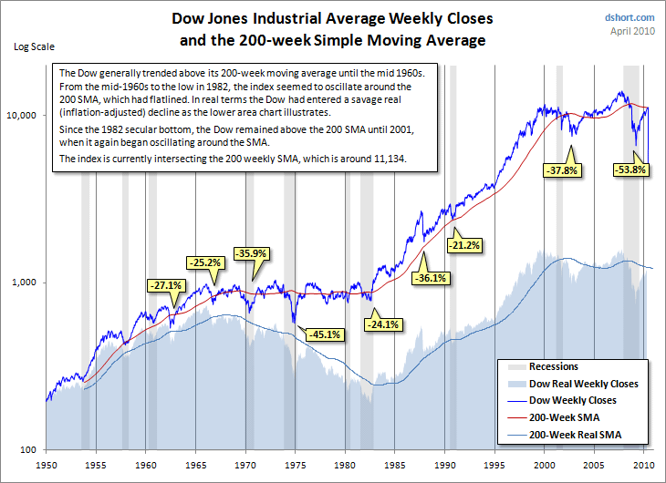
The Dow generally trended above its 200-week moving average until the mid 1960s. From that point until the 1982 low, the index seemed to oscillate around the 200-SMA, which had essentially flatlined. In fact, the real (inflation-adjusted) Dow had entered a savage decline, as the lower area chart illustrates. Since the 1982 secular bottom, the Dow remained above the 200-SMA until 2001, when it again began oscillating around the SMA. The latest (April 23rd) close at 11.204.28 put the index fractionally