In a previous article, I outlined both the purpose and construction of my Simple Stock Model. Keep reading for a quick run-down if you're new to the model; otherwise, you can skip down to "Technicals" for the updated data.
Investors are constantly exposed to sound bites and data points presented without any proper context. You might have read an article about how stocks have historically bounced when sentiment has reached a negative extreme. Or that you should be out of the market if it's trading below its 200-day moving average.
When I come across articles like that, I always thought it was shortsighted to base an opinion on the S&P on only one indicator without also considering a wide variety of other inputs.
The goal of the model is to help you form a data-based outlook on the S&P. Additionally, at the end of this article, I showcase a composite model that incorporates all of the indicators I use, so your view can be comprehensive as opposed to having tunnel vision on only one indicator.
How the Model Works
Each article is broken down into four main sections: Technicals, Sentiment, Rates and Macro. Each section includes a number of different indicators. For each indicator, there's a "filter rule" for when to be out of the market. In the spirit of simplicity, the filter rule is always binary, dictating either 100% long exposure to the S&P or a 100% cash position. The S&P is represented by the SPDR S&P 500 Trust ETF (NYSEARCA:SPY). Let's dive into an example graph. All graphs are from the Simple Stock Model website:
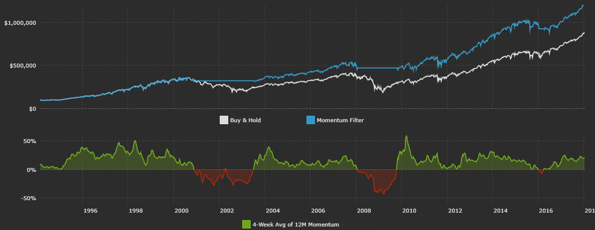
The above data is from Yahoo Finance. The graph shows the price momentum indicator within the technicals section. The bottom portion plots the momentum metric over time, and the top portion plots the historical performance of following the filter rule.
For each indicator, new data each weekend is used to generate a long SPY or cash position for the next week. For the above momentum example, SPY's dividend-adjusted close as of Friday is the main input. Using this, I calculate the 12-month total return. For each indicator on this site (except for the macro data), I take a four-week average of the main indicator input.
So, for this example, I'm taking the four-week average of 12-month total return momentum. Why four weeks? To reduce false positives and whipsaws when an indicator is bouncing slightly above or below its filter rule. There's nothing special about a four-week average. You could use two or eight weeks and reach similar results.
Data is compiled as of Friday's close. Buying or selling decisions occur at Monday's close. I do this, as opposed to making trades at Monday's open, simply because I had a more reliable data source for dividend-adjusted close data. It's also important to reflect realistic transaction costs. Each simulated historical performance graph factors in a $10 trade commission and a 0.02% spread on SPY for each buy or sell. Commissions and spreads are lower now, but considering SPY started in 1993, I chose to use these above-average numbers.
Now you understand the methodology behind the model. Each week, I'll cover a handful of indicators, especially those that have changed positioning over the past week. Let's get started with some technicals.
Technicals
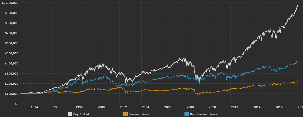
We are in the middle of the buyback blackout period. Companies typically suspend share buybacks (and insider transactions) in the five-week period leading up to their scheduled earnings announcements.
It's important to note that this buyback blackout window is different for each company, and my period covers the five-week period before a majority of companies report earnings. As a percentage of total NYSE volume, corporate buybacks have increased over the past few years. Data is from Yahoo Finance.
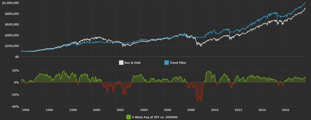
The classic trend-following approach is to have long exposure to the S&P if the index is above its 200-day moving average. That works, but you get whipsawed with a lot of false signals. That's why I use a four-week average of SPY's distance relative to its 200-day moving average. It's a bit slower on catching big moves but signals fewer false positives. The S&P is currently above its 200-day moving average, meaning it's in an uptrend.
Following this trend strategy would have kept you invested in the market since March of 2016. The main benefit of long-only trend-following strategies is not in higher returns, but instead through (hopefully) lower volatility. Data is from Yahoo Finance.
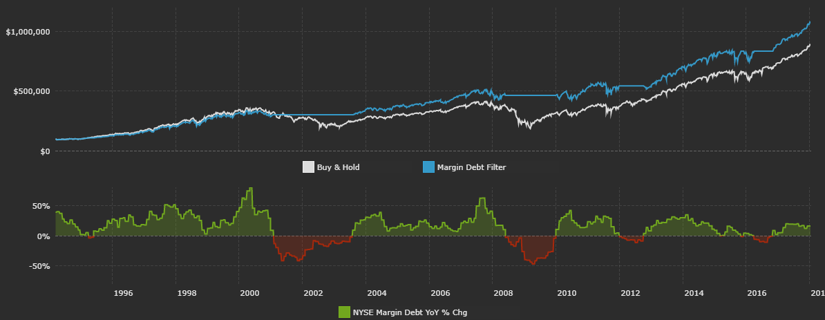
Margin debt increases as investors pledge securities to obtain loans from their brokerage firm. FINRA releases margin debt data on a monthly basis. It should be noted that I previously used data from the NYSE, but they will soon hand over the reporting duty to FINRA.
It's important to avoid looking at the nominal amount of margin debt outstanding. Any credit-based indicator will steadily grow over time as the economy expands. Instead, I like to look at the yearly percentage change in margin debt.
Historically, positive annual growth in margin debt has actually been a positive sign for future short-term S&P returns. Note how excessive margin debt growth was in 2000 and 2007. Margin debt has grown by 16.2% over the past year. Data is from FINRA.
Sentiment
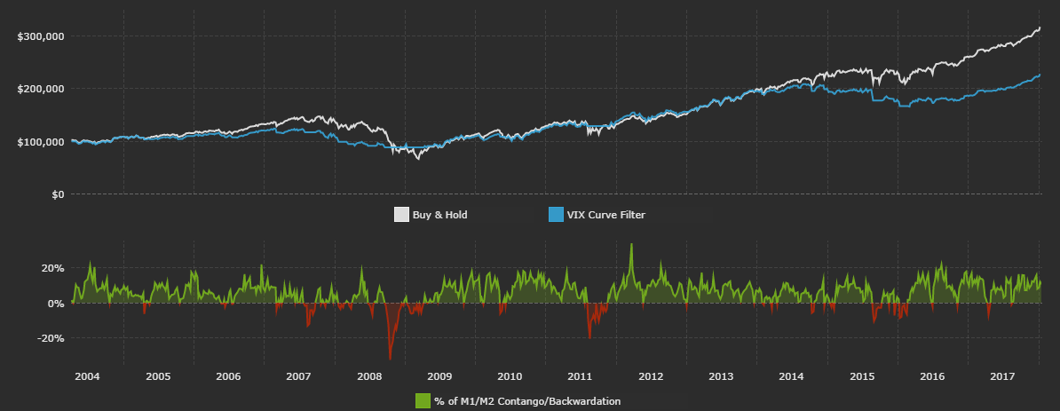
The VIX futures curve is made up of prices of individual VIX futures contracts. When the curve is upward sloping from left to right, the curve is said to be in contango. Contango means that market participants expect implied volatility to be higher in the future. The VIX futures curve is typically in contango.
When the curve is downward sloping from left to right, the curve is said to be in backwardation. In this scenario, near-term VIX futures are more expensive than long-term futures, meaning that investors expect volatility in the short term to be very high.
The VIX futures curve is currently in contango, although it did flatten out a bit last Wednesday. It should be noted that the front part of the VSTOXX futures curve (similar to the VIX, but for European equity volatility) is currently in backwardation. This is because there's uncertainty about Italian elections in early March. Data is from the CBOE.
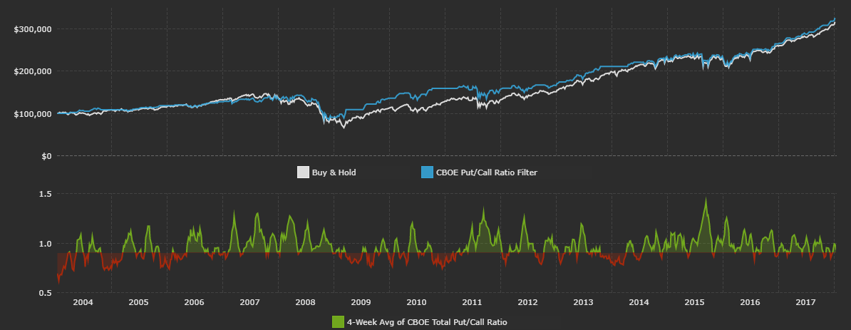
The Chicago Board Options Exchange reports three different put/call ratios: total, index and equity. The total put/call ratio combines the latter two. I analyze the total put/call ratio since it gives the most comprehensive view of options market sentiment. Historically, it's worked out well to cut exposure to the S&P when the ratio is low.
A low put/call ratio means that few investors are buying puts, and are therefore not worried about a sell-off in stocks. Data is from the CBOE.
Rates
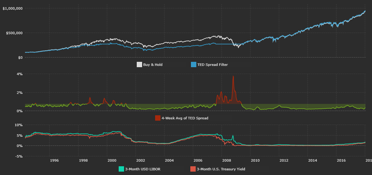
The TED spread is frequently cited as a measure of credit risk in the overall economy. The spread reflects the difference between two short-term interest rates: 3-month USD LIBOR and the 3-month U.S. Treasury (NYSEARCA:BIL) yield. LIBOR reflects the rate at which banks borrow from each other on an unsecured basis.
The perceived risk in the banking sector grows as the spread between LIBOR and T-bills increases. The current TED spread is at multi-month lows and is below my cut-off filter of 0.75%. Data is from the St. Louis Federal Reserve Economic Database.
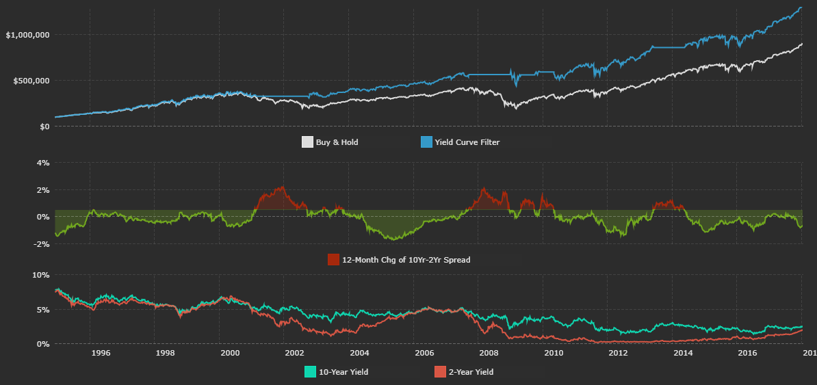
The yield curve is a popular tool used to forecast the direction of the economy. More often than not, people talk about how a flat or inverted yield curve is bad for markets. I choose to analyze the movement of the curve rather than its static shape. Specifically, I look at how the difference between the 2-year Treasury yield (NYSEARCA:SHY) and the 10-year yield (NYSEARCA:IEF) has shifted over the past 12 months.
A lot has been written about the yield curve the past few months since it's quickly flattened. This made people wonder if a flattening yield curve is an ominous sign for U.S. stocks. I personally don't think so.
Historically, a rapidly steepening curve has actually been more detrimental for stocks than a flat or inverted curve. In a steepening curve, short-term rates fall faster than long-term rates. In the past, steepening yield curves have been associated with the Federal Reserve quickly lowering the Federal Funds rate during a recession. That being said, there's now less room for the curve to massively steepen since short-term rates are still fairly low.
This 10-2 year portion of the yield curve has flattened by 63 basis points over the past 12 months. My cut-off filter is steepening of more than 50 basis points. Data is from the U.S. Treasury.
Macro
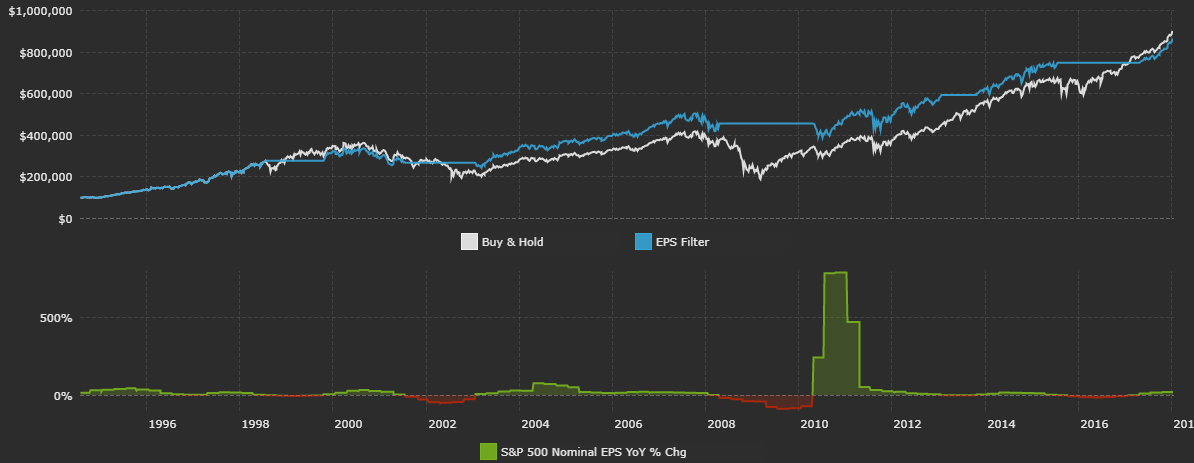
Earnings growth for the S&P 500 is largely driven by sales growth and profit margin expansion. Additionally, share buybacks are a contributing factor in earnings per share growth as buybacks shrink the number of shares outstanding. People view EPS growth as a sign of the improving profitability of American companies. My rule for EPS is as follows: If the 12-month change in S&P EPS is greater than 0%, be invested in SPY.
S&P EPS has risen by 19.7% over the past 12 months, and forward EPS estimates are actually being revised up (not down like they usually are). Data is from Standard & Poor's.
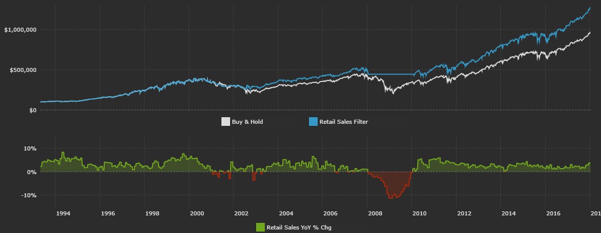
Retail sales reflect the total value of sales at the retail level. It's a primary measure of consumer spending, which accounts for the majority of economic activity in the U.S. I like to look at real retail sales data that is adjusted for inflation.
Real retail sales are up 3.7% over the past year, a strong number. Data is from the St. Louis Federal Reserve Economic Database.
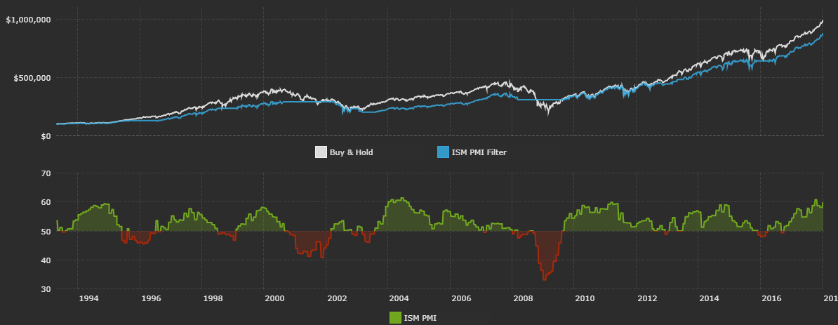
The ISM PMI is a diffusion index based on surveyed purchasing managers in the manufacturing industry. It's a leading indicator of economic health. A PMI reading above 50 indicates expansion in the manufacturing sector, below 50 indicates contraction.
The current ISM PMI is 59.7. Data is from the Institute of Supply Management.
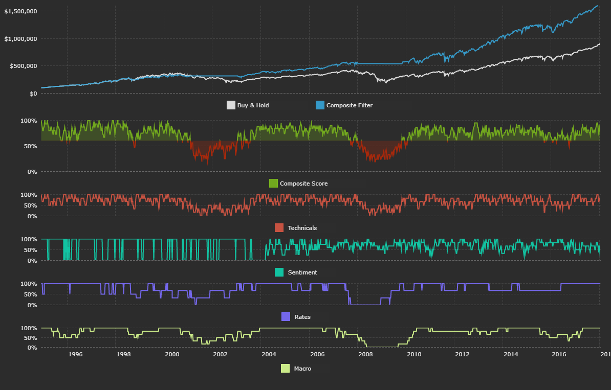
Composite Model
Think of each indicator as a building block that helps form an overall opinion. One study might say current sentiment has historically been bullish on stocks. Who cares? That's just one data point in isolation. I'm interested in a bigger-picture view with more context. A picture that also factors in what's going on with macro data, interest rates, etc. The composite model does just that.
Here's how it works: Each indicator is given a score of 1 or 0 depending on its current reading relative to its filter rule. If S&P earnings are down over the past year and the filter rule for that metric is to be out of the market if yearly earnings growth is below 0%, then that indicator gets a 0. The table below summarizes data from all the previous sections and assigns a 1 or 0 to each indicator based on its current reading.
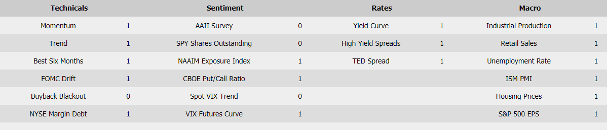
All 21 indicators are averaged to form the composite score. If the composite score is greater than 0.6, the model is invested in SPY. Think of 0.6 as the overall filter rule for the composite model.
There's nothing special about 0.6 - it results in being invested in SPY about 80% of the time. I could have used a higher filter rule like 0.75 to only be exposed to the S&P when more indicators are saying to be invested, but this results in less time exposed to the market since it's a "stricter" cut-off. The chart below plots each individual category average score and the overall composite score.
So where do we stand? Technical data is strong. The trend is up, we're in a seasonally strong period, margin debt hasn't contracted over the past year, and we're within the FOMC drift period. We are still in the buyback blackout period though.
Sentiment data is mostly optimistic. Spot VIX is low, CBOE's total put/call ratio is low, VIX futures are in contango, and AAII survey users are very bullish. The NAAIM Exposure Index (a more institutional-focused sentiment survey) has reflected a bit less optimism.
The TED spread is low, which is a healthy sign. The Treasury yield curve has flattened over the past year. High yield spreads are at 10-year lows, which is a tad worrying, but they're still falling and below their 12-month average.
US macro data is extremely strong. Real retail sales, S&P EPS growth, industrial production, and housing prices are all up over the past year. The unemployment rate is low and trending lower, and the ISM PMI is north of 50.
Overall, the composite model is still long. This is because the composite score is 0.81, above the cut-off filter of 0.60.
I update all of the individual indicators and the composite model each week, so be sure to follow me to track future updates!
I hope this article can help you out in your own investing process. Do let me know in the comments below if you have any questions.