Sohel_Parvez_Haque/iStock via Getty Images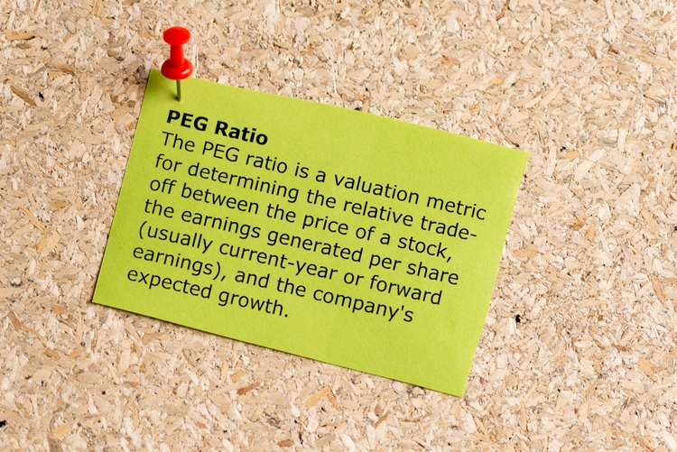
As we saw in Part 3, in order for stock prices to rise over the long term, a certain amount of earnings growth is necessary: the higher the PE ratio, the more earnings growth is required. With the S&P 500 currently priced at a trailing PE of around 25 (and the S&P 500 near 4700 at time of writing), the question is, how much earnings growth will the market require to maintain its current level? How much will it need for stocks to match historical returns? What does the market anticipate? How likely is the market to get the growth it anticipates?
This series is arguing, among other things, that a) the market is anticipating high growth, that b) long-term growth will likely be very high, but that c) the market will struggle to maintain current prices. Even if the market gets the growth it anticipates and more, it will likely not be enough to avoid depressed returns over the next 10-20 years.
In order to draw these conclusions, we have to estimate what the equilibrium relationship between PE and G (future earnings growth) is. For reasons discussed in Part 3, we have focused on G7.5, G10, and G20 (that is, subsequent annualized growth rates for 7.5-, 10-, and 20-year earnings), especially G7.5 and G10.
Are rising equilibrium levels in PEG and CAPE ratios sustainable?
History suggests, using log values of PE and G (specifically for G7.5 and G10), that the equilibrium value (or, ‘fair value’) for PEG (i.e., the price-to-earnings-to-growth ratio) is a (log) value somewhere near 3.0. That would imply that the market only needs about 3% growth through 2029 to maintain the 4700 level. The good news is the market will likely get more than 3%; the bad news is that will still be insufficient to avoid low returns.
This may appear somewhat contradictory. I am arguing that a) market history ‘says’ the S&P 500 ‘needs’ 3% growth, b) the market will likely get that and more, but c) we will experience a long-term bear market. My argument is that history is, for lack of a better word, wrong, but I will use history to show why.
Below are two charts showing the relationship between ‘logarithmic PEG’ and stock returns, using 7.5-year growth rates.

Chart 1. (Source: Robert Shiller’s CAPE data)

Chart 2. (Source: Shiller data)
The second chart shows that the historical equilibrium value for PEG7.5 is about 3.0, but the first chart shows that wherever it is that that equilibrium value lies, it has shifted. This is especially clear from around 1990, but perhaps it began earlier. Where the green line (stock returns) rises higher relative to the purple line (the logarithmic PEG), it suggests that stocks have become more ‘fuel efficient’ when it comes to earnings. In other words, the historical equilibrium value for the logarithmic PEG has risen.
We can measure how this historical equilibrium has shifted in a variety of ways.
Chart 3, below, shows equilibrium values for any given month using long-term cumulative data (the red line) and rolling, 30-year ratios and returns (the blue line).

Chart 3. (Source: Shiller data)
The first 30 years of data (1871-1901), suggest that the equilibrium value was around 2.8. Until about 1958, the equilibrium values seem relatively steady, but sometime after World War II, something changes, although it is not especially clear from the cumulative data. But from the 1990s, it is clear that the historical equilibrium has shifted, and it is still rising.
For a cumulative value to rise, it takes a lot of heavy lifting from the most recent periods of history, and I think this is reflected in the rolling 30-year equilibrium measurement. Our eyes are not deceiving us when we look at Chart 1. The market has been getting by on less and less earnings growth.
This is also reflected in the history of the historical average of Shiller’s Cyclically Adjusted PE ratio (also called the CAPE or P/E10 ratio) in Chart 4 below, although in less dramatic fashion.

Chart 4. (Source: Shiller data)
The 30-year moving average of the CAPE is the highest it has ever been, but it has only raised the cumulative moving average to 100-year highs, not all-time highs. Quite simply, price has been rising relative to earnings, especially since the 1990s.
There are at least two long-term risks, then. First, with CAPE at historic highs (around an arithmetic value of 38 last I checked), it could revert to its historic average (17 at present). CAPE typically corrects through changes in the ‘price’ side of the ratio. Second, it is possible that the historic average could revert to a prior historic average (14, perhaps). In order for that to happen, the CAPE ratio would have to fall below its current historic average for a very long time.
But is there any reason to expect that to happen? Is there a natural equilibrium between price and earnings? The CAPE ratio and its relationship with subsequent returns is effectively based on this premise, but this takes for granted that the historic average is the natural equilibrium. The argument here is not that it is ‘wrong’ to make that assumption. There is not much of an alternative if you just look at the relationship between price and a smoothed average of earnings (the E10 in the P/E10).
Again, the argument this series is making is that there probably is a ‘true equilibrium’ level in the relationship between price and earnings, but we are not likely to get there by calculating historic averages.
Thus, in the following chart of cumulative and rolling averages of the 7.5-year forward PE, we can see that something has changed since the 1990s, but we cannot derive an equilibrium value from this data.

Chart 5. (Source: Shiller data)
There is something of a paradox here. As we can see in the chart below, the historic average of 7.5-year forward PE ratios (the blue line) is actually near all-time lows while the logarithmic PEG7.5 equilibrium value (green line) has kept rising, and the CAPE average (the red line) seems to be somewhere in the middle.

Chart 6. (Source: Shiller data)
This is especially paradoxical because the ‘logarithmic PEG’ is exactly the same as the forward PE ratio, as discussed in Part 3. A PE ratio divided by a future rate of earnings growth (G) is the forward PE.
PEGₓ = P/E ÷ Eₓ/E = P/Eₓ
My intuition tells me that the equilibrium of the logarithmic PEG should resemble the long-term historical average of the forward PE in some way, either in terms of absolute values or in their respective trends. But, they don’t, and the gap between the two has been widening at least since World War II.
What is more, if price has been falling relative to forward earnings since World War II and even as far back as the 1890s, it seems hard to argue that price has risen far from a supposed ‘true equilibrium’. If anything, it appears that forward PE ratios are simply (albeit also suddenly) reacquiring an older equilibrium.
Which measurement is “right”?
I think the answer lies in one of the charts from Part 3 (Chart 7, below).

Chart 7. (Source: Shiller data)
In Part 3, we used this chart to illustrate how well PE anticipates G, but here we want to visualize what has been moving PEG ratios and forward PEs. Keep in mind that PEG = Forward PE. We can see that PEG ratios were high prior to the 1930s and remained low until the 1980s due to the extremely high rates of earnings growth (all else being equal, high growth lowers the ratio of PE to G). Since then, PEG ratios have been rising and/or elevated. Again, this is what we see in Chart 5 above. High PEG ratios/high forward PEs are nothing new. The difference between the high PEGs of our time and the high PEGs of the pre-Fed period is that this time price is not responding. Growth is falling yet prices are not. Prior to the Fed, as I have pointed out in previous articles and perhaps mentioned in an earlier installment of this series, price tended to track with earnings quite closely. Now, it does not.
The delta between the cumulative equilibrium values of the PEG7.5 ratio and the cumulative moving averages of the 7.5-year forward PE (which is also the PEG7.5 ratio) shows that the stock market’s insensitivity to declines in earnings growth had already begun as far back as World War II and then curiously increased as growth fell. Almost as if earnings did not matter.
Let me put this another way, using Chart 8.
CHART 8. (Source: Shiller data)
In Chart 8, we can see the way that stock prices (green) have reacted to PEG ratios (purple; remember, PEG = Forward PE) going back to 1871. From the 1930s to the early 1990s, PEG ratios were depressed (the PEG scale is inverted, so the line rises on this chart). Forward PEs were thus depressed relative to their historic averages (2.3-2.4), but prices continued to rise. And even with the collapse in earnings in 2008-2009 (both absolutely and relative to the PE ratio), prices hardly fell, which is why PE in 2008-2009 was so outrageously high—but also, as we saw in Part 3 (and illustrated to some degree in Chart 7 above), apparently due to anticipation of a future of very high earnings growth.
This chart shows quite clearly that forward PEs (i.e., PEG ratios) are within historic ranges. The outlier is stock prices. That is why when we look at 30-year averages, we see them rising to near all-time highs.
Can this continue indefinitely? Or perhaps high earnings growth can swoop in and save the day? Without a purely theoretical framework for explaining the relationships between price and earnings and changes in price and earnings, there is no answer except for history, and history is never presented to us raw, without its having already been stewed in our prejudices, so I will present my reasons as to why I think history says it is very unlikely that the stock market is going to be rescued by high growth. Readers will likely have their own interpretations.
Keynes and Schumpeter on yields and prices (and earnings?)
There are two primary reasons, as I see it, and the first is related to what Keynes pointed to as the cause of “Gibson’s Paradox”, as he called it. Having expected nominal interest rates to be inversely correlated with prices, it turned out that prices and yields had been positively correlated going back as far as the early 1700s. The second reason is related to what Schumpeter called Kondratiev Waves, long-term quasi-cyclical rises and falls in prices and yields that Schumpeter supposed (I believe correctly) are tied to technological waves.
There is not enough space here to justify why I think both of these phenomena are still at work, despite having mostly been abandoned by mainstream thought since the 1930s. I have written about them in some way or another in nearly all of my old articles on Seeking Alpha. In short, I believe that the relationship between prices and yields termed Gibson’s Paradox was (and remains to this day) a relationship between real commodity prices and the earnings yield (the inverse of the PE ratio), but that this was not apparent until after the establishment of the Fed disrupted many of the old reliable economic relationships (the Phillip’s Curve, for example). Similarly, I believe that the creation of the Fed doubled the frequency of Kondratiev Waves, which, like Gibson’s Paradox, are expressed most clearly in the earnings yield and commodity prices. Consumer inflation and bond yields are also subject to these phenomena but in a somewhat different way.
Finally, to bring this back to the focus of this series, I think earnings growth is also subject to both Gibson’s Paradox and Kondratiev Waves. In other words, earnings growth--here are we talking about concurrent earnings growth, not subsequent growth--is, for lack of a better word, bounded by the earnings yield (in a manner similar to primary commodity prices), and it rises and falls in a way reminiscent of Kondratiev Waves.
I will illustrate these relationships with the two charts below (Charts 9 and 10).

Chart 9. (Source: Shiller data)
I think there is no doubt that since the creation of the Fed, (consumer) inflation has been higher than it had been under the gold standard. The interesting thing is that it has converged with the earnings yield. This is also true for interest rates since the end of World War II.
This convergence has occurred simultaneously with an increased frequency of Kondratiev Waves, which prior to 1914 saw peaks every 50-60 years but now see peaks every 30 years (1920, 1950, 1980, 2010, 2040?).
The more persistent relationships, however, are between commodity prices, earnings, and the earnings yield.

Chart 10. (Sources: Shiller data, World Bank)
The differences in the scales of these two charts shows that earnings and commodity prices are much more volatile than consumer inflation. Commodity inflation also has a greater tendency to peak every 30 years. Commodity inflation can break higher than the earnings yield, but usually not for too long (or, at least not more than a decade). This has been growing more frequent, however, as commodity inflation remains elevated (relative to gold-standard days) while the earnings yield peaks at lower and lower levels.
Earnings, the earnings yield, and commodity prices (especially industrial metals prices) have a very curious relationship. They are joined at the hip cyclically. If you want to know what earnings are doing at any given time, a glance at industrial metals inflation often is a good clue, or even something like the copper/gold ratio. But, when we stretch this out to ‘supercyclical’ time frames (7 to 8 years), the relationship is different.
Long-term earnings “inflation” tends to oscillate around commodity inflation. Like commodity inflation and the earnings yield, it experiences peaks about every 30 years. When the earnings yield and/or commodity inflation is high, earnings growth also tends to be high. And, during those peaks, earnings growth rarely exceeds the level of the earnings yield itself, or at least not by much.
Recall that we saw in Part 3 that very high PEs (low yields) tend to predict high growth, while here we see that high yields (low PEs) coincide with high growth (or, high earnings “inflation”). But, in between these peaks in the earnings yield that we have seen since 1871, there tends to be a single, massive spike in earnings growth that breaks free of both commodity inflation and the earnings yield (see 1900, 1929, 1965, 2000, 2016 in Chart 10 above). These too were anticipated by high PE ratios; in Part 3, we could not find any period of high earnings growth (for 7.5- and 20-year rates) that was not anticipated by high PE.
Moreover, these spikes have typically rapidly corrected and the rate of earnings growth has been brought back to the level (or lower) of commodity inflation, which is typically low or falling at the time. Not only is this correction relatively rapid, but it has often meant trouble for the stock market. Each of those off-cycle peaks were followed by 7-14 years of low stock market returns, although the 2016 peak has yet to play out (see Chart 12 below).
The CAPE ratio says much the same thing, if in its own language. Think for a moment amount the relationship between the earnings yield and the CAPE (or, P/E10) ratio:
E/E10 ÷ E/P = P/E10
(earnings growth) ÷ (earnings yield) = CAPE
The rate of earnings growth divided by the earnings yield produces the CAPE ratio. The combination of a high rate of growth and a high PE are what produces peaks in that indicator. I am taking that a step farther and arguing that the earnings yield forms an upper bound to earnings growth that can be breached but not without consequences (I discussed this in Part 1).
If you look at Chart 10, you can see that earnings growth has been near or above the earnings yield almost continuously since 1990. Earnings and commodity inflation are pushing higher (at times of their choosing and in their own ways) while the earnings yield is pushing lower. If I am right, they (and we) have effectively come to an impasse. Further long-term inflation (primarily expressed in commodities and earnings, but perhaps also consumer prices) will have to push up the earnings yield (and thus reduce PE). But, we do not have many circumstances in which we see a long-term decline in PE coincide with rising stock prices. Alternatively, PE could keep rising, driving the earnings yield down, and probably growth and inflation as well.
This is jumping a bit ahead of the argument, though.
Let me first illustrate the relationship between CAPE and the earnings-yield-earnings-growth equilibrium.

Chart 11. (Source: Shiller data)
The green line is good ol’ CAPE. The blue line shows a rolling correlation between earnings inflation and the earnings yield. Typically, CAPE peaks just around the time that the correlation turns negative, and the ratio does not bottom until the correlation between growth and yield is restored. It is possible that the pre-pandemic peak in CAPE was a peak, and the pandemic crash was the reset for another secular round of rising stock prices. But, I do not think so.

Chart 12. (Source: Shiller data)
Chart 12 shows the correlation between earnings growth and the earnings yield (the green line) and subsequent stock market returns (the blue line). This chart suggests something like 0% returns for the 2016-2023 period, which, if borne out, would be equivalent to something like a 60% drop in stocks between now and late 2023. I think most of the catalysts are in place to make that happen, but that is an argument for a future installment.
If PEG is correlated with long-term returns, and CAPE is correlated with long-term returns, and rolling correlations between earnings growth and the earnings yield are correlated with long-term returns, then we might hope to see that the correlation between growth and yield ‘predicts’ the PEG ratio.
In the chart below, we can see that whenever the correlation between growth and yield (green) breaks down, the PEG ratio (in purple) also spikes up (down, in this inverted scale).
This suggests that, in the short-term, both growth and stock returns will stall.

Chart 13. (Source: Shiller data)
In other words, where the correlation between earnings growth and the earnings yield breaks down (and this curiously only occurs through growth breaking above the yield), PE overshoots subsequent growth, which translates into depressed returns, even setting aside the question of a ‘true’ equilibrium level.
The earnings yield as a limit to growth
This brings us back to the discussion in Part 1, in which we attempted to characterize the nature of the equilibrium and the interaction of multiple equilibria. We can be a touch more concrete about this now. It appears that the earnings yield itself plays the role of an equilibrium limit for earnings growth, particularly as a permeable upward limit in much the same way the surface of the ocean is a ‘ceiling’ for marine life. This is reflected in the CAPE ratio and the rolling correlation between earnings growth and the yield.
The product of earnings growth chronically pushing up against the earnings yield is distortions to the historical equilibrium level of the PEG ratio, pushing it higher. It appears likely, therefore, that the ‘true’ equilibrium level for the PEG ratio and things like CAPE lie closer to their pre-distortion historical values. For the PEG ratio, using Chart 3, it appears that the true equilibrium value for the logarithmic PEG is between 2.67 (the lowest value in Fedworld) and 2.80 (the gold standard maximum), which is roughly equivalent to 7.5-year forward PEs of 14.4 and 16.4, respectively. If forced to choose a single value, then 2.75 (a forward PE of a bit over 15.5) would be a conservative guess.
That is also suggested by the historical equilibrium value from 1871-1980, illustrated in Chart 14 below.

Chart 14. (Source: Shiller data)
The following chart sets the equilibrium level for logarithmic PEG at 2.75.

Chart 15. (Source: Shiller data)
This gives us a rough notion of how much earnings growth will be necessary for stocks to maintain their current levels over the course of the 2020s.
Assuming ‘fair value’ for PEG is a log value of 2.75, the S&P 500 would need to see about 6.5% growth per year until 2029 just to maintain the 4700 level and significantly higher rates of growth to see average returns. (The historical average of earnings growth has been about 3.8% per year since 1871 and 6.4% since 1932). But the problem with getting higher rates of growth is that they would likely need a higher earnings yield in 2029 to accommodate them, as suggested in Chart 10. A 6.5% growth rate in 2029 translates into an equivalent trailing PE near 15.5. If the growth rate were to be 10%, we would have to expect a maximum trailing PE of 10 (100/10=10) in 2029, as well. This is all assuming markets are ready to simply reconverge to our supposed ‘true equilibrium’. A 10% growth rate over 7.5 years is about a doubling of earnings. If earnings were to double, and PE fell from the current 25 to 10, that results in a S&P 500 around 3800. Paradoxically, higher earnings growth in this scenario results in lower returns, despite everything we have said about ‘excess’ earnings growth resulting quite consistently in higher stock returns. As I wrote in Part 1, this suggests to me that we may be caught in an ‘equilibrium trap’. If we get growth, PEs go down; if growth is weak, stock prices fall.
It is hard not to notice the parallels between this scenario and the trap the Fed has been in the last decade. If the Fed can generate growth and inflation, that would raise interest rates, but any tightening seems to lead to declines in growth and inflation.
In the end, however, the burden of proof has to be on my side. After all, the market has simply gotten out of these traps by ignoring them. Even when the bears have been briefly vindicated, markets have still outperformed. From the point of view of the PEG ratio, for example, the 2008 bear market should have been considerably worse. Chart 3 really tells the story. No matter how poorly earnings have done relative to expectations (as manifested in PEs), stocks have outperformed.
Thus the next big question is, assuming the existence of a ‘true equilibrium’, how likely is it that it will reassert itself in the next 7.5 years, 10 years, or 20 years?
We are not ready to tackle that question in this installment, but looking at what we have found so far, it appears that we are due for a major ‘earnings miss’ over the next 24-36 months (per Chart 13) that will result in a collapse in the S&P 500 (per Chart 12) to something like 2000 over the same period. (Earlier research on long-term sector rotations suggest that tech stocks are most vulnerable). We have also seen, particularly in Part 3, that earnings growth from the crisis lows of 2020 through to 2028 will likely be very high, suggesting that earnings will surge higher after a crisis centered around 2023.
As I said above, breakdowns in the equilibrium relationship between earnings growth and the earnings yield tend to see 7-14 years of low nominal stock returns. Chart 16, below, illustrates the longer-term impact.

Chart 16. (Source: Shiller data)
In other words, even if earnings rally powerfully out of a 2023 crisis, this chart suggests that stocks may be rangebound between the 2016 highs (around 2000) and our current highs (around 4700) until the early 2030s.
Conclusion
Part 3 suggested that earnings inflation will also be low in the 2028-2033 period, but high in the 2033-2040 period, but there is nothing thus far to suggest what stock returns will look like. However, if Kondratiev cyclicality should be in place, with rising yields (of all kinds) and rising inflation (of all kinds), we ought to expect very low returns all the way through 2040. This discussion is better suited for Part 5, but it would appear from this quick round-up that the prime period for a reimposition of the ‘true equilibrium’ would be in the 2030s, but that does not mean that it could not start sooner, particularly with a stock market crash in the near future.