Introduction
The problem with using a long-term valuation approach to Bitcoin (BTC-USD) (COIN) (OTCQX:GBTC) is that you only have a clear direction when the market has made a severe mistake. If the market has priced Bitcoin too low, it's a great time to buy; if it's too high, maybe you should move some of that into cash or another asset class. However, when the models say the price is fair, or when they contradict each other, what do you do?
One clue we have comes from the past behavior of bubbles, which do seem to repeat with moderate variation every few years. In other words, there does seem to be a very large psychological component to Bitcoin's price, that causes bubbles to emerge, and eventually pop. After a bubble, people need to psychologically reset, but when the market starts going crazy, people stampede in and FOMO takes hold.
From the perspective of the past, we just left a bubble, and the price has been grinding lower for 12 months. Now, we also know that as we pass the "fair value," or the long-term trend line, we can only be moving in one of two directions. Before a bubble, we pass the fair value going up, and then after a bubble, we pass the fair value coming back down.
Today, I'm going to present three bullish and three bearish charts. Let's get started.
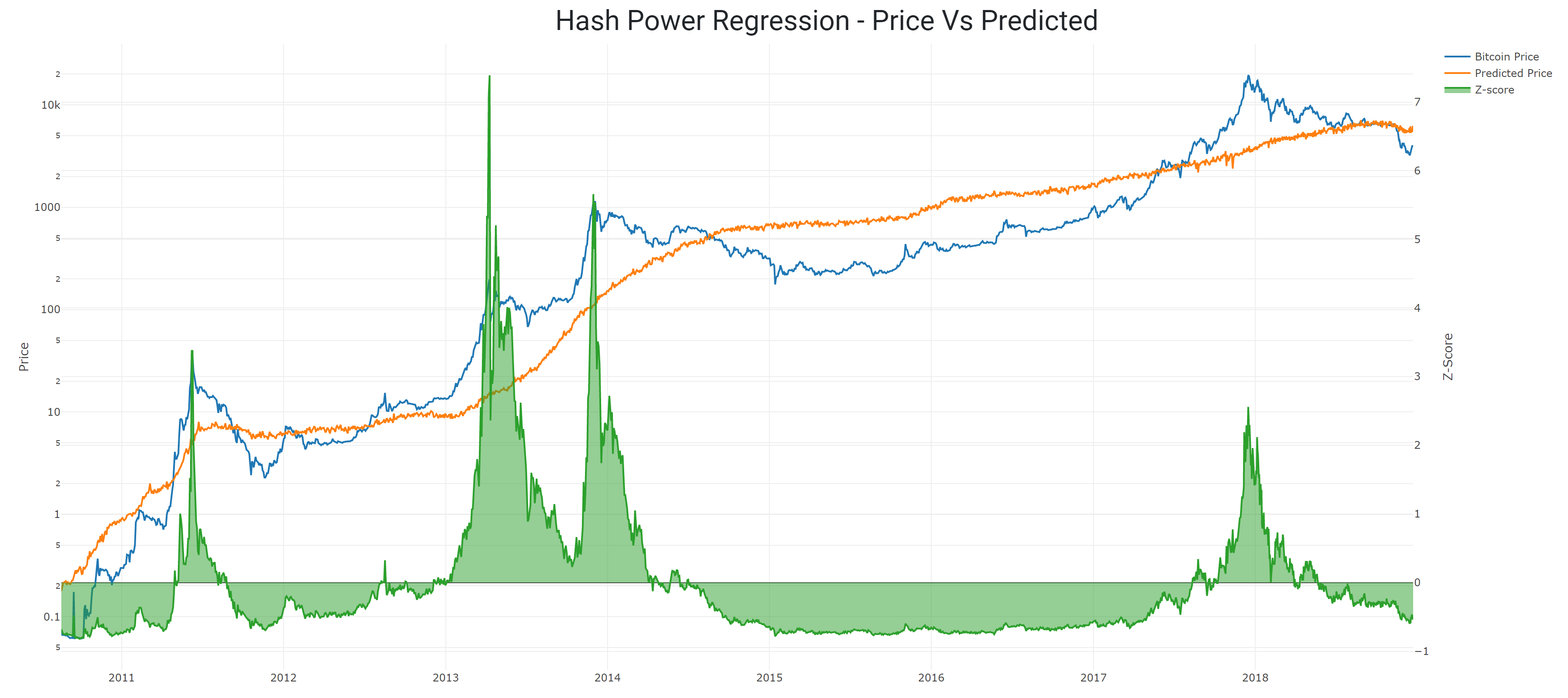
Hash Power Regression
In previous articles, I have argued that the Bitcoin price and the hash power of the network form a feedback loop. Because of this relationship, we can easily spot divergences between the hash power and price. Ideally, this helps us spot buying or selling opportunities.
Let's take a look at this relationship over the long term.
 Source: blockchain.com and author's charts
Using this model, the price is now significantly below the expected level. However, the magnitude of the divergence has not yet reached the lowest levels that we saw in 2011, 2012, and 2015.
| Predicted | Actual | |
| Price | $6,156 | $4,027 |
Data through December 23rd, 2018.
Bitcoin Mayer Multiple
The Mayer Multiple is the Bitcoin price divided by the 200 DMA of the price. Recently, it has dropped down to levels that haven't been seen in several years.
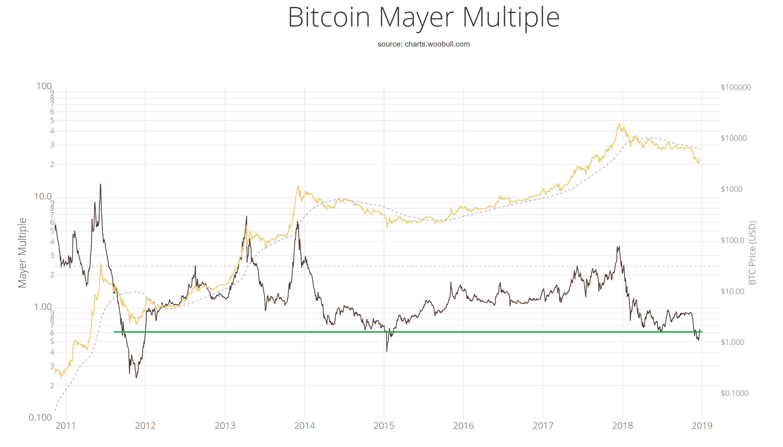 Source: charts.woobull.com
There have been lower readings in the past, but it's been nearly four years since we saw the 0.6 to 0.5 level. Using this approach, Bitcoin today might be a very good buy.
Total Transaction Regression
The total transaction count that have ever confirmed on the Bitcoin network has been growing since the very beginning. I have suggested in the past that the total transactions are an interesting proxy for the age of Bitcoin. As long as they're increasing, Bitcoin is still alive.
The total transaction count is one of the inputs into the Bitcoin Value Indicator reports that I publish here once a month. Let's look at this relationship on a more granular level.
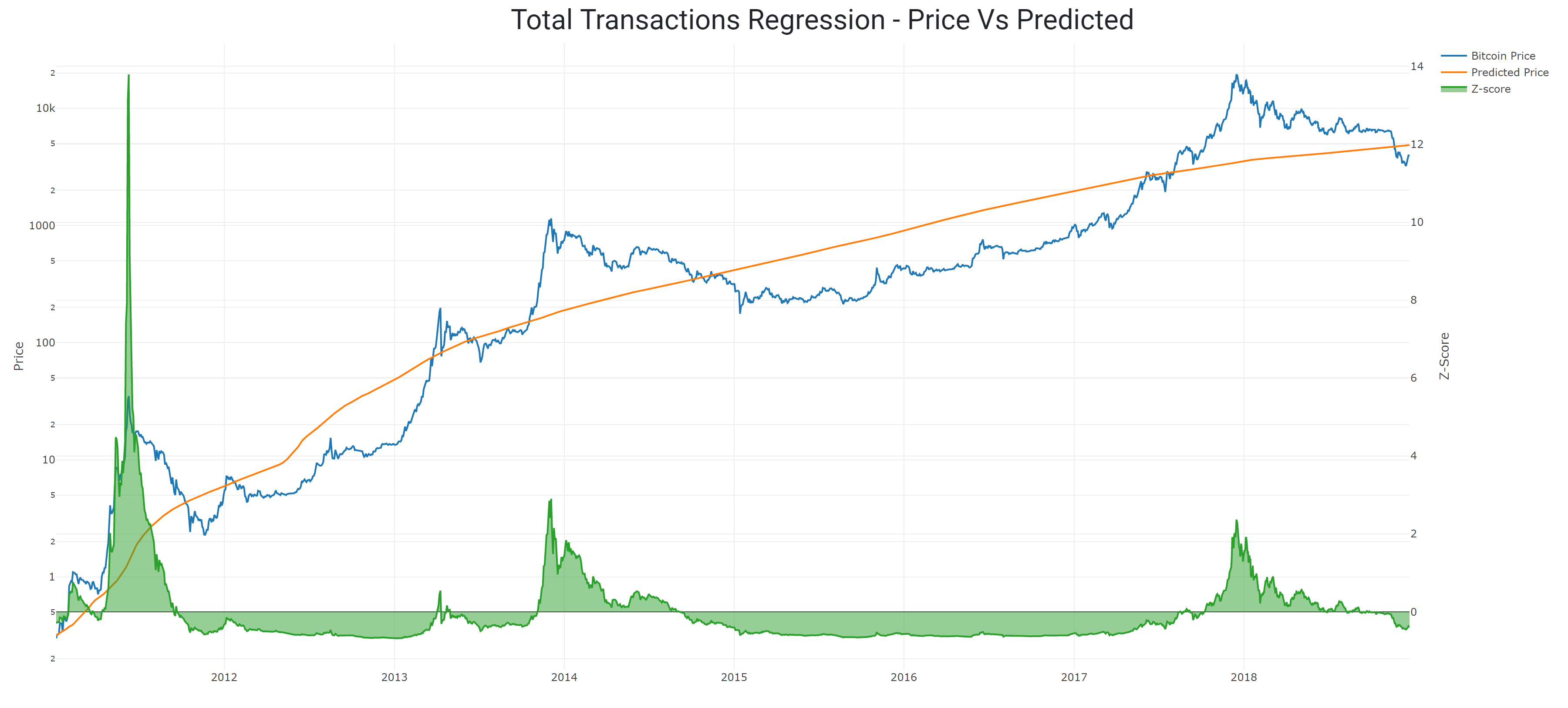 Source: blockchain.com and author's charts
| Predicted | Actual | |
| Price | $4,860 | $4,027 |
Data through December 23rd, 2018.
Using this model, Bitcoin's price does come in under what's expected. However, in the past, this state (where the price is below expected) has persisted for many months or even years. So, maybe it's a good time to buy, but there doesn't seem to be any reason to rush in at this point. If this period of undervaluation continues, then there will be plenty of time to take a position when (or if) it's right for you.
Network Value Approaches
There are several ways to value the Bitcoin network using Metcalfe's Law. My approach is to use the daily transaction count and the number of unique addresses, which I wrote about here.
Unique Addresses Regression
The number of unique addresses in use is a proxy for the number of Bitcoin users (probably a very conservative one). Let's look at the relationship between the unique addresses and the price over the long run.
 Source: blockchain.com and author's charts
Using the number of unique addresses in use, it does not appear that we're out of the woods yet. The price is still clearly over what's predicted, indicating that the current price of Bitcoin is not supported by the network.
| Predicted | Actual | |
| Price | $1,565 | $4,027 |
Data through December 23rd, 2018.
Daily Transactions
The daily transaction count tells the network story from the point of view of the activity of the network, rather than the number of participants. Using the same approach as above, let's see what we find.
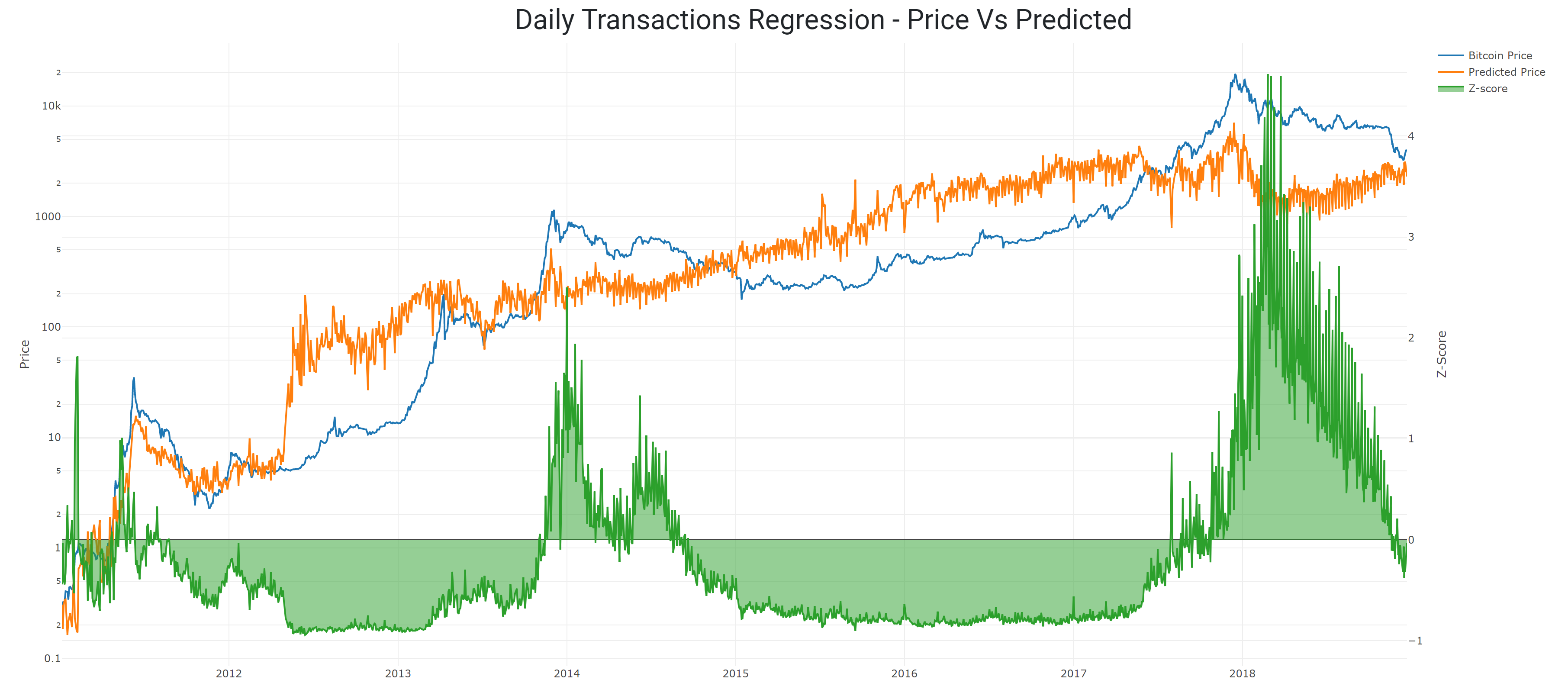 Source: blockchain.com and author's charts
| Predicted | Actual | |
| Price | $2,302 | $4,027 |
Data through December 23rd, 2018.
From the point of view of network valuation, it appears that the price of Bitcoin is still too high. In order to close this gap, the price has to come down, or the activity levels need to go up (or both).
Willy Woo's NVT
The NVT is a way to measure the value transmitted over the Bitcoin network compared to the price of Bitcoin. I've written a review of this approach, which you can find here. The "too long; didn't read" version is that the approach is interesting, but it seems to lag the market by several months. Nevertheless, it's interesting to watch and is a popular valuation method.
 Source: charts.woobull.com
Using the NVT ratio, it appears that we are out of the dangerous bubble territory, but we have yet to enter the prime buying range. The thin grey lines (which are the daily measurements) have been trending lower, but they have yet to pull down the thicker red line, which represents the moving average.
Conclusion
Five out of the six models that I've presented have one thing in common. They all agree that in early/mid-2015, there was a remarkable buying opportunity. Indeed, Bitcoin's price briefly dipped below $180 at that time.
However, the bullish indicators seemed to place the peak of the last bubble in December of 2017, where the bearish indicators registered the highest outputs in Q1 or even Q3 of 2018.
I think when we hit the actual price bottom of this current market, we'll see that same signal cohesion. In other words, the charts will agree. Until then, there's going to be a lot of noise and confusion.
Cheers,
Hans
This article was published first in Crypto Blue Chips.